This is a band.
Accordion
A vertical list of items, each of which can be expanded or collapsed to show more content.
{% include '@bolt-components-accordion/accordion.twig' with {
items: [
{
trigger: 'Accordion item 1',
content: 'This is the accordion content.',
},
{
trigger: 'Accordion item 2',
content: 'This is the accordion content.',
},
{
trigger: 'Accordion item 3',
content: 'This is the accordion content.',
}
]
} only %}| Prop Name | Description | Type | Default Value | Option(s) |
|---|---|---|---|---|
|
items
|
All of the items in the accordion. Each item should contain a header and a content. |
array
| — |
|
|
single
|
Allow only one section to open at a time. |
boolean
|
false
|
|
|
no_separator
|
Hides the separator in between items. |
boolean
|
false
|
|
|
box_shadow
|
Creates a box shadow around the accordion. |
boolean
|
false
|
|
|
spacing
|
Controls the inset spacing of each item. |
string
|
medium
|
|
|
icon_valign
|
Vertically align the accordion trigger content and trigger icon. |
string
|
center
|
|
|
scroll_offset_selector
|
Selects a fixed element on the page, offsets smooth scrolling by the height of that element. Must be a valid CSS selector. |
string
| — |
|
|
scroll_offset
|
Additional offset for smooth scrolling, integer converted to pixel value. |
integer
| — |
|
items
| Prop Name | Description | Type | Default Value | Option(s) |
|---|---|---|---|---|
|
trigger
|
Trigger content of an item. |
string
, object
, array
|
Toggle Accordion
|
|
|
content
|
Expandable content of an item. |
string
, object
, array
|
— |
|
|
open
|
Automatically expand an item on page load. |
boolean
|
false
|
|
|
inactive
|
Display item trigger as an inactive element. Item content will be collapsed and the toggle icon hidden. |
boolean
|
false
|
|
|
id
|
Unique identifier for each item, may be used for deep linking. |
string
| — |
|
|
open_label
|
Accessible label for the open trigger to expand an item. |
string
|
Open Accordion
|
|
|
close_label
|
Accessible label for the close trigger to collapse an item. |
string
|
Close Accordion
|
|
|
uuid
(deprecated) |
Internal use only. Unique ID for an item, randomly generated if not provided. |
string
| — |
|
npm install @bolt/components-accordion
By setting the single prop to true, it allows only one item to be opened at a time.
Single open item
Multiple open items (default)
By setting the no_separator prop to true, it will remove the separator in between items.
Accordion with separators
Accordion without separators
By setting the box_shadow prop to true, it will create a box shadow around the accordion.
Box shadow
Box shadow, no separator
No box shadow
By setting the spacing prop to none, xsmall, small, medium, or large, it applies the appropriate inset spacing for each accordion item. The default is medium.
Spacing: none
Lorem ipsum dolor sit, amet consectetur adipisicing elit. Neque minima nisi optio cumque esse ullam rerum reiciendis itaque iste, quod sunt explicabo, est eum quo aliquid hic commodi laboriosam at. Lorem ipsum dolor sit, amet consectetur adipisicing elit. Neque minima nisi optio cumque esse ullam rerum reiciendis itaque iste, quod sunt explicabo, est eum quo aliquid hic commodi laboriosam at.
Lorem ipsum dolor sit, amet consectetur adipisicing elit. Neque minima nisi optio cumque esse ullam rerum reiciendis itaque iste, quod sunt explicabo, est eum quo aliquid hic commodi laboriosam at. Lorem ipsum dolor sit, amet consectetur adipisicing elit. Neque minima nisi optio cumque esse ullam rerum reiciendis itaque iste, quod sunt explicabo, est eum quo aliquid hic commodi laboriosam at.
Lorem ipsum dolor sit, amet consectetur adipisicing elit. Neque minima nisi optio cumque esse ullam rerum reiciendis itaque iste, quod sunt explicabo, est eum quo aliquid hic commodi laboriosam at. Lorem ipsum dolor sit, amet consectetur adipisicing elit. Neque minima nisi optio cumque esse ullam rerum reiciendis itaque iste, quod sunt explicabo, est eum quo aliquid hic commodi laboriosam at.
Spacing: xsmall
Lorem ipsum dolor sit, amet consectetur adipisicing elit. Neque minima nisi optio cumque esse ullam rerum reiciendis itaque iste, quod sunt explicabo, est eum quo aliquid hic commodi laboriosam at. Lorem ipsum dolor sit, amet consectetur adipisicing elit. Neque minima nisi optio cumque esse ullam rerum reiciendis itaque iste, quod sunt explicabo, est eum quo aliquid hic commodi laboriosam at.
Lorem ipsum dolor sit, amet consectetur adipisicing elit. Neque minima nisi optio cumque esse ullam rerum reiciendis itaque iste, quod sunt explicabo, est eum quo aliquid hic commodi laboriosam at. Lorem ipsum dolor sit, amet consectetur adipisicing elit. Neque minima nisi optio cumque esse ullam rerum reiciendis itaque iste, quod sunt explicabo, est eum quo aliquid hic commodi laboriosam at.
Lorem ipsum dolor sit, amet consectetur adipisicing elit. Neque minima nisi optio cumque esse ullam rerum reiciendis itaque iste, quod sunt explicabo, est eum quo aliquid hic commodi laboriosam at. Lorem ipsum dolor sit, amet consectetur adipisicing elit. Neque minima nisi optio cumque esse ullam rerum reiciendis itaque iste, quod sunt explicabo, est eum quo aliquid hic commodi laboriosam at.
Spacing: small
Lorem ipsum dolor sit, amet consectetur adipisicing elit. Neque minima nisi optio cumque esse ullam rerum reiciendis itaque iste, quod sunt explicabo, est eum quo aliquid hic commodi laboriosam at. Lorem ipsum dolor sit, amet consectetur adipisicing elit. Neque minima nisi optio cumque esse ullam rerum reiciendis itaque iste, quod sunt explicabo, est eum quo aliquid hic commodi laboriosam at.
Lorem ipsum dolor sit, amet consectetur adipisicing elit. Neque minima nisi optio cumque esse ullam rerum reiciendis itaque iste, quod sunt explicabo, est eum quo aliquid hic commodi laboriosam at. Lorem ipsum dolor sit, amet consectetur adipisicing elit. Neque minima nisi optio cumque esse ullam rerum reiciendis itaque iste, quod sunt explicabo, est eum quo aliquid hic commodi laboriosam at.
Lorem ipsum dolor sit, amet consectetur adipisicing elit. Neque minima nisi optio cumque esse ullam rerum reiciendis itaque iste, quod sunt explicabo, est eum quo aliquid hic commodi laboriosam at. Lorem ipsum dolor sit, amet consectetur adipisicing elit. Neque minima nisi optio cumque esse ullam rerum reiciendis itaque iste, quod sunt explicabo, est eum quo aliquid hic commodi laboriosam at.
Spacing: medium
Lorem ipsum dolor sit, amet consectetur adipisicing elit. Neque minima nisi optio cumque esse ullam rerum reiciendis itaque iste, quod sunt explicabo, est eum quo aliquid hic commodi laboriosam at. Lorem ipsum dolor sit, amet consectetur adipisicing elit. Neque minima nisi optio cumque esse ullam rerum reiciendis itaque iste, quod sunt explicabo, est eum quo aliquid hic commodi laboriosam at.
Lorem ipsum dolor sit, amet consectetur adipisicing elit. Neque minima nisi optio cumque esse ullam rerum reiciendis itaque iste, quod sunt explicabo, est eum quo aliquid hic commodi laboriosam at. Lorem ipsum dolor sit, amet consectetur adipisicing elit. Neque minima nisi optio cumque esse ullam rerum reiciendis itaque iste, quod sunt explicabo, est eum quo aliquid hic commodi laboriosam at.
Lorem ipsum dolor sit, amet consectetur adipisicing elit. Neque minima nisi optio cumque esse ullam rerum reiciendis itaque iste, quod sunt explicabo, est eum quo aliquid hic commodi laboriosam at. Lorem ipsum dolor sit, amet consectetur adipisicing elit. Neque minima nisi optio cumque esse ullam rerum reiciendis itaque iste, quod sunt explicabo, est eum quo aliquid hic commodi laboriosam at.
Spacing: large
Lorem ipsum dolor sit, amet consectetur adipisicing elit. Neque minima nisi optio cumque esse ullam rerum reiciendis itaque iste, quod sunt explicabo, est eum quo aliquid hic commodi laboriosam at. Lorem ipsum dolor sit, amet consectetur adipisicing elit. Neque minima nisi optio cumque esse ullam rerum reiciendis itaque iste, quod sunt explicabo, est eum quo aliquid hic commodi laboriosam at.
Lorem ipsum dolor sit, amet consectetur adipisicing elit. Neque minima nisi optio cumque esse ullam rerum reiciendis itaque iste, quod sunt explicabo, est eum quo aliquid hic commodi laboriosam at. Lorem ipsum dolor sit, amet consectetur adipisicing elit. Neque minima nisi optio cumque esse ullam rerum reiciendis itaque iste, quod sunt explicabo, est eum quo aliquid hic commodi laboriosam at.
Lorem ipsum dolor sit, amet consectetur adipisicing elit. Neque minima nisi optio cumque esse ullam rerum reiciendis itaque iste, quod sunt explicabo, est eum quo aliquid hic commodi laboriosam at. Lorem ipsum dolor sit, amet consectetur adipisicing elit. Neque minima nisi optio cumque esse ullam rerum reiciendis itaque iste, quod sunt explicabo, est eum quo aliquid hic commodi laboriosam at.
By setting the icon_valign prop to top or center, it will vertically align the trigger and the icon accordingly.
Icon Valign: top
Icon Valign: center
Set the inactive prop to true on any accordion item to display the trigger as an inactive element. It will have the same font-styles as the other triggers but none of the interactive styles. It will not be clickable, and that item's content and toggle icon will always be hidden.
Lorem ipsum dolor sit, amet consectetur adipisicing elit. Neque minima nisi optio cumque esse ullam rerum reiciendis itaque iste, quod sunt explicabo, est eum quo aliquid hic commodi laboriosam at. Lorem ipsum dolor sit, amet consectetur adipisicing elit. Neque minima nisi optio cumque esse ullam rerum reiciendis itaque iste, quod sunt explicabo, est eum quo aliquid hic commodi laboriosam at.
Lorem ipsum dolor sit, amet consectetur adipisicing elit. Neque minima nisi optio cumque esse ullam rerum reiciendis itaque iste, quod sunt explicabo, est eum quo aliquid hic commodi laboriosam at. Lorem ipsum dolor sit, amet consectetur adipisicing elit. Neque minima nisi optio cumque esse ullam rerum reiciendis itaque iste, quod sunt explicabo, est eum quo aliquid hic commodi laboriosam at.
Lorem ipsum dolor sit, amet consectetur adipisicing elit. Neque minima nisi optio cumque esse ullam rerum reiciendis itaque iste, quod sunt explicabo, est eum quo aliquid hic commodi laboriosam at. Lorem ipsum dolor sit, amet consectetur adipisicing elit. Neque minima nisi optio cumque esse ullam rerum reiciendis itaque iste, quod sunt explicabo, est eum quo aliquid hic commodi laboriosam at.
Accordion inside various themes
Accordion with shadow inside various themes
Using the grid inside trigger and content
Lorem ipsum dolor sit, amet consectetur adipisicing elit. Neque minima nisi optio cumque esse ullam rerum reiciendis itaque iste, quod sunt explicabo, est eum quo aliquid hic commodi laboriosam at. Lorem ipsum dolor sit, amet consectetur adipisicing elit.
Neque minima nisi optio cumque esse ullam rerum reiciendis itaque iste, quod sunt explicabo, est eum quo aliquid hic commodi laboriosam at.
Pass various components into the content
| Column 1 | Column 2 | Column 3 | |
|---|---|---|---|
| Row 1 | R1C1 | R1C2 | R1C3 |
| Row 2 | R2C1 | R2C2 | R2C3 |
| Row 3 | R3C1 | R3C2 | R3C3 |
| Footer | FC1 | FC2 | FC3 |
This is a headline
This is regular text. Suspendisse dictum feugiat nisl ut dapibus. Mauris iaculis porttitor posuere. Praesent id metus massa, ut blandit odio. Proin quis tortor orci. Etiam at risus et.
Tab label 1
Tab label 2
Tab label 3
Example Q&A
Placeholder "fixed" element, should not overlap active accordion item when page first loads.
scroll_offset_selector to select the "fixed" element. That will offset the scroll position by the "fixed" element's height. Use scroll_offset for any additional adjstments. See a demo: ?selected-accordion-item=item-3.
By setting the content_spacing or trigger_spacing prop to an Accordion Item, the default spacing value inherited from the parent Accordion can be optionally overridden.
Basic usage: spacing
Using spacing will uniformly set the same spacing on both the trigger and the content.
This entire accordion has the
spacing prop defined.
This entire accordion has the
spacing prop defined.
This entire accordion has the
spacing prop defined.
Advanced usage: content spacing
Using content_spacing will only set the spacing on the content container. This should only be used if you don't want the same spacing on both the trigger and the content.
This item has the
content_spacing prop defined.
This item has the
content_spacing prop defined.
This item has the
content_spacing prop defined.
Advanced usage: trigger spacing
Using trigger_spacing will only set the spacing on the trigger container. This should only be used if you don't want the same spacing on both the trigger and the content.
trigger_spacing prop defined.
trigger_spacing prop defined.
trigger_spacing prop defined.
bolt-accordion element containing any number of bolt-accordion-item elements to create an accordion. Inside each bolt-accordion-item mark the "trigger" content with the attribute slot="trigger". Everything else is considered accordion "content".
<bolt-accordion>
<bolt-accordion-item>
<bolt-text slot="trigger">Accordion item 1</bolt-text>
<bolt-text>Lorem ipsum dolor sit, amet consectetur adipisicing elit.</bolt-text>
</bolt-accordion-item>
<bolt-accordion-item>
<bolt-text slot="trigger">Accordion item 2</bolt-text>
<bolt-text>Lorem ipsum dolor sit, amet consectetur adipisicing elit.</bolt-text>
</bolt-accordion-item>
<bolt-accordion-item>
<bolt-text slot="trigger">Accordion item 3</bolt-text>
<bolt-text>Lorem ipsum dolor sit, amet consectetur adipisicing elit.</bolt-text>
</bolt-accordion-item>
</bolt-accordion>no-separator. Use this prop rather than the separator prop used in Twig.
<bolt-accordion spacing="small" icon-valign="top" box-shadow no-separator multiple>
<bolt-accordion-item>
<bolt-text slot="trigger">Accordion item 1 with a lot of text in the trigger, which could wrap to multiple lines, and this trigger and the icon are vertically aligned center</bolt-text>
<bolt-text>Lorem ipsum dolor sit, amet consectetur adipisicing elit.</bolt-text>
</bolt-accordion-item>
<bolt-accordion-item>
<bolt-text slot="trigger">Accordion item 2</bolt-text>
<bolt-text>Lorem ipsum dolor sit, amet consectetur adipisicing elit.</bolt-text>
</bolt-accordion-item>
<bolt-accordion-item>
<bolt-text slot="trigger">Accordion item 3</bolt-text>
<bolt-text>Lorem ipsum dolor sit, amet consectetur adipisicing elit.</bolt-text>
</bolt-accordion-item>
</bolt-accordion>bolt-accordion-item by adding the open prop.
<bolt-accordion>
<bolt-accordion-item>
<bolt-text slot="trigger">Accordion item 1</bolt-text>
<bolt-text>Lorem ipsum dolor sit, amet consectetur adipisicing elit.</bolt-text>
</bolt-accordion-item>
<bolt-accordion-item open>
<bolt-text slot="trigger">Accordion item 2</bolt-text>
<bolt-text>This item is opened by default. Lorem ipsum dolor sit, amet consectetur adipisicing elit.</bolt-text>
</bolt-accordion-item>
<bolt-accordion-item>
<bolt-text slot="trigger">Accordion item 3</bolt-text>
<bolt-text>Lorem ipsum dolor sit, amet consectetur adipisicing elit.</bolt-text>
</bolt-accordion-item>
</bolt-accordion>Action Blocks
A grid layout of actions consist of icon and text.
{% set icon %}
{% include '@bolt-elements-icon/icon.twig' with {
name: 'icon-name',
}%}
{% endset %}
{% set shape %}
{% include '@bolt-elements-shape/shape.twig' with {
content: icon,
}%}
{% endset %}
{% include '@bolt-components-action-blocks/action-blocks.twig' with {
items: [
{
text: 'Item 1',
url: '#!',
media: icon,
},
{
text: 'Item 2',
url: '#!',
media: icon,
},
{
text: 'Item 3',
url: '#!',
media: icon,
}
]
} only %}| Prop Name | Description | Type | Default Value | Option(s) |
|---|---|---|---|---|
|
attributes
|
A Drupal-style attributes object with extra attributes to append to this component. |
object
| — |
|
|
spacing
|
Spacing surrounding each action block. |
string
|
medium
|
|
|
max_items_per_row
|
The max amount of items (action blocks) to be displayed in one row. |
number
|
6
|
|
|
valign
|
Vertical alignment of the content inside each action block. |
string
|
start
|
|
|
borderless
|
Removes the border in between each action block. |
boolean
|
false
|
|
|
content
|
Free form content to populate the action blocks |
string
, array
, object
|
— |
|
|
children
(deprecated) |
Use content prop instead. |
— | — |
|
|
items
|
Content items to populate the action blocks. |
array
| — |
|
|
maxItemsPerRow
(deprecated) |
Use max_items_per_row prop instead. |
— | — |
|
|
align
(deprecated) |
Use valign prop instead. |
— | — |
|
|
border
(deprecated) |
Use borderless prop instead. |
— | — |
|
items
| Prop Name | Description | Type | Default Value | Option(s) |
|---|---|---|---|---|
|
attributes
|
A Drupal-style attributes object with extra attributes to append to this component. |
object
| — |
|
|
text
|
string
| — |
|
|
|
url
|
string
| — |
|
|
|
media
|
Renderable media content (i.e. a string, render array, or included pattern) for this item, usually an icon or an image |
string
, object
, array
|
— |
|
|
icon
(deprecated) |
Use media prop instead and pass a fully rendered icon |
— | — |
|
npm install @bolt/components-action-blocksVertical alignment: start
Vertical alignment: center
Vertical alignment: end
Max items per row: 2
Max items per row: 3
Max items per row: 4
Max items per row: 5
Max items per row: 6
Max items per row: 7
Max items per row: 8
Max items per row: 9
Max items per row: 10
Max items per row: 11
Max items per row: 12
Spacing: xsmall
Spacing: small
Spacing: medium
Background
An absolute positioned element that renders as a background (image, video, or shapes) inside relative positioned containers.
{% set image %}
{% include '@bolt-elements-image/image.twig' with {
background: true,
attributes: {
src: '/images/placeholders/backgrounds/background-light-tall.jpg',
srcset: '/images/placeholders/backgrounds/background-light-tall-640.jpg 640w, /images/placeholders/backgrounds/background-light-tall-1024.jpg 1024w, /images/placeholders/backgrounds/background-light-tall-1920.jpg 1920w',
width: 3840,
height: 2160
},
} only %}
{% endset %}
{% include '@bolt-components-background/background.twig' with {
opacity: 'heavy',
fill: 'gradient',
focal_point: {
vertical: 'center',
horizontal: 'center'
},
items: [
image
]
} only %}| Prop Name | Description | Type | Default Value | Option(s) |
|---|---|---|---|---|
|
attributes
|
A Drupal-style attributes object with extra attributes to append to this component. |
object
| — |
|
|
opacity
|
Overlay opacity |
string
|
medium
|
|
|
shape_group
|
Add a Bolt Background Shapes group. |
string
|
none
|
|
|
shape_alignment
|
Alignment of shape group. |
string
|
right
|
|
|
fill
|
Type of fill to use for the overlay. |
string
|
color
|
|
|
fill_color
|
Color of the fill to use in the overlay. |
string
|
default
|
|
|
focal_point
|
Where the opacity background should originate. |
object
| — |
|
|
items
|
An array of renderable items to place in the background. |
array
| — |
|
|
overlay
(deprecated) |
Use opacity instead |
— | — |
|
|
shapeGroup
(deprecated) |
Use shape_group instead. |
— | — |
|
|
shapeAlignment
(deprecated) |
Use shape_alignment instead. |
— | — |
|
|
fillColor
(deprecated) |
Use fill_color instead. |
— | — |
|
|
focalPoint
(deprecated) |
Use focal_point instead. |
— | — |
|
|
contentItems
(deprecated) |
Use content_items instead. |
— | — |
|
|
content_items
(deprecated) |
Use items instead (each item must be renderable, e.g. a string or render array. Arrays inteded to be rendered with pattern_template() are no longer supported) |
— | — |
|
npm install @bolt/components-backgroundOpacity: None

Visualization & Simulation
Imagine the Future with Decision Hub
Continuously improve results by visualizing how future adjustments to your strategies can impact business performance. Simulate and test your ideas, evaluate the results using intuitive views, and then deploy optimal alterations.
Opacity: Light
Visualization & Simulation
Imagine the Future with Decision Hub
Continuously improve results by visualizing how future adjustments to your strategies can impact business performance. Simulate and test your ideas, evaluate the results using intuitive views, and then deploy optimal alterations.
Opacity: Medium
Visualization & Simulation
Imagine the Future with Decision Hub
Continuously improve results by visualizing how future adjustments to your strategies can impact business performance. Simulate and test your ideas, evaluate the results using intuitive views, and then deploy optimal alterations.
Opacity: Heavy
Visualization & Simulation
Imagine the Future with Decision Hub
Continuously improve results by visualizing how future adjustments to your strategies can impact business performance. Simulate and test your ideas, evaluate the results using intuitive views, and then deploy optimal alterations.
Opacity: Full
Visualization & Simulation
Imagine the Future with Decision Hub
Continuously improve results by visualizing how future adjustments to your strategies can impact business performance. Simulate and test your ideas, evaluate the results using intuitive views, and then deploy optimal alterations.
Heavy Opacity with Left Focal Point
Visualization & Simulation
Imagine the Future with Decision Hub
Continuously improve results by visualizing how future adjustments to your strategies can impact business performance. Simulate and test your ideas, evaluate the results using intuitive views, and then deploy optimal alterations.
Heavy Opacity with Right Focal Point
Visualization & Simulation
Imagine the Future with Decision Hub
Continuously improve results by visualizing how future adjustments to your strategies can impact business performance. Simulate and test your ideas, evaluate the results using intuitive views, and then deploy optimal alterations.
Background Shapes: Shape Group A
Visualization & Simulation
Imagine the Future with Decision Hub
Continuously improve results by visualizing how future adjustments to your strategies can impact business performance. Simulate and test your ideas, evaluate the results using intuitive views, and then deploy optimal alterations.
Background Shapes: Shape Group B
Visualization & Simulation
Imagine the Future with Decision Hub
Continuously improve results by visualizing how future adjustments to your strategies can impact business performance. Simulate and test your ideas, evaluate the results using intuitive views, and then deploy optimal alterations.
Background Shapes: Shape Group A, Alignment Left
Visualization & Simulation
Imagine the Future with Decision Hub
Continuously improve results by visualizing how future adjustments to your strategies can impact business performance. Simulate and test your ideas, evaluate the results using intuitive views, and then deploy optimal alterations.
Fill: Color
Visualization & Simulation
Imagine the Future with Decision Hub
Continuously improve results by visualizing how future adjustments to your strategies can impact business performance. Simulate and test your ideas, evaluate the results using intuitive views, and then deploy optimal alterations.
Fill: Gradient
Visualization & Simulation
Imagine the Future with Decision Hub
Continuously improve results by visualizing how future adjustments to your strategies can impact business performance. Simulate and test your ideas, evaluate the results using intuitive views, and then deploy optimal alterations.
Note: alignment of an image can be achieved by passing inline styles to the Image element's attributes objects. Then you can pass the Image element to the Background component via items.
valign: center
Visualization & Simulation
Imagine the Future with Decision Hub
Continuously improve results by visualizing how future adjustments to your strategies can impact business performance. Simulate and test your ideas, evaluate the results using intuitive views, and then deploy optimal alterations.
valign: top
Visualization & Simulation
Imagine the Future with Decision Hub
Continuously improve results by visualizing how future adjustments to your strategies can impact business performance. Simulate and test your ideas, evaluate the results using intuitive views, and then deploy optimal alterations.
valign: bottom
Visualization & Simulation
Imagine the Future with Decision Hub
Continuously improve results by visualizing how future adjustments to your strategies can impact business performance. Simulate and test your ideas, evaluate the results using intuitive views, and then deploy optimal alterations.
valign: 25%
Visualization & Simulation
Imagine the Future with Decision Hub
Continuously improve results by visualizing how future adjustments to your strategies can impact business performance. Simulate and test your ideas, evaluate the results using intuitive views, and then deploy optimal alterations.
Background Shapes
Pega branded shapes, for use with background component.
{% include '@bolt-components-background-shapes/background-shapes.twig' with {
shapeGroup: 'B'
} only %}| Prop Name | Description | Type | Default Value | Option(s) |
|---|---|---|---|---|
|
shapeGroup
|
The shapeGroup to use to build the shapes layout. |
string
|
A
|
|
npm install @bolt/components-background-shapesBand
A general content container with spacing and background options.
{% include '@bolt-components-band/band.twig' with {
content: 'This is a band.',
} only %}| Prop Name | Description | Type | Default Value | Option(s) |
|---|---|---|---|---|
|
attributes
|
A Drupal-style attributes object with extra attributes to append to this component. |
object
| — |
|
|
content
|
Main content of the band. |
string
, array
, object
|
— |
|
|
pinned_content
|
Pinned content of the band. |
object
| — |
|
|
tag
|
Controls the semantic HTML tag to use for the band's content. |
string
|
div
|
|
|
valign
|
Controls the internal vertical alignment of the band's content. |
string
|
center
|
|
|
size
|
Controls the vertical spacing of the band. |
string
|
medium
|
|
|
full_bleed
|
If set to true, the band will take the full width of the page. |
boolean
|
true
|
|
|
theme
|
Controls the theme of the band. |
string
|
dark
|
|
|
row_gutter
(deprecated) |
Please use |
— | — |
|
|
content_row_start
(deprecated) |
Please use |
— | — |
|
|
items
(deprecated) |
Please use |
— | — |
|
|
fullBleed
(deprecated) |
This prop has been renamed. Please use |
— | — |
|
|
contentTag
(deprecated) |
This prop is no longer needed. |
— | — |
|
npm install @bolt/components-band This is a band with size set to none.
This is a band with size set to xsmall.
This is a band with size set to small.
This is a band with size set to medium.
This is a band with size set to large.
This is a band with theme set to none.
This is a band with theme set to xlight.
This is a band with theme set to light.
This is a band with theme set to dark.
This is a band with theme set to xdark.
This is a band with theme set to xxdark.
Setting the container's HTML tag to: div
This is a band.
Setting the container's HTML tag to: article
Setting the container's HTML tag to: section
This is a band.
Setting the container's HTML tag to: header
This is a band.
Setting the container's HTML tag to: footer
Setting the container's HTML tag to: nav
Setting the container's HTML tag to: figure
This is a band.
Note: turn off full bleed option if you don't want the band to span the full width of the page.
Full bleed
This band spans the full width of the page, it ignores the spacing of its parent container.
This is a band.
Not full bleed
This band only takes up the available space within its parent container, it accounts for the spacing of its parent container.
This is a band.
Each pinned area (upper and lower) can have 1 or more items, spacing will be evenly distributed
upper pinned 1
upper pinned 2
upper pinned 3
This Is a Headline
This Is a Subheadline
lower pinned 1
lower pinned 2
lower pinned 3
This Is a Headline
This Is a Subheadline
When there is only 1 item, you can set the align prop to your liking (start, center, end)
This Is a Headline
This Is a Subheadline
Note: please convert the deprecated items prop to the new pinned_content prop.
Deprecated items prop usage
{% include '@bolt-components-band/band.twig' with {
content: content,
items: [
{
position: {
align: 'end',
valign: 'center',
row_start: 1,
column_start: 1,
column_end: 12,
},
content: pinned_share,
},
]
} only %}New pinned_content prop usage
{% include '@bolt-components-band/band.twig' with {
content: content,
pinned_content: {
upper: [
{
content: pinned_share,
align: 'end',
},
],
}
} only %}
This Is an Eyebrow
This Is a Headline
This Is a Subheadline
This is a paragraph.

Collection 1
Collection 2
Collection 3
{% include '@bolt-components-blockquote/blockquote.twig' with {
content: '<p>The greater danger for most of us lies not in ... achieving our mark.</p>'
} only %}| Prop Name | Description | Type | Default Value | Option(s) |
|---|---|---|---|---|
|
attributes
|
A Drupal-style attributes object with extra attributes to append to this component. |
object
| — |
|
|
content
*
|
Text to appear in blockquote (Twig only). May be plain text or text wrapped in < p> tags. |
string
| — |
|
|
size
|
Text size. |
string
|
xlarge
|
|
|
weight
|
Text weight. |
string
|
semibold
|
|
|
alignItems
|
Aligns items left, center, or right. |
string
|
left
|
|
|
border
|
Add a border. |
string
|
vertical
|
|
|
indent
|
Indent text. |
boolean
|
false
|
|
|
fullBleed
|
Width of the brower window. |
boolean
|
false
|
|
|
no_quotes
|
Hide quotation marks. |
boolean
|
false
|
|
|
lang
|
Set language-specific quotation marks. By default, inherits the value of the closest |
string
| — |
|
|
logo
|
Add a logo component. |
object
| — | |
|
author
|
Author of the quote. |
object
| — |
|
npm install @bolt/components-blockquoteThe greater danger for most of us lies not in setting our aim too high and falling short; but in setting our aim too low, and achieving our mark.
alignItems: left

The greater danger for most of us lies not in setting our aim too high and falling short; but in setting our aim too low, and achieving our mark.
alignItems: center
The greater danger for most of us lies not in setting our aim too high and falling short; but in setting our aim too low, and achieving our mark.
alignItems: right
The greater danger for most of us lies not in setting our aim too high and falling short; but in setting our aim too low, and achieving our mark.
Indent: True
The greater danger for most of us lies not in setting our aim too high and falling short; but in setting our aim too low, and achieving our mark.
Indent: False
The greater danger for most of us lies not in setting our aim too high and falling short; but in setting our aim too low, and achieving our mark.
Border: vertical
The greater danger for most of us lies not in setting our aim too high and falling short; but in setting our aim too low, and achieving our mark.
Border: horizontal
The greater danger for most of us lies not in setting our aim too high and falling short; but in setting our aim too low, and achieving our mark.
Border: none
The greater danger for most of us lies not in setting our aim too high and falling short; but in setting our aim too low, and achieving our mark.
fullBleed: false
The greater danger for most of us lies not in setting our aim too high and falling short; but in setting our aim too low, and achieving our mark.
fullBleed: true
The greater danger for most of us lies not in setting our aim too high and falling short; but in setting our aim too low, and achieving our mark.
No quotes
The greater danger for most of us lies not in setting our aim too high and falling short; but in setting our aim too low, and achieving our mark.
Multiple Paragraph Content
Blockquote can have one paragraph. In pellentesque faucibus vestibulum. Nulla at nulla justo, eget luctus tortor. Nulla facilisi. Duis aliquet egestas purus.
Or it can have multiple paragraphs. Mauris iaculis porttitor posuere. Praesent id metus massa, ut blandit odio. Proin quis tortor orci. Etiam at risus et justo dignissim congue. Donec congue lacinia dui, a porttitor lectus condimentum laoreet. Nunc eu ullamcorper orci.
lang attribute. Override that value by setting the lang prop directly on the component.
English
The greater danger for most of us lies not in setting our aim too high and falling short; but in setting our aim too low, and achieving our mark.
German
Echtzeit bedeutet Relevanz. Kunden erwarten von uns, dass wir jederzeit wissen, was sie gerade denken.
French
Davantage de temps réel, c’est plus de pertinence. Les clients s’attendent à ce que nous lisions dans leurs pensées, dans l’instant présent.
Japanese
リアルタイムであればあるほど、関連性は高まります。顧客は自分たちが今何を考えているかこちらが把握することを期待しています。
theme: xlight
The greater danger for most of us lies not in setting our aim too high and falling short; but in setting our aim too low, and achieving our mark.
theme: light
The greater danger for most of us lies not in setting our aim too high and falling short; but in setting our aim too low, and achieving our mark.
theme: dark
The greater danger for most of us lies not in setting our aim too high and falling short; but in setting our aim too low, and achieving our mark.
theme: xdark
The greater danger for most of us lies not in setting our aim too high and falling short; but in setting our aim too low, and achieving our mark.
weight: semibold
The greater danger for most of us lies not in setting our aim too high and falling short; but in setting our aim too low, and achieving our mark.
weight: bold
The greater danger for most of us lies not in setting our aim too high and falling short; but in setting our aim too low, and achieving our mark.
size: large
The greater danger for most of us lies not in setting our aim too high and falling short; but in setting our aim too low, and achieving our mark.
size: xlarge
The greater danger for most of us lies not in setting our aim too high and falling short; but in setting our aim too low, and achieving our mark.
size: xxlarge
The greater danger for most of us lies not in setting our aim too high and falling short; but in setting our aim too low, and achieving our mark.
<bolt-blockquote> custom element. Note: you must wrap your quote text in <p> tags for the appropriate quotation marks to appear. Add attribution to the quote by adding the author-name, author-title, and author-image attributes to <bolt-blockquote>.
The greater danger for most of us lies not in setting our aim too high and falling short; but in setting our aim too low, and achieving our mark.
<bolt-blockquote author-name="Michelangelo di Lodovico Buonarroti Simoni" author-title="Renaissance Artist" author-image="/images/placeholders/square.jpg">
<p>The greater danger for most of us lies not in setting our aim too high and falling short; but in setting our aim too low, and achieving our mark.</p>
</bolt-blockquote><bolt-blockquote> element. Attribute names and values match the Twig schema but use "kebab-case" instead of "camelCase". For example, alignItems becomes align-items.
The greater danger for most of us lies not in setting our aim too high and falling short; but in setting our aim too low, and achieving our mark.
<bolt-blockquote align-items="center" border="horizontal" author-name="Michelangelo di Lodovico Buonarroti Simoni" author-title="Renaissance Artist" author-image="/images/placeholders/square.jpg">
<p>The greater danger for most of us lies not in setting our aim too high and falling short; but in setting our aim too low, and achieving our mark.</p>
</bolt-blockquote><bolt-blockquote> place logo content (for example: <bolt-logo> or <img>) next to blockquote text, and add the attribute slot="logo" to the logo's outermost container.
The greater danger for most of us lies not in setting our aim too high and falling short...
In fact, the greater danger is setting our aim too low and achieving our mark.
<bolt-blockquote author-name="Michelangelo di Lodovico Buonarroti Simoni" author-title="Renaissance Artist" author-image="/images/placeholders/square.jpg">
<img slot="logo" src="/images/content/logos/logo-paypal.svg" alt="PayPal Logo">
<p>The greater danger for most of us lies not in setting our aim too high and falling short...</p>
<p>In fact, the greater danger is setting our aim too low and achieving our mark.</p>
</bolt-blockquote>Breadcrumb Component in a Band ^
The above example shows a xsmall band containing the breadcrumbs.
Breadcrumb Band Stacking On Top of Featured Band ^
The above example shows a small band containing the breadcrumbs and large band containing the content. Both have theme set to none.
Background and Theming
There is an outer band containing the breadcrumb band and the featured band, background and theme should be set on that outer band.

Breadcrumb Band Stacking On Top of Featured Band with Outer Background Band ^
The above example shows a small band containing the breadcrumbs and large band containing the content. Both have theme set to none.
Background and Theming
A background image is set on the outer band and the theme is set to dark.
Breadcrumb Band Stacking On Top of Featured Band (individually themed)^
The above example shows a xsmall band containing the breadcrumbs and large band containing the content.
Background and Theming
No background or theme is set on the outer band in this case because it's not neccessary.
Card Replacement
A content container with drop shadows (temporarily renamed as 'Card Replacement' on Bolt v2.x to avoid naming collisions)
// Standard card-replacement
{% set image %}
{% include '@bolt-elements-image/image.twig' with {
attributes: {
alt: 'alt text',
src: '/images/placeholders/backgrounds/background-light2.jpg',
loading: 'lazy',
},
} only %}
{% endset %}
{% include '@bolt-components-card-replacement/card-replacement.twig' with {
media: {
image: image,
},
body: {
eyebrow: 'This is an eyebrow',
headline: 'This is a headline',
paragraph: 'This is a paragraph.',
},
actions: [
{
text: 'This is a button',
url: 'https://google.com',
},
],
} only %}
// Custom section content
{% include '@bolt-components-card-replacement/card-replacement.twig' with {
media: {
content: 'Pass custom content to the card-replacement media.',
},
body: {
content: 'Pass custom content to the card-replacement body.',
},
} only %}
// Custom overall content
{% include '@bolt-components-card-replacement/card-replacement.twig' with {
content: 'Pass completely custom content to the card-replacement, without the styles of the card-replacement body.',
} only %}| Prop Name | Description | Type | Default Value | Option(s) |
|---|---|---|---|---|
|
attributes
|
A Drupal-style attributes object with extra attributes to append to this component. |
object
| — |
|
|
tag
|
HTML tag that contains the card-replacement content. |
string
|
article
|
|
|
horizontal
|
Displays the card media + body horizontally. |
boolean
| — |
|
|
height
|
Controls the height of the card-replacement to auto fit to content or the full height of the column in a grid. |
string
|
full
|
|
|
border_radius
|
Controls the border-radius of the card-replacement. |
string
|
small
|
|
|
spacing
|
Controls the spacing of the card-replacement. |
string
|
medium
|
|
|
theme
|
Controls the theme of the individual card-replacement. |
string
|
none
|
|
|
link
|
Providing a link will make the whole card-replacement clickable. |
object
| — |
|
|
media
|
Media section of the card-replacement, accepts either image and video, or custom content. |
object
| — |
|
|
body
|
Body section of the card-replacement, accepts pre-configured eyebrow, headline, and paragraph or custom content. |
object
| — |
|
|
actions
|
Actions section of the card-replacement, accepts buttons. |
array
| — |
|
|
content
|
Content will override media, body, and actions props. Use this to build a completely cuztomized card-replacement. |
string
, array
, object
|
— |
|
items
| Prop Name | Description | Type | Default Value | Option(s) |
|---|---|---|---|---|
|
text
|
Action link text. |
string
| — |
|
|
url
|
Action link url. |
string
| — |
|
|
external
|
Indicate if this is an external link. If true, the link will open in a new tab. |
boolean
| — |
|
|
icon
|
Allows user to specify the icon showed on the action button. If no icon is provided in this prop, the default behavior will take place and the icon shown will depend on if the URL is internal or external. Alternatively, providing "none" as the value can show no icon. |
string
| — |
|
|
attributes
|
A Drupal-style attributes object with extra attributes to append to this component. Attributes are added to the bolt-button element inside the action item. |
object
| — |
|
Advanced Schema Options
|
raised
|
Manually switch on / off the raised (shadow + animation effect) treament. By default this config option is applied if the card-replacement contains a bolt-card-replacement-link OR includes the |
boolean
| — |
|
npm install @bolt/components-card-replacementhorizontal prop to true remember to set height prop to auto. The image you pass for card media should also have its background prop set to true in order to allow the image to be cropped and display properly.
{% set image %}
{% include '@bolt-elements-image/image.twig' with {
background: true,
attributes: {
alt: 'Image alt text',
src: 'path/image.jpg',
},
} only %}
{% endset %}
{% include '@bolt-components-card-replacement/card-replacement.twig' with {
horizontal: true,
height: 'auto',
media: {
image: image,
},
...
} only %}This is an eyebrow
This Is a Headline
This is a paragraph. Donec congue lacinia dui, a porttitor lectus condimentum laoreet. Nunc eu ullamcorper orci. Quisque eget odio ac lectus vestibulum faucibus.
min-width to the card media. Please use your best judgment when doing this, because absolute units such as px, em, and rem will break responsive layouts. % is the recommended unit to use.
media: {
image: image,
attributes: {
style: 'min-width: 25%',
}
}This card's media is 80px wide
This is a paragraph. Donec congue lacinia dui, a porttitor lectus condimentum laoreet. Nunc eu ullamcorper orci. Quisque eget odio ac lectus vestibulum faucibus.
This card's media is 150px wide
This is a paragraph. Donec congue lacinia dui, a porttitor lectus condimentum laoreet. Nunc eu ullamcorper orci. Quisque eget odio ac lectus vestibulum faucibus.
This card's media is 25% wide
This is a paragraph. Donec congue lacinia dui, a porttitor lectus condimentum laoreet. Nunc eu ullamcorper orci. Quisque eget odio ac lectus vestibulum faucibus.
This card's media is 50% wide
This is a paragraph. Donec congue lacinia dui, a porttitor lectus condimentum laoreet. Nunc eu ullamcorper orci. Quisque eget odio ac lectus vestibulum faucibus.
body: {
content: customContentWithGrid,
}
This card's media is 80px wide
This is a paragraph. Donec congue lacinia dui, a porttitor lectus condimentum laoreet. Nunc eu ullamcorper orci. Quisque eget odio ac lectus vestibulum faucibus.
This card's media is 150px wide
This is a paragraph. Donec congue lacinia dui, a porttitor lectus condimentum laoreet. Nunc eu ullamcorper orci. Quisque eget odio ac lectus vestibulum faucibus.
This card's media is 25% wide
This is a paragraph. Donec congue lacinia dui, a porttitor lectus condimentum laoreet. Nunc eu ullamcorper orci. Quisque eget odio ac lectus vestibulum faucibus.
This card's media is 50% wide
This is a paragraph. Donec congue lacinia dui, a porttitor lectus condimentum laoreet. Nunc eu ullamcorper orci. Quisque eget odio ac lectus vestibulum faucibus.
This is an eyebrow
This card's `action` is an internal link
This is a paragraph.
This is an eyebrow
This card's `action` is an external link
This is a paragraph.
This is an eyebrow
This card's `action` has the `download` icon
This is a paragraph.
This is an eyebrow
This card's `action` has no icon
This is a paragraph.
This is an eyebrow
This is a headline
This is a paragraph.
Inside DARK Parent Container
XLIGHT Themed card-replacement
Each card-replacement can be individually theme, only when the theme is set to none should the card-replacement background be semi-transparent.
LIGHT Themed card-replacement
Each card-replacement can be individually theme, only when the theme is set to none should the card-replacement background be semi-transparent.
DARK Themed card-replacement
Each card-replacement can be individually theme, only when the theme is set to none should the card-replacement background be semi-transparent.
XDARK Themed card-replacement
Each card-replacement can be individually theme, only when the theme is set to none should the card-replacement background be semi-transparent.
NONE Themed card-replacement
Each card-replacement can be individually theme, only when the theme is set to none should the card-replacement background be semi-transparent.
Inside LIGHT Parent Container
XLIGHT Themed card-replacement
Each card-replacement can be individually theme, only when the theme is set to none should the card-replacement background be semi-transparent.
LIGHT Themed card-replacement
Each card-replacement can be individually theme, only when the theme is set to none should the card-replacement background be semi-transparent.
DARK Themed card-replacement
Each card-replacement can be individually theme, only when the theme is set to none should the card-replacement background be semi-transparent.
XDARK Themed card-replacement
Each card-replacement can be individually theme, only when the theme is set to none should the card-replacement background be semi-transparent.
NONE Themed card-replacement
Each card-replacement can be individually theme, only when the theme is set to none should the card-replacement background be semi-transparent.
This card has auto height.
This card has full height. In pellentesque faucibus vestibulum. Nulla at nulla justo, eget luctus tortor. Nulla facilisi. Duis aliquet egestas purus in blandit. Curabitur vulputate, ligula lacinia scelerisque tempor, lacus lacus ornare ante, ac egestas est urna sit amet arcu. Class aptent taciti sociosqu ad litora torquent per conubia nostra, per inceptos himenaeos. Sed molestie.
This card also has full height.
No link
This card doesn't have a link.
With link
This card has a url, which makes the whole card clickable, but you can still have text links in the body (like this) or the action button to link somewhere else if needed.
Video Thumbnail with action play
The Video Thumbnail with an inline video (video object passed into the video.content prop) is passed in to the card's media.video prop. The video play button and the card's action button will play/pause the video.
Video Thumbnail without action play
The Video Thumbnail with an inline video (video object passed into the video.content prop) is passed in to the card's media.video prop. The video's play button will play/pause the video.
Video Thumbnail with whole card clickablity
The Video Thumbnail with an inline video (video object passed into the video.content prop) is passed in to the card's media.video prop. The video and the card's action button will play/pause the video and the whole card clickability will go to a URL path.
Video Thumbnail triggered by whole card clickablity
The Video Thumbnail with an inline video (video object passed into the video.content prop) is passed in to the card's media.video prop. The video will play/pause when the whole card is clicked
Passing free-form content inside the card-replacement body only
Anything can be passed inside the card body container. Woohoo!
Passing free-form content for the entire card
This is an eyebrow
This is a headline
This is a paragraph.
This is an eyebrow
This is a headline
This is a paragraph.
Anything can be passed inside the card container. Woohoo!
| This card is | completely customized | using the content prop | |
|---|---|---|---|
| Row 1 | R1C1 | R1C2 | R1C3 |
| Row 2 | R2C1 | R2C2 | R2C3 |
| Row 3 | R3C1 | R3C2 | R3C3 |
| Footer | FC1 | FC2 | FC3 |
Eyebrow
This is text group 1
Eyebrow
This is text group 2
Eyebrow
This is text group 3
This is an eyebrow
This is a headline.
This is body text.
This card has large border radius
This is a paragraph.
This card has large border radius
This is a paragraph.
This card has small spacing
This is a paragraph.
This card has medium spacing
This is a paragraph.
<bolt-card-replacement>
in the markup to make it render. Its inner content is comprised of
<bolt-card-replacement-media>,
<bolt-card-replacement-body>, and
<bolt-card-replacement-actions>.
<bolt-card-replacement>
<bolt-card-replacement-media>
<img src="/images/placeholders/16x9.jpg" alt="card-replacement-media." class="e-bolt-image">
</bolt-card-replacement-media>
<bolt-card-replacement-body>
<bolt-text eyebrow>This is an eyebrow</bolt-text>
<bolt-text headline>This is a headline</bolt-text>
<bolt-text>This is a paragraph.</bolt-text>
</bolt-card-replacement-body>
<bolt-card-replacement-actions>
<bolt-card-replacement-action url="!#">Internal link</bolt-card-replacement-action>
<bolt-card-replacement-action url="https://yahoo.com" external>External link</bolt-card-replacement-action>
<bolt-card-replacement-action url="https://yahoo.com">Download Icon <span slot="icon"><svg class="e-bolt-icon" xmlns="http://www.w3.org/2000/svg" viewBox="0 0 32 32" aria-hidden="true"><g fill="#151619" fill-rule="evenodd" clip-rule="evenodd"><path d="M28.1 28.6H3.9c-.9 0-1.7.8-1.7 1.7S3 32 3.9 32h24.3c.9 0 1.7-.8 1.7-1.7-.1-.9-.8-1.7-1.8-1.7M15 25.5c.2.3.6.5 1 .5s.8-.2 1-.5l9.1-10.9c.3-.4.4-.9.1-1.3-.2-.4-.7-.7-1.2-.7h-4.4V0h-9.1v12.7H6.9c-.5 0-.9.3-1.2.7-.1.2-.1.3-.1.5 0 .3.1.5.3.7z"/></g></svg></span></bolt-card-replacement-action>
<bolt-card-replacement-action url="https://yahoo.com" icon="none">No Icon</bolt-card-replacement-action>
</bolt-card-replacement-actions>
</bolt-card-replacement>url
prop on the main
<bolt-card-replacement>
component itself. Also include the
url-text
prop for accessibility.
<bolt-card-replacement url="https://google.com" url-text="Go to google.com">
<bolt-card-replacement-media>
<img src="/images/placeholders/16x9.jpg" alt="card-replacement-media." class="e-bolt-image">
</bolt-card-replacement-media>
<bolt-card-replacement-body>This is a card-replacement with an overall link that makes the whole card-replacement clickable.</bolt-card-replacement-body>
</bolt-card-replacement><bolt-card-replacement-link>
inside
<bolt-card-replacement>
and you can pass more than just
url.
<bolt-card-replacement-link>
is similar to
<bolt-link>. You can add custom attributes to
<bolt-card-replacement-link>
and insert a semantic
<a>
or
<button>
element inside.
<bolt-card-replacement>
<bolt-card-replacement-link custom-attribute="foo" html-attribute="bar">
<a href="https://google.com" target="_blank" rel="noopener">Go to google.com</a>
</bolt-card-replacement-link>
<bolt-card-replacement-media>
<img src="/images/placeholders/16x9.jpg" alt="card-replacement-media." class="e-bolt-image">
</bolt-card-replacement-media>
<bolt-card-replacement-body>This is a card-replacement with an overall link that makes the whole card-replacement clickable.</bolt-card-replacement-body>
</bolt-card-replacement><bolt-link>,
<bolt-card-replacement-link>, and
<bolt-card-replacement-action>
will work as expected.
<bolt-card-replacement url="https://google.com">
<bolt-card-replacement-media>
<div class="e-bolt-ratio e-bolt-ratio--wide">
<video-js data-account="1900410236" data-player="O3FkeBiaDz" data-embed="default" data-video-id="3974147489001" controls class="c-base-video"></video-js>
</div>
</bolt-card-replacement-media>
<bolt-card-replacement-body>
This is a card-replacement with an overall link that makes the whole card-replacement clickable, while the body can still have <a target="_blank" href="https://boltdesignsystem.com/docs" rel="noopener" class="e-bolt-text-link">text links</a> that would go somewhere else.
</bolt-card-replacement-body>
<bolt-card-replacement-actions>
<bolt-card-replacement-action url="!#">Internal link</bolt-card-replacement-action>
<bolt-card-replacement-action url="https://yahoo.com" external>External link</bolt-card-replacement-action>
<bolt-card-replacement-action url="https://yahoo.com">Download Icon <span slot="icon"><svg class="e-bolt-icon" xmlns="http://www.w3.org/2000/svg" viewBox="0 0 32 32" aria-hidden="true"><g fill="#151619" fill-rule="evenodd" clip-rule="evenodd"><path d="M28.1 28.6H3.9c-.9 0-1.7.8-1.7 1.7S3 32 3.9 32h24.3c.9 0 1.7-.8 1.7-1.7-.1-.9-.8-1.7-1.8-1.7M15 25.5c.2.3.6.5 1 .5s.8-.2 1-.5l9.1-10.9c.3-.4.4-.9.1-1.3-.2-.4-.7-.7-1.2-.7h-4.4V0h-9.1v12.7H6.9c-.5 0-.9.3-1.2.7-.1.2-.1.3-.1.5 0 .3.1.5.3.7z"/></g></svg></span></bolt-card-replacement-action>
<bolt-card-replacement-action url="https://yahoo.com" icon="none">No Icon</bolt-card-replacement-action>
</bolt-card-replacement-actions>
</bolt-card-replacement>Carousel
A web-component powered carousel component for cycling through a series of content such as images, text, or cards.
{% include '@bolt-components-carousel/carousel.twig' with {
slides: [
'Slide 1',
'Slide 2',
'Slide 3',
]
} only %}| Prop Name | Description | Type | Default Value | Option(s) |
|---|---|---|---|---|
|
attributes
|
A Drupal attributes object. Used to apply with extra HTML attributes to the outer <bolt-carousel> tag. |
object
| — |
|
|
slides
|
Array of content to include in the carousel. Note: each slide gets wrapped with a |
array
| — |
|
|
slides_per_view
|
Controls the number of slides to be shown at once. Note: the value auto is deprecated, please be explicit. |
string
|
1
|
|
|
slides_per_group
|
Controls the number of slides to be swiped at once. |
string
|
auto
|
|
|
space_between
|
Controls the horizontal spacing between each slide. |
string
|
medium
|
|
|
nav_button_position
|
Positions the previous and next buttons to either inside or outside of the carousel container. |
string
|
inside
|
|
|
overflow
|
Makes overflowing carousel slides visible. |
boolean
|
false
|
|
|
no_nav_buttons
|
Visually hide the previoius and next nav buttons. |
boolean
|
false
|
|
|
autoplay
|
Allows the carousel to automatically rotate through its slides until the user interacts with it. |
boolean
|
false
|
|
|
free_scroll
|
Enables content to be freely scrolled and flicked without snapping to an end position. Automatically switches off the pagination and switches on the scrollbar. |
boolean
|
false
|
|
|
prev_slide_message
|
Accessible label for previous button. |
string
|
Previous slide
|
|
|
next_slide_message
|
Accessible label for next button. |
string
|
Next slide
|
|
|
first_slide_message
|
Accessible label for the previous button when the carousel is on the first slide. |
string
|
This is the first slide
|
|
|
last_slide_message
|
Accessible label for previous button when the carousel is on the last slide. |
string
|
This is the last slide
|
|
|
pagination_bullet_message
|
Accessible label for a single pagination bullet. |
string
|
Go to slide {{index}}
|
|
Advanced Schema Options
|
max_slides_per_view
|
- [1
~
4]
Limits the maximum number of slides that can display at any screen size. Combine this with the |
integer
|
4
|
|
|
no_pagination
|
Removes the pagination. Not recommended unless being used with an alternative UI to display carousel progress (such as custom thumbnail previews). |
boolean
|
false
|
|
|
no_scrollbar
|
Removes the scrollbar. Not recommended unless being used with an alternative UI to display carousel progress (such as custom thumbnail previews). |
boolean
|
false
|
|
|
no_min_width
|
Disables the slide min width logic. Typically not recommended unless being used with an alternative UI to display carousel progress (such as custom thumbnail previews). |
boolean
|
false
|
|
|
mode
|
Switches between the default carousel mode and the image gallery mode. |
string
|
default
|
|
|
slide_to_clicked_slide
|
Set to true and click on any slide will produce transition to this slide. |
boolean
|
false
|
|
|
loop
|
Enables continuous loop mode.Not: the loop option is temporarily disabled and will be re-enabled in a future Bolt release. |
boolean
|
false
|
|
npm install @bolt/components-carouselSlides Per View: 1
Slides Per View: 2
Slides Per View: 3
Slides Per View: 4
Autoplay: true
Autoplay: false
Basic Usage
When using the basic carousel component, it is recommended to pass the same type of content for each slide of the carousel, and make sure each piece of content have similar dimensions.
A carousel of bands
Band slide 1
Band slide 2
Band slide 3
Band slide 4
A carousel of calls to action
This Is an Eyebrow
This Is a Call to Action Headline 1
This Is an Eyebrow
This Is a Call to Action Headline 2
This Is an Eyebrow
This Is a Call to Action Headline 3
This Is an Eyebrow
This Is a Call to Action Headline 4
This Is an Eyebrow
This Is a Call to Action Headline 5
A carousel of cards
Slide 1
This is a card
Slide 2
This is a card
Slide 3
This is a card
Slide 4
This is a card
A carousel of images
A carousel of blockquotes
You buy yourself a tape recorder, you just record yourself for a whole day. I think you’re going to be surprised at some of your phrasing.
There’s always money in the banana stand.
I don’t understand the question and I won’t respond to it.
Advanced Usage
Use specific combination of props to create different kinds of advanced carousel.
Card Carousel
This card's media has an image carousel
Hero Band Carousel
Experience The Best of Both Worlds
Customer engagement meets intelligent automation.
Customer Success
Every enterprise success story starts with the right technology.
<bolt-carousel> in the markup to make it render. For each slide, you must use <bolt-carousel-slide> to wrap around the slide content.
Slide 1
Slide 2
Slide 3
<bolt-carousel>
<bolt-carousel-slide>
<div class="u-bolt-padding-large t-bolt-xdark">Slide 1</div>
</bolt-carousel-slide>
<bolt-carousel-slide>
<div class="u-bolt-padding-large t-bolt-dark">Slide 2</div>
</bolt-carousel-slide>
<bolt-carousel-slide>
<div class="u-bolt-padding-large t-bolt-light">Slide 3</div>
</bolt-carousel-slide>
</bolt-carousel><bolt-carousel> element. Use unique combinations to customize a carousel to your liking.
Slide 1
Slide 2
Slide 3
Slide 4
<bolt-carousel nav-button-position="inside" slides-per-view=2 loop autoplay>
<bolt-carousel-slide>
<div class="u-bolt-padding-large t-bolt-xdark">Slide 1</div>
</bolt-carousel-slide>
<bolt-carousel-slide>
<div class="u-bolt-padding-large t-bolt-dark">Slide 2</div>
</bolt-carousel-slide>
<bolt-carousel-slide>
<div class="u-bolt-padding-large t-bolt-light">Slide 3</div>
</bolt-carousel-slide>
<bolt-carousel-slide>
<div class="u-bolt-padding-large t-bolt-xlight">Slide 4</div>
</bolt-carousel-slide>
</bolt-carousel>Chip
Pill like container for displaying meta data text.
{% include '@bolt-components-chip/chip.twig' with {
text: 'This is a chip',
url: 'https://google.com',
} only %}| Prop Name | Description | Type | Default Value | Option(s) |
|---|---|---|---|---|
|
attributes
|
A Drupal attributes object. Used to apply with extra HTML attributes to the outer <bolt-chip> tag. |
object
| — |
|
|
text
*
|
Text content of the chip. |
string
, array
, object
|
— |
|
|
size
|
Controls the size of the chip. |
string
|
small
|
|
|
border_radius
|
Controls the border radius of the chip. |
string
|
full
|
|
|
color
|
Controls the color of the chip. |
string
|
auto
|
|
|
url
|
Optional. Contains a URL that the chip points to. When URL is present, tag changes to |
string
| — |
|
|
target
|
A valid HTML target attribute to modify the behavior when clicking this element. Only valid when "url" is also present. |
string
|
_self
|
|
|
icon
|
Bolt icon. Accepts the same options as Bolt Icon Element |
object
| — | |
|
rel
|
Set to |
string
| — |
|
|
tag
|
DEPRECATED - tag is automatically determined by URL. |
— | — |
|
|
iconOnly
|
Display only the icon and hide the text. For accessibility purposes you are still required to provide text. |
boolean
|
false
|
|
Advanced Schema Options
|
no_shadow
|
Manually disables the component from rendering to the Shadow DOM in a Twig template. Useful for testing cross browser functionality / rendering behavior. By default this is handled globally based on browser support. |
boolean
| — |
|
|
no-shadow
|
Manually disables the web component from rendering to the Shadow DOM. Useful for testing cross browser functionality / rendering behavior. By default this is handled globally based on browser support. |
boolean
| — |
|
npm install @bolt/components-chipTwig
{% include '@bolt-components-chip/chip.twig' with {
text: 'This is a chip',
} only %}HTML
<bolt-chip>This is a chip</bolt-chip>Twig
{% include '@bolt-components-chip/chip.twig' with {
text: 'This is a linked chip',
url: 'https://google.com',
target: '_blank',
rel: 'noopener'
} only %}HTML
<bolt-chip url="https://google.com" target="_blank" rel="noopener">This is a linked chip</bolt-chip>Twig
{% include '@bolt-components-chip/chip.twig' with {
text: 'This is a medium chip',
size: 'medium',
} only %}HTML
<bolt-chip size="medium">This is a medium chip</bolt-chip>Twig
{% include '@bolt-components-chip/chip.twig' with {
text: 'This chip has small border radius',
border_radius: 'small',
} only %}HTML
<bolt-chip border-radius="small">This chip has small border radius</bolt-chip>Twig
// Regular chip with icon
{% include '@bolt-components-chip/chip.twig' with {
text: 'Chip with icon',
icon: {
name: 'lock',
position: 'after',
},
} only %}
// Icon-only chip
{% include '@bolt-components-chip/chip.twig' with {
text: 'Chip with icon',
icon: {
name: 'lock',
},
iconOnly: true,
} only %}HTML
// Regular chip with icon
<bolt-chip><span slot="before"><!-- Icon or image markup --></span>Chip with icon</bolt-chip>
// Icon-only chip
<bolt-chip icon-only><span slot="before"><!-- Icon or image markup --></span>Chip with icon</bolt-chip>color is null or set to auto, the default design has a semi-transparent background that works across all color themes; when color is set to a specific color, the chip will always render in that color.Twig
{% include '@bolt-components-chip/chip.twig' with {
text: 'Colored chip',
color: 'teal',
} only %}HTML
<bolt-chip color="teal">Colored chip</bolt-chip>{% include '@bolt-components-chip-list/chip-list.twig' with {
items: [
{
text: 'Chip 1',
url: '#!'
},
{
text: 'Chip 2',
url: '#!'
},
{
text: 'Chip 3',
url: '#!'
}
]
} only %}| Prop Name | Description | Type | Default Value | Option(s) |
|---|---|---|---|---|
|
items
|
An array of Chips. |
array
| — |
|
|
size
|
Sets the size used for all of the chips (if size isn't specified on the individual chip) |
string
| — |
|
|
truncate
|
Sets the max number of chips to show before truncating, 0 or greater |
number
| — |
|
|
collapsible
|
Allows users to collapse items after expanding by clicking a close button. |
boolean
|
false
|
|
|
id
|
Unique ID for Chip List, randomly generated if not provided (required for no-JS functionality). |
string
| — |
|
|
contentItems
(deprecated) |
Deprecated (will be removed in Bolt v3.0) - use the |
array
| — |
|
Advanced Schema Options
|
expanded
|
Shows truncated items. |
boolean
|
false
|
|
npm install @bolt/components-chip-listChip list with links
Chip list with text
Truncated chip list that can collapse after expanding
Code Snippet
Text container that displays syntax-highlighted code with support for several programming languages.
{% set code_snippet %}
<h1>Hello world!</h1>
<p>This is a code snippet.</p>
{% endset %}
{% include '@bolt-components-code-snippet/code-snippet.twig' with {
content: code_snippet,
lang: 'html',
} only %}| Prop Name | Description | Type | Default Value | Option(s) |
|---|---|---|---|---|
|
attributes
|
A Drupal-style attributes object with extra attributes to append to this element. |
object
| — |
|
|
content
|
Content of the code snippet. |
any
| — |
|
|
lang
|
Code language of the content. Each language comes with its unique syntax highlights. |
string
|
none
|
|
|
custom_lang_label
|
Custom language label. Only use this if the actual language label is not desired. |
any
| — |
|
|
mode
|
Toggle between light and dark syntax highlights, or turn it off. This works independently of Bolt color themes. |
string
|
light
|
|
|
hide_copy
|
Hide copy to clipboard from the code snippet header. |
boolean
| — |
|
|
hide_lang_label
|
Hide the language label from the code snippet header. |
boolean
| — |
|
npm install @bolt/components-code-snippet<code> element.<code> element to remove any undesired indents or whitespace.import { props } from '@bolt/core-v3.x/utils';import { props } from '@bolt/core-v3.x/utils';Twig
{% set code_snippet %}
import { props } from '@bolt/core-v3.x/utils';
{% endset %}
{% include '@bolt-components-code-snippet/code-snippet.twig' with {
content: code_snippet,
lang: 'javascript',
} only %}HTML
<div class="c-bolt-code-snippet" data-lang="js" data-mode="light">
<pre><code>import { props } from '@bolt/core-v3.x/utils';</code></pre>
</div>{% verbatim %} tag or they will be parsed as code by Twig..my-css {
display: block;
}import { props } from '@bolt/core-v3.x/utils';<p>Hello World!</p>{% include '@bolt-components-banner/banner.twig' with {
content: 'This is the banner content.'
} only %}Twig
{% set css_code %}
.my-css {
display: block;
}
{% endset %}
{% set js_code %}
import { props } from '@bolt/core-v3.x/utils';
{% endset %}
{% set html_code %}
<p>Hello World!</p>
{% endset %}
{% set twig_code %}
{# Twig does not allow nested verbatim tags, so the required verbatim tag placement for Twig language code snippets is shown in comments below #}
{# verbatim goes here #}
{% include '@bolt-components-banner/banner.twig' with {
content: 'This is the banner content.'
} only %}
{# endverbatim goes here #}
{% endset %}
{% include '@bolt-components-code-snippet/code-snippet.twig' with {
content: css_code,
lang: 'css',
} only %}
{% include '@bolt-components-code-snippet/code-snippet.twig' with {
content: js_code,
lang: 'js',
} only %}
{% include '@bolt-components-code-snippet/code-snippet.twig' with {
content: html_code,
lang: 'html',
} only %}
{% include '@bolt-components-code-snippet/code-snippet.twig' with {
content: twig_code,
lang: 'twig',
} only %}HTML
<div class="c-bolt-code-snippet" data-lang="css" data-mode="light">
<pre><code>.my-css {
display: block;
}</code></pre>
</div>
<div class="c-bolt-code-snippet" data-lang="js" data-mode="light">
<pre><code>import { props } from '@bolt/core-v3.x/utils';</code></pre>
</div>
<div class="c-bolt-code-snippet" data-lang="html" data-mode="light">
<pre><code><p>Hello World!</p></code></pre>
</div>
<div class="c-bolt-code-snippet" data-lang="twig" data-mode="light">
<pre><code>{% include '@bolt-components-banner/banner.twig' with {
content: 'This is the banner content.'
} only %}</code></pre>
</div>[data-mode="light"] or [data-mode="dark"] attribute. Otherwise, there will be no syntax highlighting.import { props } from '@bolt/core-v3.x/utils';import { props } from '@bolt/core-v3.x/utils';Twig
{% set code_snippet %}
import { props } from '@bolt/core-v3.x/utils';
{% endset %}
{% include '@bolt-components-code-snippet/code-snippet.twig' with {
content: code_snippet,
lang: 'javascript',
} only %}
{% include '@bolt-components-code-snippet/code-snippet.twig' with {
content: code_snippet,
lang: 'javascript',
mode: 'dark',
} only %}HTML
<div class="c-bolt-code-snippet" data-lang="js" data-mode="light">
<pre><code>import { props } from '@bolt/core-v3.x/utils';</code></pre>
</div>
<div class="c-bolt-code-snippet" data-lang="js" data-mode="dark">
<pre><code>import { props } from '@bolt/core-v3.x/utils';</code></pre>
</div>custom_lang_label prop or the data-custom-lang-label attribute if using HTML.$ echo "Hello World"Twig
{% set code_snippet %}
$ echo "Hello World"
{% endset %}
{% include '@bolt-components-code-snippet/code-snippet.twig' with {
content: code_snippet,
lang: 'bash',
custom_lang_label: 'Terminal',
} only %}HTML
<div class="c-bolt-code-snippet" data-lang="bash" data-mode="light" data-custom-lang-label="Terminal">
<pre><code>$ echo "Hello World"</code></pre>
</div>hide_lang_label and hide_copy props to hide one or both of these Code Snippet header items.data-hide-lang-label and data-hide-copy attributes..my-css {
display: block;
}.my-css {
display: block;
}.my-css {
display: block;
}Twig
{% set code_snippet %}
.my-css {
display: block;
}
{% endset %}
{% include '@bolt-components-code-snippet/code-snippet.twig' with {
content: code_snippet,
lang: 'css',
hide_lang_label: true,
} only %}
{% include '@bolt-components-code-snippet/code-snippet.twig' with {
content: code_snippet,
lang: 'css',
hide_copy: true,
} only %}
{% include '@bolt-components-code-snippet/code-snippet.twig' with {
content: code_snippet,
lang: 'css',
hide_lang_label: true,
hide_copy: true,
} only %}HTML
<div class="c-bolt-code-snippet c-bolt-code-snippet--light" data-lang="css" data-hide-lang-label>
<pre><code>.my-css {
display: block;
}</code></pre>
</div>
<div class="c-bolt-code-snippet c-bolt-code-snippet--light" data-lang="css" data-hide-copy>
<pre><code>.my-css {
display: block;
}</code></pre>
</div>
<div class="c-bolt-code-snippet c-bolt-code-snippet--light" data-lang="css" data-hide-lang-label data-hide-copy>
<pre><code>.my-css {
display: block;
}</code></pre>
</div>Content Pagination
A UI element that helps the user navigate to previous, next, and parent page.
{% include '@bolt-components-content-pagination/content-pagination.twig' with {
parent: {
content: 'System Administrations',
tooltip_content: 'Parent topic',
link_attributes: {
href: 'https://google.com',
},
},
previous: {
content: 'Configuring system settings',
tooltip_content: 'Previous topic',
link_attributes: {
href: 'https://google.com',
},
},
next: {
content: 'Configuring user avatar',
tooltip_content: 'Next topic',
link_attributes: {
href: 'https://google.com',
},
},
} only %}| Prop Name | Description | Type | Default Value | Option(s) |
|---|---|---|---|---|
|
attributes
|
A Drupal attributes object. Applies extra HTML attributes to the parent element. |
object
| — |
|
|
parent
|
Set the parent page link. |
object
| — |
|
|
previous
|
Set the previous page link. |
object
| — |
|
|
next
|
Set the next page link. |
object
| — |
|
npm install @bolt/components-content-pagination-
System Administrations Parent topic -
Configuring system settings Previous topic -
Configuring user avatar Next topic
Twig
{% include '@bolt-components-content-pagination/content-pagination.twig' with {
parent: {
content: 'System Administrations',
tooltip_content: 'Parent topic',
link_attributes: {
href: 'https://google.com',
},
},
previous: {
content: 'Configuring system settings',
tooltip_content: 'Previous topic',
link_attributes: {
href: 'https://google.com',
},
},
next: {
content: 'Configuring user avatar',
tooltip_content: 'Next topic',
link_attributes: {
href: 'https://google.com',
},
},
} only %}HTML
Copy To Clipboard
A function to copy a string to the clipboard.
{% include '@bolt-components-copy-to-clipboard/copy-to-clipboard.twig' with {
text_to_copy: 'https://boltdesignsystem.com'
} only %}| Prop Name | Description | Type | Default Value | Option(s) |
|---|---|---|---|---|
|
attributes
|
A Drupal-style attributes object with extra attributes to append to this component. |
object
| — |
|
|
trigger_text
|
Text to use for the inital copy button. Ignored if the custom_trigger property is used. |
string
|
Copy Link
|
|
|
text_to_copy
*
|
The text to copy to the clipboard. |
string
| — |
|
|
custom_trigger
|
(optional) Custom content to show for the initial copy trigger. If you pass a link, set the URL to '#!' since it should not being followed. |
string
, object
, array
|
— |
|
|
custom_transition
|
(optional) Custom content to show while copy is in progress. This content will be rotated while the copying happens, so it's recommended to pass an icon. |
string
, object
, array
|
— |
|
|
custom_confirmation
|
(optional) Custom content to show after a successful copy. |
string
, object
, array
|
— |
|
|
text
(deprecated) |
This property has been renamed trigger_text |
string
|
Copy Link
|
|
|
copiedText
(deprecated) |
Use the custom_confirmation property instead if you need to change the confirmation text. |
string
|
Copied!
|
|
|
iconSize
(deprecated) |
Use custom_trigger, custom_transition, and custom_confirmation properties if you need to change icon size. |
string
|
medium
|
|
|
url
(deprecated) |
This property has been renamed text_to_copy |
string
| — |
|
npm install @bolt/components-copy-to-clipboardDevice Viewer
Mockup frames emulating phones, tablets, and laptops.
{% set content %}
{% include '@bolt-elements-image/image.twig' with {
attributes: {
src: '/images/sample/product-device-screenshot--phone.jpg',
loading: 'lazy',
}
} only %}
{% endset %}
{% include '@bolt-components-device-viewer/device-viewer.twig' with {
device: 'iphone8',
orientation: 'portrait',
color: 'white',
content: content,
} only %}| Prop Name | Description | Type | Default Value | Option(s) |
|---|---|---|---|---|
|
deviceName
|
Name of the device. |
string
| — |
|
|
color
|
Device color. |
string
| — |
|
|
orientation
|
Device orientation. |
string
| — |
|
|
content
|
Renderable content (i.e. a string, render array, or included pattern) to display within the device. Usually represents an image or video. |
any
| — |
|
npm install @bolt/components-device-viewerColor: black
Orientation: 'portrait'
Color: black
Orientation: 'landscape'
Color: silver
Orientation: 'portrait'
Color: silver
Orientation: 'landscape'
Color: black
Orientation: 'portrait'
Color: black
Orientation: 'landscape'
Color: silver
Orientation: 'portrait'
Color: silver
Orientation: 'landscape'
Color: gold
Orientation: 'portrait'
Color: gold
Orientation: 'landscape'
Dialog
A content container that usually presents users with a short task or gathered information without losing context of the underlying page.
{# Render a trigger button #}
{% include '@bolt-elements-button/button.twig' with {
content: 'Open dialog',
attributes: {
type: 'button',
'data-bolt-dialog-target': '#dialog-1',
}
} only %}
{# Render the related dialog #}
{% set dialog_content %}
{% include '@bolt-components-dialog/dialog-header.twig' with {
content: header_content,
} only %}
{% include '@bolt-components-dialog/dialog-body.twig' with {
content: body_content,
} only %}
{% include '@bolt-components-dialog/dialog-footer.twig' with {
content: footer_content,
} only %}
{% endset %}
{% include '@bolt-components-dialog/dialog.twig' with {
content: dialog_content,
attributes: {
id: 'dialog-1'
},
} only %}
Dialog
(dialog.twig)
| Prop Name | Description | Type | Default Value | Option(s) |
|---|---|---|---|---|
|
attributes
|
A Drupal-style attributes object with extra attributes to append to this component. |
object
| — |
|
|
content
|
Renders the dialog content. The dialog-header.twig, dialog-body.twig, and dialog-footer.twig components are expected here. |
any
| — |
|
|
width
|
Controls the width of the dialog. |
string
|
optimal
|
|
|
spacing
|
Controls the inset spacing of the dialog header, body, and footer. |
string
|
medium
|
|
|
persistent
|
Enables the dialog to be persistent. This will eliminate ways to close the dialog and it is up to the author to provide a custom link to close the dialog or redirect to another page within the dialog content. |
boolean
|
false
|
|
|
transparent
|
Renders a transparent background for the dialog. Only use this when building an image or video only modal without any text. Do not pass header and footer as text will not be legible with a transparent background. |
boolean
|
false
|
|
Dialog Header
(dialog-header.twig)
| Prop Name | Description | Type | Default Value | Option(s) |
|---|---|---|---|---|
|
attributes
|
A Drupal attributes object. Applies extra HTML attributes to the parent element. |
object
| — |
|
|
content
|
Main content of the dialog header. |
any
| — |
|
Dialog Body
(dialog-body.twig)
| Prop Name | Description | Type | Default Value | Option(s) |
|---|---|---|---|---|
|
attributes
|
A Drupal attributes object. Applies extra HTML attributes to the parent element. |
object
| — |
|
|
content
|
Main content of the dialog body. |
any
| — |
|
Dialog Footer
(dialog-footer.twig)
| Prop Name | Description | Type | Default Value | Option(s) |
|---|---|---|---|---|
|
attributes
|
A Drupal attributes object. Applies extra HTML attributes to the parent element. |
object
| — |
|
|
content
|
Main content of the dialog footer. |
any
| — |
|
npm install @bolt/components-dialog<button>.data-bolt-dialog-target attribute to the trigger and set the value to the <dialog>’s unique id or class name (eg. #dialog-1).dialog-header.twigdialog-body.twigdialog-footer.twigTwig
{# Render a trigger button #}
{% include '@bolt-elements-button/button.twig' with {
content: 'Open dialog',
attributes: {
type: 'button',
'data-bolt-dialog-target': '#dialog-1',
}
} only %}
{# Render the related dialog #}
{% set dialog_content %}
{% include '@bolt-components-dialog/dialog-header.twig' with {
content: header_content,
} only %}
{% include '@bolt-components-dialog/dialog-body.twig' with {
content: body_content,
} only %}
{% include '@bolt-components-dialog/dialog-footer.twig' with {
content: footer_content,
} only %}
{% endset %}
{% include '@bolt-components-dialog/dialog.twig' with {
content: dialog_content,
attributes: {
id: 'dialog-1'
},
} only %}HTML
width prop to adjust the dialog’s width.Full: This is taking up the full width of the screen minus the gutters (about 2rem on left and right). Regular: This is 10 out 12 columns wide, about 80% of the screen width. Optimal: This is about 75 characters wide, close to optimal reading length (This is the default setting).Auto: This adapts the width of the dialog content. Only use this option if the dialog content has an explicit width. Recommended for advanced usage. Twig
{% include '@bolt-components-dialog/dialog.twig' with {
content: content,
width: 'full',
attributes: {
id: 'dialog-width-1'
},
} only %}HTML
spacing prop to control the spacing. It can even be set to none to remove all spacing.Twig
{% include '@bolt-components-dialog/dialog.twig' with {
content: content,
spacing: 'large',
attributes: {
id: 'dialog-spacing-1'
},
} only %}HTML
persistent prop to true to make a dialog persistent.data-dialog-close attribute to close a persistent dialog or a link to navigate to another page in the dialog content.Twig
{% include '@bolt-components-dialog/dialog.twig' with {
content: content,
persistent: true,
attributes: {
id: 'dialog-persistent-1'
},
} only %}HTML
transparent prop to true to make a dialog transparent.Twig
{% include '@bolt-elements-button/button.twig' with {
content: 'Transparent dialog',
attributes: {
type: 'button',
'data-bolt-dialog-target': '#dialog-transparent',
}
} only %}
{% set dialog_content %}
{# Manually set the color theme (text + background color) #}
{% include '@bolt-components-dialog/dialog-body.twig' with {
content: 'Lorem, ipsum dolor sit amet consectetur adipisicing elit. Mollitia aliquam distinctio optio debitis ab praesentium, velit magnam aliquid tenetur sequi ipsam maiores porro sapiente eaque. Maiores quibusdam eaque cupiditate placeat?',
attributes: {
class: 't-bolt-yellow',
},
} only %}
{% endset %}
{% include '@bolt-components-dialog/dialog.twig' with {
content: dialog_content,
transparent: true,
attributes: {
id: 'dialog-transparent'
},
} only %}HTML
Twig
{% include '@bolt-components-dialog/dialog.twig' with {
content: content,
attributes: {
class: 't-bolt-navy',
id: 'dialog-theme-1',
},
} only %}HTML
spacing prop to none and transparent prop to true.width prop to auto. This allows the dialog to be as big as the image size.Twig
{# Image only dialog #}
{% set image_dialog_content %}
{% set image %}
{% include '@bolt-elements-image/image.twig' with {
attributes: {
src: '/images/placeholders/16x9.jpg',
alt: 'Alt text.',
loading: 'lazy',
width: 640,
height: 480,
}
} only %}
{% endset %}
{% include '@bolt-components-dialog/dialog-body.twig' with {
content: image,
} only %}
{% endset %}
{% include '@bolt-components-dialog/dialog.twig' with {
content: image_dialog_content,
spacing: 'none',
width: 'auto',
transparent: true,
attributes: {
id: 'dialog-image'
},
} only %}
{# Image + caption dialog #}
{% set caption_dialog_content %}
{% set image %}
{% include '@bolt-elements-image/image.twig' with {
attributes: {
src: '/images/placeholders/16x9.jpg',
alt: 'Alt text.',
loading: 'lazy',
width: 640,
height: 480,
}
} only %}
{% endset %}
{% include '@bolt-components-dialog/dialog-body.twig' with {
content: image,
} only %}
{% include '@bolt-components-dialog/dialog-footer.twig' with {
content: 'This is the image caption.',
} only %}
{% endset %}
{% include '@bolt-components-dialog/dialog.twig' with {
content: caption_dialog_content,
spacing: 'small',
width: 'auto',
attributes: {
id: 'dialog-caption'
},
} only %}HTML
spacing prop to none and transparent prop to true.Twig
{# Video only dialog #}
{% set image_dialog_content %}
{% set video %}
{% set brightcove %}
<video-js
data-delayed-account="1900410236"
data-delayed-player="O3FkeBiaDz"
data-delayed-video-id="4892122320001"
data-video-delayed
data-embed="default"
controls
data-media-title
data-media-duration
class="c-base-video"></video-js>
{% endset %}
{% include '@bolt-elements-ratio/ratio.twig' with {
content: brightcove,
ratio: 'wide'
} only %}
{% endset %}
{% include '@bolt-components-dialog/dialog-body.twig' with {
content: video,
} only %}
{% endset %}
{% include '@bolt-components-dialog/dialog.twig' with {
content: image_dialog_content,
spacing: 'none',
transparent: true,
attributes: {
id: 'dialog-video'
},
} only %}
{# Video + description dialog #}
{% set caption_dialog_content %}
{% set video %}
{% set brightcove %}
<video-js
data-delayed-account="1900410236"
data-delayed-player="O3FkeBiaDz"
data-delayed-video-id="4892122320001"
data-video-delayed
data-embed="default"
controls
data-media-title
data-media-duration
class="c-base-video"></video-js>
{% endset %}
{% include '@bolt-elements-ratio/ratio.twig' with {
content: brightcove,
ratio: 'wide'
} only %}
{% endset %}
{% include '@bolt-components-dialog/dialog-body.twig' with {
content: video,
} only %}
{% include '@bolt-components-dialog/dialog-footer.twig' with {
content: 'This is the video description.',
} only %}
{% endset %}
{% include '@bolt-components-dialog/dialog.twig' with {
content: caption_dialog_content,
spacing: 'small',
attributes: {
id: 'dialog-description'
},
} only %}HTML
<form> element must have an id.<button> element must have the form attribute set to the id of the <form> element.Twig
{% set header_content %}
{% include '@bolt-components-headline/headline.twig' with {
text: 'Get the Report',
size: 'xlarge'
} only %}
{% include '@bolt-components-headline/text.twig' with {
text: '(all fields are required)',
size: 'small'
} only %}
{% endset %}
{% set body_content %}
<form id="form-uuid-123">
{# form elements #}
</form>
{% endset %}
{% set footer_content %}
{% set icon_download %}
{% include '@bolt-elements-icon/icon.twig' with {
name: 'download',
} only %}
{% endset %}
{% include '@bolt-elements-button/button.twig' with {
content: 'Download Now',
icon_before: icon_download,
display: 'block',
attributes: {
type: 'submit',
form: 'form-uuid-123',
},
} only %}
{% endset %}
{% set dialog_content %}
{% include '@bolt-components-dialog/dialog-header.twig' with {
content: header_content,
} only %}
{% include '@bolt-components-dialog/dialog-body.twig' with {
content: body_content,
} only %}
{% include '@bolt-components-dialog/dialog-footer.twig' with {
content: footer_content,
} only %}
{% endset %}
{% include '@bolt-components-dialog/dialog.twig' with {
content: dialog_content,
attributes: {
id: 'dialog-form'
},
} only %}HTML
Twig
{% set layout %}
{% include '@bolt-layouts-layout/layout.twig' with {
content: 'Complex layout goes here',
padding_top: 'medium',
padding_bottom: 'none',
} only %}
{% endset %}
{% set footer_content %}
{% include '@bolt-elements-button/button.twig' with {
content: 'View full profile',
display: 'block',
attributes: {
href: 'https://pega.com',
},
} only %}
{% endset %}
{% set dialog_content %}
{% include '@bolt-components-dialog/dialog-body.twig' with {
content: layout,
} only %}
{% include '@bolt-components-dialog/dialog-footer.twig' with {
content: footer_content,
} only %}
{% endset %}
{% include '@bolt-components-dialog/dialog.twig' with {
content: dialog_content,
attributes: {
id: 'dialog-layout'
},
} only %}HTML
Figure
A media container for a complimentary graphic within an article.
{% set image %}
{% include '@bolt-elements-image/image.twig' with {
attributes: {
src: '/images/placeholders/square.jpg',
loading: 'lazy',
}
} only %}
{% endset %}
{% include '@bolt-components-figure/figure.twig' with {
media: {
content: image
},
caption: 'Figure caption.'
} only %}| Prop Name | Description | Type | Default Value | Option(s) |
|---|---|---|---|---|
|
attributes
|
A Drupal-style attributes object with extra attributes to append to this component. |
object
| — |
|
|
media
|
Pass in any renderable media content via the |
object
| — |
|
|
caption
|
Caption for the figure. |
string
, object
, array
|
— |
|
npm install @bolt/components-figureImage Figure
Icon Figure
Video Figure
Table Figure
| Column 1 | Column 2 | Column 3 | |
|---|---|---|---|
| Row 1 | R1C1 | R1C2 | R1C3 |
| Row 2 | R2C1 | R2C2 | R2C3 |
| Row 3 | R3C1 | R3C2 | R3C3 |
| Footer | FC1 | FC2 | FC3 |
<bolt-figure> to wrap your figure media and caption. The figure media must have the attribute slot="media" or be wrapped by an element with that attribute. Everything else inside the <bolt-figure> tag is considered the caption. We recommend simply using text with optional inline markup (as seen below).
<bolt-figure>
<bolt-image src="/images/placeholders/4x3.jpg" slot="media"></bolt-image>
This is a caption. Lorem ipsum <em>dolor sit amet</em>, consectetur adipiscing elit <a href="#">text link</a>.
</bolt-figure>{% set form_children %}
{% set label %}
{% include '@bolt-components-form/form-label.twig' with {
title: 'First Name',
displayType: 'floating',
attributes: {
for: 'first-name',
},
} only %}
{% endset %}
{% set input %}
{% include '@bolt-components-form/form-input.twig' with {
attributes: {
placeholder: 'Enter your first name',
required: true,
type: 'text',
id: 'first-name',
},
} only %}
{% endset %}
{% include '@bolt-components-form/form-element.twig' with {
label: label,
children: input,
} only %}
{% set label %}
{% include '@bolt-components-form/form-label.twig' with {
title: 'Last Name',
displayType: 'floating',
attributes: {
for: 'last-name',
},
} only %}
{% endset %}
{% set input %}
{% include '@bolt-components-form/form-input.twig' with {
attributes: {
placeholder: 'Enter your last name',
required: true,
type: 'text',
id: 'last-name',
},
} only %}
{% endset %}
{% include '@bolt-components-form/form-element.twig' with {
label: label,
children: input,
} only %}
{% set label %}
{% include '@bolt-components-form/form-label.twig' with {
title: 'Email Address',
displayType: 'floating',
attributes: {
for: 'email-address',
},
} only %}
{% endset %}
{% set input %}
{% include '@bolt-components-form/form-input.twig' with {
attributes: {
placeholder: 'Enter your email',
required: true,
type: 'email',
id: 'email-address',
},
} only %}
{% endset %}
{% include '@bolt-components-form/form-element.twig' with {
label: label,
children: input,
} only %}
{% set label %}
{% include '@bolt-components-form/form-label.twig' with {
title: 'Title',
displayType: 'floating',
attributes: {
for: 'job-title',
},
} only %}
{% endset %}
{% set input %}
{% include '@bolt-components-form/form-input.twig' with {
attributes: {
placeholder: 'Enter your current job title',
required: true,
type: 'text',
id: 'job-title',
},
} only %}
{% endset %}
{% include '@bolt-components-form/form-element.twig' with {
label: label,
children: input,
} only %}
{% set label %}
{% include '@bolt-components-form/form-label.twig' with {
title: 'Company Name',
displayType: 'floating',
attributes: {
for: 'company-name',
},
} only %}
{% endset %}
{% set input %}
{% include '@bolt-components-form/form-input.twig' with {
attributes: {
placeholder: 'Enter the name of your company',
required: true,
type: 'text',
id: 'company-name',
},
} only %}
{% endset %}
{% include '@bolt-components-form/form-element.twig' with {
label: label,
children: input,
} only %}
{% set label %}
{% include '@bolt-components-form/form-label.twig' with {
title: 'Country',
displayType: 'floating',
} only %}
{% endset %}
{% set select %}
{% include '@bolt-components-form/form-select.twig' with {
attributes: {
required: true
},
options: [
{
type: 'option',
value: '',
label: '- Select an Country -',
attributes: {
disabled: true
}
},
{
type: 'option',
value: 'a',
label: 'Argentina'
},
{
type: 'option',
value: 'b',
label: 'Belgium'
},
{
type: 'option',
value: 'c',
label: 'Croatia'
}
]
} only %}
{% endset %}
{% include '@bolt-components-form/form-element.twig' with {
label: label,
children: select,
} only %}
{% set label %}
{% include '@bolt-components-form/form-label.twig' with {
title: 'Receive periodic emails on key analyst reports, Pega events, and important news. You can unsubscribe at any time',
displayType: 'inline-checkbox',
attributes: {
for: 'checkbox-id',
name: 'checkbox-name'
},
} only %}
{% endset %}
{% set input %}
{% include '@bolt-components-form/form-input.twig' with {
attributes: {
type: 'checkbox',
id: 'checkbox-id',
},
} only %}
{% endset %}
{% include '@bolt-components-form/form-element.twig' with {
label: label,
children: input,
} only %}
{% include '@bolt-components-form/form-button.twig' with {
text: 'Download Now',
width: 'full',
icon: {
name: 'download'
}
} only %}
{% endset %}
{% include '@bolt-components-headline/headline.twig' with {
text: 'Get the Report',
size: 'xlarge'
} only %}
{% include '@bolt-components-headline/text.twig' with {
text: '(all fields are required)',
size: 'small'
} only %}
{% include '@bolt-components-form/form.twig' with {
children: form_children
} only %}| Prop Name | Description | Type | Default Value | Option(s) |
|---|---|---|---|---|
|
icon_size
|
Customize the size of the input icon used |
— |
medium
|
|
npm install @bolt/components-formform-label.twig, form-input.twig, and form-element.twig.type attribute for each input. Reference all valid values on this MDN article.<label> elements.required attribute.disabled attribute. However, this should be used sparingly because disabled inputs are bad for accessibility.descriptionText prop in form-element.twig.form-fieldset.twig. Multiple fieldsets can be used if it is necessary to group certain form inputs.form.twig.Twig
{% set form_children %}
{% set fieldset_children %}
{% set label %}
{% include '@bolt-components-form/form-label.twig' with {
title: 'Text input type',
displayType: 'floating',
attributes: {
for: 'text',
},
} only %}
{% endset %}
{% set input %}
{% include '@bolt-components-form/form-input.twig' with {
attributes: {
placeholder: 'Enter text',
type: 'text',
id: 'text',
},
} only %}
{% endset %}
{% set icon_info_circle %}
{% include '@bolt-elements-icon/icon.twig' with {
name: 'info-circle',
} only %}
{% endset %}
{% include '@bolt-components-form/form-element.twig' with {
label: label,
children: input,
descriptionText: icon_info_circle ~ '<small>Helper text for this specific form input.</small>',
} only %}
{% set label %}
{% include '@bolt-components-form/form-label.twig' with {
title: 'Text input type',
displayType: 'floating',
attributes: {
for: 'required-text',
},
} only %}
{% endset %}
{% set input %}
{% include '@bolt-components-form/form-input.twig' with {
attributes: {
placeholder: 'Enter text (required)',
type: 'text',
id: 'required-text',
required: true,
},
} only %}
{% endset %}
{% set icon_info_circle %}
{% include '@bolt-elements-icon/icon.twig' with {
name: 'info-circle',
} only %}
{% endset %}
{% include '@bolt-components-form/form-element.twig' with {
label: label,
children: input,
} only %}
{% set label %}
{% include '@bolt-components-form/form-label.twig' with {
title: 'Text input type',
displayType: 'floating',
attributes: {
for: 'disabled-text',
},
} only %}
{% endset %}
{% set input %}
{% include '@bolt-components-form/form-input.twig' with {
attributes: {
placeholder: 'Enter text (disabled)',
type: 'text',
id: 'disabled-text',
disabled: true,
},
} only %}
{% endset %}
{% set icon_info_circle %}
{% include '@bolt-elements-icon/icon.twig' with {
name: 'info-circle',
} only %}
{% endset %}
{% include '@bolt-components-form/form-element.twig' with {
label: label,
children: input,
} only %}
{% set label %}
{% include '@bolt-components-form/form-label.twig' with {
title: 'Email input type',
displayType: 'floating',
attributes: {
for: 'email',
},
} only %}
{% endset %}
{% set input %}
{% include '@bolt-components-form/form-input.twig' with {
attributes: {
placeholder: 'Enter email',
type: 'email',
id: 'email',
},
} only %}
{% endset %}
{% include '@bolt-components-form/form-element.twig' with {
label: label,
children: input,
} only %}
{% set label %}
{% include '@bolt-components-form/form-label.twig' with {
title: 'Password input type',
displayType: 'floating',
attributes: {
for: 'password',
},
} only %}
{% endset %}
{% set input %}
{% include '@bolt-components-form/form-input.twig' with {
attributes: {
placeholder: 'Enter password',
type: 'password',
id: 'password',
},
} only %}
{% endset %}
{% include '@bolt-components-form/form-element.twig' with {
label: label,
children: input,
} only %}
{% set label %}
{% include '@bolt-components-form/form-label.twig' with {
title: 'URL input type',
displayType: 'floating',
attributes: {
for: 'url',
},
} only %}
{% endset %}
{% set input %}
{% include '@bolt-components-form/form-input.twig' with {
attributes: {
placeholder: 'Enter URL',
type: 'url',
id: 'url',
},
} only %}
{% endset %}
{% include '@bolt-components-form/form-element.twig' with {
label: label,
children: input,
} only %}
{% set label %}
{% include '@bolt-components-form/form-label.twig' with {
title: 'Telephone input type',
displayType: 'floating',
attributes: {
for: 'tel',
},
} only %}
{% endset %}
{% set input %}
{% include '@bolt-components-form/form-input.twig' with {
attributes: {
placeholder: 'Enter telephone number',
type: 'tel',
id: 'tel',
},
} only %}
{% endset %}
{% include '@bolt-components-form/form-element.twig' with {
label: label,
children: input,
} only %}
{% endset %}
{% include '@bolt-components-form/form-fieldset.twig' with {
legendTitle: 'Fieldset Legend',
legendInnerAttributes: {
class: 'u-bolt-visuallyhidden',
},
children: fieldset_children,
} only %}
{% endset %}
{% include '@bolt-components-form/form.twig' with {
children: form_children
} only %}HTML
displayType prop on form-label.twig determines how an input label is visually displayed. floating will render a floating label, while block will render a block label before the form input.labelDisplay prop to before on form-element.twig.Twig
{% set form_children %}
{% set fieldset_children %}
{% set label %}
{% include '@bolt-components-form/form-label.twig' with {
title: 'Floating Label',
displayType: 'floating',
attributes: {
for: 'floating-label',
},
} only %}
{% endset %}
{% set input %}
{% include '@bolt-components-form/form-input.twig' with {
attributes: {
placeholder: 'Enter value (floating label)',
type: 'text',
id: 'floating-label',
},
} only %}
{% endset %}
{% include '@bolt-components-form/form-element.twig' with {
label: label,
children: input,
} only %}
{% set label %}
{% include '@bolt-components-form/form-label.twig' with {
title: '<strong>Block Label</strong>',
displayType: 'block',
attributes: {
for: 'block-label',
},
} only %}
{% endset %}
{% set input %}
{% include '@bolt-components-form/form-input.twig' with {
attributes: {
placeholder: 'Enter value (block label)',
type: 'text',
id: 'block-label',
},
} only %}
{% endset %}
{% include '@bolt-components-form/form-element.twig' with {
label: label,
children: input,
labelDisplay: 'before',
} only %}
{% endset %}
{% include '@bolt-components-form/form-fieldset.twig' with {
legendTitle: 'Fieldset Legend',
legendInnerAttributes: {
class: 'u-bolt-visuallyhidden',
},
children: fieldset_children,
} only %}
{% endset %}
{% include '@bolt-components-form/form.twig' with {
children: form_children
} only %}HTML
form-fieldset.twig. Multiple fieldsets can be used if it is necessary to group certain form inputs.legendTitle to set the legend text; use legendSize to set the legend text size.legendAttributes to add the class u-bolt-visuallyhidden. This will still allow screen readers to access the legend.descriptionText prop.errors prop.Twig
{% set form_children %}
{% set fieldset_children %}
{% set label %}
{% include '@bolt-components-form/form-label.twig' with {
title: 'Email input type',
displayType: 'floating',
attributes: {
for: 'email',
},
} only %}
{% endset %}
{% set input %}
{% include '@bolt-components-form/form-input.twig' with {
attributes: {
placeholder: 'Enter email',
type: 'email',
id: 'email',
},
} only %}
{% endset %}
{% include '@bolt-components-form/form-element.twig' with {
label: label,
children: input,
} only %}
{% set label %}
{% include '@bolt-components-form/form-label.twig' with {
title: 'Password input type',
displayType: 'floating',
attributes: {
for: 'password',
},
} only %}
{% endset %}
{% set input %}
{% include '@bolt-components-form/form-input.twig' with {
attributes: {
placeholder: 'Enter password',
type: 'password',
id: 'password',
},
} only %}
{% endset %}
{% include '@bolt-components-form/form-element.twig' with {
label: label,
children: input,
} only %}
{% endset %}
{% include '@bolt-components-form/form-fieldset.twig' with {
legendTitle: 'Account Info',
children: fieldset_children,
} only %}
{% set fieldset_children %}
{% set label %}
{% include '@bolt-components-form/form-label.twig' with {
title: 'Text input type',
displayType: 'floating',
attributes: {
for: 'text',
},
} only %}
{% endset %}
{% set input %}
{% include '@bolt-components-form/form-input.twig' with {
attributes: {
placeholder: 'Enter text',
type: 'text',
id: 'text',
},
} only %}
{% endset %}
{% include '@bolt-components-form/form-element.twig' with {
label: label,
children: input,
} only %}
{% set label %}
{% include '@bolt-components-form/form-label.twig' with {
title: 'URL input type',
displayType: 'floating',
attributes: {
for: 'url',
},
} only %}
{% endset %}
{% set input %}
{% include '@bolt-components-form/form-input.twig' with {
attributes: {
placeholder: 'Enter URL',
type: 'url',
id: 'url',
},
} only %}
{% endset %}
{% include '@bolt-components-form/form-element.twig' with {
label: label,
children: input,
} only %}
{% set label %}
{% include '@bolt-components-form/form-label.twig' with {
title: 'Telephone input type',
displayType: 'floating',
attributes: {
for: 'tel',
},
} only %}
{% endset %}
{% set input %}
{% include '@bolt-components-form/form-input.twig' with {
attributes: {
placeholder: 'Enter telephone number',
type: 'tel',
id: 'tel',
},
} only %}
{% endset %}
{% include '@bolt-components-form/form-element.twig' with {
label: label,
children: input,
} only %}
{% endset %}
{% set icon_info_circle %}
{% include '@bolt-elements-icon/icon.twig' with {
name: 'info-circle',
} only %}
{% endset %}
{% set icon_warning %}
{% include '@bolt-elements-icon/icon.twig' with {
name: 'warning',
} only %}
{% endset %}
{% include '@bolt-components-form/form-fieldset.twig' with {
legendTitle: 'Personal Info',
children: fieldset_children,
descriptionText: icon_info_circle ~ '<small>Helper text for this specific fieldset.</small>',
errors: icon_warning ~ ' This is an error message for this specific fieldset.'
} only %}
{% endset %}
{% include '@bolt-components-form/form.twig' with {
children: form_children
} only %}HTML
displayType: 'inline-radio' for each label when creating radio inputs.displayType: 'inline-checkbox' for each label when creating checkbox inputs.type as radio for radio inputs.type as checkbox for checkbox inputs.for attribute to the label element and an id (with the same name as for attribute) to the radio/checkbox element.Twig
{% set radios_children %}
{% set label %}
{% include '@bolt-components-form/form-label.twig' with {
title: 'Left-aligned',
displayType: 'inline-radio',
attributes: {
for: 'radio-left',
name: 'radio-alignment'
},
} only %}
{% endset %}
{% set input %}
{% include '@bolt-components-form/form-input.twig' with {
attributes: {
type: 'radio',
id: 'radio-left',
},
} only %}
{% endset %}
{% include '@bolt-components-form/form-element.twig' with {
label: label,
children: input,
} only %}
{% set label %}
{% include '@bolt-components-form/form-label.twig' with {
title: 'Center-aligned',
displayType: 'inline-radio',
attributes: {
for: 'radio-center',
name: 'radio-alignment'
},
} only %}
{% endset %}
{% set input %}
{% include '@bolt-components-form/form-input.twig' with {
attributes: {
type: 'radio',
id: 'radio-center',
},
} only %}
{% endset %}
{% include '@bolt-components-form/form-element.twig' with {
label: label,
children: input,
} only %}
{% set label %}
{% include '@bolt-components-form/form-label.twig' with {
title: 'Right-aligned',
displayType: 'inline-radio',
attributes: {
for: 'radio-right',
name: 'radio-alignment'
},
} only %}
{% endset %}
{% set input %}
{% include '@bolt-components-form/form-input.twig' with {
attributes: {
type: 'radio',
id: 'radio-right',
},
} only %}
{% endset %}
{% include '@bolt-components-form/form-element.twig' with {
label: label,
children: input,
} only %}
{% endset %}
{% set fieldset_children %}
{% include '@bolt-components-form/form-radios.twig' with {
children: radios_children
} only %}
{% endset %}
{% include '@bolt-components-form/form-fieldset.twig' with {
legendTitle: 'Select an alignment',
children: fieldset_children
} only %}
{% set checkbox_children %}
{% set label %}
{% include '@bolt-components-form/form-label.twig' with {
title: 'Pepperoni',
displayType: 'inline-checkbox',
attributes: {
for: 'checkbox-pepperoni',
name: 'checkbox-name'
},
} only %}
{% endset %}
{% set input %}
{% include '@bolt-components-form/form-input.twig' with {
attributes: {
type: 'checkbox',
id: 'checkbox-pepperoni',
},
} only %}
{% endset %}
{% include '@bolt-components-form/form-element.twig' with {
label: label,
children: input,
} only %}
{% set label %}
{% include '@bolt-components-form/form-label.twig' with {
title: 'Olives',
displayType: 'inline-checkbox',
attributes: {
for: 'checkbox-olives',
name: 'checkbox-name'
},
} only %}
{% endset %}
{% set input %}
{% include '@bolt-components-form/form-input.twig' with {
attributes: {
type: 'checkbox',
id: 'checkbox-olives',
},
} only %}
{% endset %}
{% include '@bolt-components-form/form-element.twig' with {
label: label,
children: input,
} only %}
{% set label %}
{% include '@bolt-components-form/form-label.twig' with {
title: 'Feta',
displayType: 'inline-checkbox',
attributes: {
for: 'checkbox-feta',
name: 'checkbox-name'
},
} only %}
{% endset %}
{% set input %}
{% include '@bolt-components-form/form-input.twig' with {
attributes: {
type: 'checkbox',
id: 'checkbox-feta',
},
} only %}
{% endset %}
{% include '@bolt-components-form/form-element.twig' with {
label: label,
children: input,
} only %}
{% set label %}
{% include '@bolt-components-form/form-label.twig' with {
title: 'Pineapple',
displayType: 'inline-checkbox',
attributes: {
for: 'checkbox-pineapple',
name: 'checkbox-name'
},
} only %}
{% endset %}
{% set input %}
{% include '@bolt-components-form/form-input.twig' with {
attributes: {
type: 'checkbox',
id: 'checkbox-pineapple',
},
} only %}
{% endset %}
{% include '@bolt-components-form/form-element.twig' with {
label: label,
children: input,
} only %}
{% endset %}
{% set fieldset_children %}
{% include '@bolt-components-form/form-checkboxes.twig' with {
children: checkbox_children
} only %}
{% endset %}
{% include '@bolt-components-form/form-fieldset.twig' with {
legendTitle: 'Select toppings',
children: fieldset_children,
} only %}HTML
form-select.twig include statement.type as an option and add label and value attributes to each of the options.<option> element with empty value, then use the option label as the placeholder text (eg. “- Select an option -”).Twig
{% set label %}
{% include '@bolt-components-form/form-label.twig' with {
title: 'Select',
displayType: 'floating',
} only %}
{% endset %}
{% set select %}
{% include '@bolt-components-form/form-select.twig' with {
options: [
{
type: 'option',
value: '',
label: '- Select an option -'
},
{
type: 'option',
value: 'option-a',
label: 'Option A'
},
{
type: 'option',
value: 'option-b',
label: 'Option B'
}
]
} only %}
{% endset %}
{% include '@bolt-components-form/form-element.twig' with {
label: label,
children: select,
} only %}HTML
form-textarea.twig include statement.placeholder or required.Twig
{% set label %}
{% include '@bolt-components-form/form-label.twig' with {
title: 'Describe the job',
displayType: 'floating',
} only %}
{% endset %}
{% set textarea %}
{% include '@bolt-components-form/form-textarea.twig' with {
attributes: {
placeholder: 'Describe the job'
}
} only %}
{% endset %}
{% include '@bolt-components-form/form-element.twig' with {
label: label,
children: textarea,
} only %}HTML
Add proper data-bolt-format-input to the form-input.twig attributes object in order to autoformat a given value into input field. For example:
'data-bolt-format-input': 'percent' for percentage autoformatting.'data-bolt-format-input': 'currency-us' for dollar autoformatting.'data-bolt-format-input': 'currency-ja' for yen autoformatting.'data-bolt-format-input': 'number' for number autoformatting.Twig
{% set form_children %}
{% set for_value = 'percent' %}
{% set label %}
{% include '@bolt-components-form/form-label.twig' with {
title: 'Example of percent auto formatting (add attribute \'data-bolt-format-input="percent"\')',
attributes: {
for: for_value
},
displayType: 'block'
} only %}
{% endset %}
{% set input %}
{% include '@bolt-components-form/form-input.twig' with {
attributes: {
placeholder: 'E.g. 10',
required: true,
type: 'number',
id: for_value,
'data-bolt-format-input': 'percent',
min: 0,
max: 100
},
} only %}
{% endset %}
{% include '@bolt-components-form/form-element.twig' with {
labelDisplay: 'before',
label: label,
children: input
} only %}
{% endset %}
{% include '@bolt-components-form/form.twig' with {
children: form_children
} only %}HTML
type attribute to search for the input.search_button_label prop to render a unique label for the search button.Twig
{% set form_children %}
{% set label %}
{% include '@bolt-components-form/form-label.twig' with {
title: 'Employees or contractors',
displayType: 'floating',
attributes: {
for: 'search',
},
} only %}
{% endset %}
{% set input %}
{% include '@bolt-components-form/form-input.twig' with {
search_button_label: 'Search people',
attributes: {
placeholder: 'Employees or contractors',
type: 'search',
id: 'search',
},
} only %}
{% endset %}
{% include '@bolt-components-form/form-element.twig' with {
label: label,
children: input,
} only %}
{% endset %}
{% include '@bolt-components-form/form.twig' with {
children: form_children
} only %}HTML
Get the Report
(all fields are required)
Get the Report
(all fields are required)
Twig
{% set form_children %}
{% set label %}
{% include '@bolt-components-form/form-label.twig' with {
title: 'First Name',
displayType: 'floating',
attributes: {
for: 'first-name',
},
} only %}
{% endset %}
{% set input %}
{% include '@bolt-components-form/form-input.twig' with {
attributes: {
placeholder: 'Enter your first name',
required: true,
type: 'text',
id: 'first-name',
},
} only %}
{% endset %}
{% include '@bolt-components-form/form-element.twig' with {
label: label,
children: input,
} only %}
{% set label %}
{% include '@bolt-components-form/form-label.twig' with {
title: 'Last Name',
displayType: 'floating',
attributes: {
for: 'last-name',
},
} only %}
{% endset %}
{% set input %}
{% include '@bolt-components-form/form-input.twig' with {
attributes: {
placeholder: 'Enter your last name',
required: true,
type: 'text',
id: 'last-name',
},
} only %}
{% endset %}
{% include '@bolt-components-form/form-element.twig' with {
label: label,
children: input,
} only %}
{% set label %}
{% include '@bolt-components-form/form-label.twig' with {
title: 'Email Address',
displayType: 'floating',
attributes: {
for: 'email-address',
},
} only %}
{% endset %}
{% set input %}
{% include '@bolt-components-form/form-input.twig' with {
attributes: {
placeholder: 'Enter your email',
required: true,
type: 'email',
id: 'email-address',
},
} only %}
{% endset %}
{% include '@bolt-components-form/form-element.twig' with {
label: label,
children: input,
} only %}
{% set label %}
{% include '@bolt-components-form/form-label.twig' with {
title: 'Title',
displayType: 'floating',
attributes: {
for: 'job-title',
},
} only %}
{% endset %}
{% set input %}
{% include '@bolt-components-form/form-input.twig' with {
attributes: {
placeholder: 'Enter your current job title',
required: true,
type: 'text',
id: 'job-title',
},
} only %}
{% endset %}
{% include '@bolt-components-form/form-element.twig' with {
label: label,
children: input,
} only %}
{% set label %}
{% include '@bolt-components-form/form-label.twig' with {
title: 'Company Name',
displayType: 'floating',
attributes: {
for: 'company-name',
},
} only %}
{% endset %}
{% set input %}
{% include '@bolt-components-form/form-input.twig' with {
attributes: {
placeholder: 'Enter the name of your company',
required: true,
type: 'text',
id: 'company-name',
},
} only %}
{% endset %}
{% include '@bolt-components-form/form-element.twig' with {
label: label,
children: input,
} only %}
{% set label %}
{% include '@bolt-components-form/form-label.twig' with {
title: 'Country',
displayType: 'floating',
} only %}
{% endset %}
{% set select %}
{% include '@bolt-components-form/form-select.twig' with {
attributes: {
required: true
},
options: [
{
type: 'option',
value: '',
label: '- Select an Country -',
attributes: {
disabled: true
}
},
{
type: 'option',
value: 'a',
label: 'Argentina'
},
{
type: 'option',
value: 'b',
label: 'Belgium'
},
{
type: 'option',
value: 'c',
label: 'Croatia'
}
]
} only %}
{% endset %}
{% include '@bolt-components-form/form-element.twig' with {
label: label,
children: select,
} only %}
{% set label %}
{% include '@bolt-components-form/form-label.twig' with {
title: 'Receive periodic emails on key analyst reports, Pega events, and important news. You can unsubscribe at any time',
displayType: 'inline-checkbox',
attributes: {
for: 'checkbox-id',
name: 'checkbox-name'
},
} only %}
{% endset %}
{% set input %}
{% include '@bolt-components-form/form-input.twig' with {
attributes: {
type: 'checkbox',
id: 'checkbox-id',
},
} only %}
{% endset %}
{% include '@bolt-components-form/form-element.twig' with {
label: label,
children: input,
} only %}
{% include '@bolt-components-form/form-button.twig' with {
text: 'Download Now',
width: 'full',
icon: {
name: 'download'
}
} only %}
{% endset %}
{% include '@bolt-components-headline/headline.twig' with {
text: 'Get the Report',
size: 'xlarge'
} only %}
{% include '@bolt-components-headline/text.twig' with {
text: '(all fields are required)',
size: 'small'
} only %}
{% include '@bolt-components-form/form.twig' with {
children: form_children
} only %}HTML
display set to inline, and pass each input as an item. This will create an inline layout with multiple inputs. The width of each input will be adjusted to fit its content.display set to flex, and pass each input as an item. This will create a flexible layout with multiple inputs. The width of each input will be adjusted to the available space to fill up the full width of the layout.Twig
{% set form_children %}
{% set label %}
{% include '@bolt-components-form/form-label.twig' with {
title: 'Email Address',
displayType: 'floating',
attributes: {
for: 'email-address',
},
} only %}
{% endset %}
{% set input %}
{% include '@bolt-components-form/form-input.twig' with {
attributes: {
placeholder: 'Enter email address',
required: true,
type: 'email',
id: 'email-address',
},
} only %}
{% endset %}
{% include '@bolt-components-form/form-element.twig' with {
label: label,
children: input,
} only %}
{% endset %}
{% set submit_button %}
{% include '@bolt-components-form/form-button.twig' with {
text: 'Sign Up Now',
type: 'submit'
} only %}
{% endset %}
{% include '@bolt-components-list/list.twig' with {
display: 'inline',
spacing: 'xsmall',
align: 'start',
valign: 'start',
items: [
form_children,
submit_button
]
} only %}HTML
Twig
{% set form_children %}
{% set category_input %}
{% set label %}
{% include '@bolt-components-form/form-label.twig' with {
title: 'Category',
displayType: 'floating',
attributes: {
for: 'category',
},
} only %}
{% endset %}
{% set select %}
{% include '@bolt-components-form/form-select.twig' with {
options: [
{
type: 'option',
value: '',
label: '- Select a category -',
},
{
type: 'option',
value: 'option-a',
label: 'Option A'
},
{
type: 'option',
value: 'option-b',
label: 'Option B'
}
],
attributes: {
id: 'category',
required: true,
},
} only %}
{% endset %}
{% include '@bolt-components-form/form-element.twig' with {
label: label,
children: select,
} only %}
{% endset %}
{% set first_name_input %}
{% set label %}
{% include '@bolt-components-form/form-label.twig' with {
title: 'First name',
displayType: 'floating',
attributes: {
for: 'first-name',
},
} only %}
{% endset %}
{% set input %}
{% include '@bolt-components-form/form-input.twig' with {
attributes: {
placeholder: 'Enter first name',
type: 'text',
id: 'first-name',
required: true,
},
} only %}
{% endset %}
{% include '@bolt-components-form/form-element.twig' with {
label: label,
children: input,
} only %}
{% endset %}
{% set last_name_input %}
{% set label %}
{% include '@bolt-components-form/form-label.twig' with {
title: 'Last name',
displayType: 'floating',
attributes: {
for: 'last-name',
},
} only %}
{% endset %}
{% set input %}
{% include '@bolt-components-form/form-input.twig' with {
attributes: {
placeholder: 'Enter last name',
type: 'text',
id: 'last-name',
required: true,
},
} only %}
{% endset %}
{% include '@bolt-components-form/form-element.twig' with {
label: label,
children: input,
} only %}
{% endset %}
{% set work_email_input %}
{% set label %}
{% include '@bolt-components-form/form-label.twig' with {
title: 'Work email',
displayType: 'floating',
attributes: {
for: 'work-email',
},
} only %}
{% endset %}
{% set input %}
{% include '@bolt-components-form/form-input.twig' with {
attributes: {
placeholder: 'Enter work email',
type: 'email',
id: 'work-email',
required: true,
},
} only %}
{% endset %}
{% include '@bolt-components-form/form-element.twig' with {
label: label,
children: input,
} only %}
{% endset %}
{% set phone_number_input %}
{% set label %}
{% include '@bolt-components-form/form-label.twig' with {
title: 'Phone number',
displayType: 'floating',
attributes: {
for: 'phone-number',
},
} only %}
{% endset %}
{% set input %}
{% include '@bolt-components-form/form-input.twig' with {
attributes: {
placeholder: 'Enter phone number',
type: 'tel',
id: 'phone-number',
required: true,
},
} only %}
{% endset %}
{% include '@bolt-components-form/form-element.twig' with {
label: label,
children: input,
} only %}
{% endset %}
{% set country_input %}
{% set label %}
{% include '@bolt-components-form/form-label.twig' with {
title: 'Country',
displayType: 'floating',
attributes: {
for: 'country',
},
} only %}
{% endset %}
{% set select %}
{% include '@bolt-components-form/form-select.twig' with {
options: [
{
type: 'option',
value: '',
label: '- Select a country -',
},
{
type: 'option',
value: 'option-a',
label: 'Option A'
},
{
type: 'option',
value: 'option-b',
label: 'Option B'
}
],
attributes: {
id: 'country',
required: true,
},
} only %}
{% endset %}
{% include '@bolt-components-form/form-element.twig' with {
label: label,
children: select,
} only %}
{% endset %}
{% set message_input %}
{% set label %}
{% include '@bolt-components-form/form-label.twig' with {
title: 'Message',
displayType: 'floating',
attributes: {
for: 'message',
},
} only %}
{% endset %}
{% set textarea %}
{% include '@bolt-components-form/form-textarea.twig' with {
attributes: {
placeholder: 'Enter a message',
rows: 5,
required: true,
id: 'message',
}
} only %}
{% endset %}
{% include '@bolt-components-form/form-element.twig' with {
label: label,
children: textarea,
} only %}
{% endset %}
{% set agreement_input %}
{% set label %}
{% include '@bolt-components-form/form-label.twig' with {
title: 'Lorem ipsum dolor sit amet, consectetur adipisicing elit.',
displayType: 'inline-checkbox',
attributes: {
for: 'agreement',
name: 'agreement',
},
} only %}
{% endset %}
{% set input %}
{% include '@bolt-components-form/form-input.twig' with {
attributes: {
type: 'checkbox',
id: 'agreement',
},
} only %}
{% endset %}
{% include '@bolt-components-form/form-element.twig' with {
label: label,
children: input,
} only %}
{% endset %}
{% set submit_button %}
{% include '@bolt-elements-button/button.twig' with {
content: 'Send',
display: 'block',
attributes: {
type: 'submit'
},
} only %}
{% endset %}
{% include '@bolt-components-grid/grid.twig' with {
items: [
{
column_start: '1',
column_span: '12',
content: category_input,
},
{
column_start: '1',
column_span: '12 6@small',
content: first_name_input,
},
{
column_start: '1 7@small',
column_span: '12 6@small',
content: last_name_input,
},
{
column_start: '1',
column_span: '12 6@small',
content: work_email_input,
},
{
column_start: '1 7@small',
column_span: '12 6@small',
content: phone_number_input,
},
{
column_start: '1',
column_span: '12',
content: country_input,
},
{
column_start: '1',
column_span: '12',
content: message_input,
},
{
column_start: '1',
column_span: '12',
content: agreement_input,
},
{
column_start: '1',
column_span: '12',
content: submit_button,
},
]
} only %}
{% endset %}
{% include '@bolt-components-form/form.twig' with {
children: form_children,
} only %}HTML
Grid
A flexible 12-column grid with responsive breakpoint options.
{% include '@bolt-components-grid/grid.twig' with {
gutter: 'medium',
row_gutter: 'medium',
items: [
{
column_start: '1',
column_span: '1',
row_start: '1',
row_span: '1',
valign: 'start',
content: 'Item Content',
},
]
} only %}
Grid
(grid.twig)
| Prop Name | Description | Type | Default Value | Option(s) |
|---|---|---|---|---|
|
attributes
|
A Drupal-style attributes object with extra attributes to append to this component. |
object
| — |
|
|
gutter
|
Spacing between the columns of the grid. |
string
|
medium
|
|
|
row_gutter
|
Spacing between the rows of the grid. |
string
|
medium
|
|
|
items
|
Array of grid items to render inside the grid. |
array
| — |
|
Grid Item
(grid-item.twig)
| Prop Name | Description | Type | Default Value | Option(s) |
|---|---|---|---|---|
|
attributes
|
A Drupal-style attributes object with extra attributes to append to this component. |
object
| — |
|
|
valign
|
Vertical alignment of the grid item itself |
string
|
auto
|
|
|
column_start
|
The general column the grid item should start on. For example, a |
string
| — |
|
|
column_end
|
The general column the grid item should stop on. For example, a |
string
| — |
|
|
column_span
|
The number of columns the |
string
| — |
|
|
row_start
|
Specifies a grid item’s start position within the grid row |
string
|
auto
|
|
|
row_end
|
Specifies a grid item’s ending position within the grid row |
string
|
auto
|
|
|
row_span
|
Specifies the number of rows a |
string
|
auto
|
|
npm install @bolt/components-gridBolt Grid is a 12-column grid design approach
By using The Grid to design layouts, consistency is guaranteed. If your goal is to confine your layout to a 12-column grid and have elements spaced and lined up consistently using the Bolt spacing system, The Grid is for you. Otherwise, you should not use The Grid, there is the List component for simple layouts and alignments.
Column start and column span
The Bolt Grid is built on the concept of column start and column span, this allows the user to have full control of the grid layout.
Common usage
Main content in the center (column start 3 and column span 8) with 2 asides.
Main content with an aside (column start 9 and column span 4).
Row start and row span
Row start and row span are also available, they are for less common layouts.
All possible start and span options
Please refer to the Bolt Breakpoints for all possible breakpoint names. number@breakpoint-name means starting at that specific breakpoint, change to the number defined. For example: column_span: "6@small" means starting at the small breakpoint, span 6 columns.
| Regular Option | Responsive Option | |
|---|---|---|
column_start
|
1 to 12 | 1@breakpoint-name to 12@breakpoint-name |
column_span
|
1 to 12 | 1@breakpoint-name to 12@breakpoint-name |
row_start
|
1 to 12 | 1@breakpoint-name to 12@breakpoint-name |
row_span
|
1 to 12 | 1@breakpoint-name to 12@breakpoint-name |
None Gutter
Small Gutter
Medium Gutter
Large Gutter
None Row Gutter
Small Row Gutter
Medium Row Gutter
Large Row Gutter
Each item can span from 1 to 12 columns
Use any combination that adds up to 12 columns to form a row
In this example, the item 1 is starting at column 1 and spanning 3 columns wide, the item 2 is starting at column 4 and spanning 9 columns.
In this example, the item 1 is starting at column 1 and spanning 6 columns wide, the item 2 is starting at column 7 and spanning 6 columns.
Each item can span from 1 to 12 rows
Row span works as long as you have multiple rows. For example, if you only have 2 rows of content, you cannot have an item to span 3 rows because the highest you can get is 2.
Responsive breakpoint options
Use the @breakpoint options to do advanced responsive layouts.
-
Item 1
- Up to small breakpoint: start at row 2 and span 12 columns
- Starting at small breakpoint: start at row 1 and span for 4 columns
- Starting at medium breakpoint: start at row 1 and span for 3 columns
column_start: '1', column_span: '12 3@small 4@medium', row_start: '2 1@small' -
Item 2
- Up to small breakpoint: start at row 1 and span 12 columns
- Starting at small breakpoint: start at row 1 and span for 8 columns
- Starting at medium breakpoint: start at row 1 and span for 9 columns
column_start: '1 5@small 4@medium', column_span: '12 8@small 9@medium', row_start: '1 1@small'
Horizontal item alignment
The alignment must be set manually by using column start and column span, that way the user can position the item exactly as intended with the flexibility doing more than the common start, center, and end alignments.
Standard alignments
To align an item to the start, set column start to 1.
To align an item to the center, set column start by using this formula: (12 - column_span) / 2 + 1.
To align an item to the end, set column start by using this formula: (12 - column_span) + 1.
Advanced alignments
Offset by 1 column from the center.
Offset by 1 column from the start.
Vertical item alignment
Vertical alignment of an item can simply be defined by the valign prop.
Start
Center
End
Traditional Columns and Rows
- Use a parent grid to create rows, each item span for 12 columns.
- Inside each item of the parent grid, pass a child grid to create columns.
Headline
Specific combinations of typographic styles for displaying text.
{% include '@bolt-components-headline/headline.twig' with {
text: 'This is a headline',
} only %}
{% include '@bolt-components-headline/eyebrow.twig' with {
text: 'This is an eyebrow',
} only %}
{% include '@bolt-components-headline/subheadline.twig' with {
text: 'This is a subheadline',
} only %}
{% include '@bolt-components-headline/text.twig' with {
text: 'This is text',
} only %}
{% include '@bolt-components-headline/lead.twig' with {
text: 'This is a lead',
} only %}| Prop Name | Description | Type | Default Value | Option(s) |
|---|---|---|---|---|
|
text
*
|
Renderable text content of the headline. |
string
, object
, array
|
— |
|
|
tag
|
Set the semantic HTML tag for the headline. |
string
|
p
|
|
|
align
|
Set the text alignment of the headline. |
string
| — |
|
|
weight
|
Set the weight of the headline. |
string
|
regular
|
|
|
style
|
Set the style fo the headline. |
string
|
normal
|
|
|
size
|
Set the size of the headline. |
string
|
medium
|
|
|
autoshrink
|
Automatically shrink the font size used in the |
boolean
|
true
|
|
|
target
|
A valid HTML target attribute to modify the behavior when clicking this element. Only valid when "url" is also present. |
string
|
_self
|
|
|
transform
|
Text transformation. |
string
| — |
|
|
url
|
Optional. Contains a URL that the chip points to. When URL is present, tag changes to |
string
| — |
|
|
icon
|
Bolt icon. Accepts either 1) an icon name as a string 2) an icon object as expected by |
object
, string
, string
|
— |
|
|
quoted
|
Adds quoted styling to text. |
boolean
| — |
|
|
number_text
|
Text that displays in a small circle to the left of the main Headline text. Providing content will trigger the bullet to appear. |
string
, number
|
— |
|
|
number_color
|
The optional background color of the Headline bullet. Uses inherited theme colors if unspecified. |
string
| — |
|
|
numberText
(deprecated) |
Use number_text instead. |
— | — |
|
|
numberColor
(deprecated) |
Use number_color instead. |
— | — |
|
npm install @bolt/components-headlineThis headline is <h1> and xxxlarge size
This headline is <h2> and xxlarge size
This headline is <h3> and xlarge size
This headline is <h4> and large size
This headline is <h5> and small size
This headline is <h6> and xsmall size
This text is <p> and medium size.
This headline is aligned left
This headline is aligned center
This headline is aligned right
This is light weight and normal text
This is light weight and italic text
This is bold weight and normal text
This is bold weight and italic text
This is regular weight and normal text
This is regular weight and italic text
This is semibold weight and normal text
This is semibold weight and italic text
Headline w/ Icon Position before
What we do at Pega is brilliant!
What we do at Pega is brilliant!
What we do at Pega is brilliant!
What we do at Pega is brilliant!
What we do at Pega is brilliant!
What we do at Pega is brilliant!
Headline w/ Icon Position after
What we do at Pega is brilliant!
Headline w/ Default Icon Position
What we do at Pega is brilliant!
Headline w/ Icon Options
What we do at Pega is brilliant!
(Deprecated) Headline w/ Left Icon Position
What we do at Pega is brilliant!
(Deprecated) Headline w/ Right Icon Position
What we do at Pega is brilliant!
Numbered Headline
Basic Usage
7 Example numbered headline (w/o number_color)
{% include '@bolt-components-headline/headline.twig' with {
text: 'Example numbered headline (w/o number_color)',
number_text: 7,
} only %}42 Example numbered headline (w/ number_color)
{% include '@bolt-components-headline/headline.twig' with {
text: 'Example numbered headline (w/ number_color)',
number_text: 42,
number_color: 'orange'
} only %}Up to 3 digits supported
7 Single-digit
42 Double-digit
123 Triple-digit
Icons Supported
1Numbered Headline With Left Icon
2Numbered Headline With Right Icons
Align Support
1 Numbered Headline - Left
2 Numbered Headline - Center
3 Numbered Headline - Right
4 Numbered Eyebrow
1 Numbered Headline (xxxlarge)
2 Numbered Subheadline (xxlarge)
3 Numbered Text
1 Numbered Headline (xxsmall)
2 Numbered Headline (xsmall)
3 Numbered Headline (small)
5 Numbered Headline (large)
6 Numbered Headline (xlarge)
7 Numbered Headline (xxlarge)
8 Numbered Headline (xxxlarge)
number_color
By setting the number_color prop to navy, violet, teal, or orange, you can choose the background color of the Headline Number.
1 Numbered Headline w/ Number
2 Numbered Headline w/ Number
3 Numbered Headline w/ Number
4 Numbered Headline w/ Number
A Numbered Headline w/ Letter
B Numbered Headline w/ Letter
C Numbered Headline w/ Letter
D Numbered Headline w/ Letter
Theming
If you don't specify a number_color, the current theme's colors will be used instead.
1 Without number_color
2 Without number_color
3 Without number_color
4 Without number_color
Image
A container for displaying responsive image.
{% include '@bolt-components-image/image.twig' with {
src: '/src/images/turtle.jpg',
alt: 'A Turtle'
} only %}| Prop Name | Description | Type | Default Value | Option(s) |
|---|---|---|---|---|
|
attributes
|
A Drupal-style attributes object with extra attributes to append to this component. |
object
| — |
|
|
src
|
Source url for image. |
string
| — |
|
|
alt
|
Alt tag for image. |
string
| — |
|
|
lazyload
|
Lazyload can boost performance by loading images on demand, instead of on initial page load. |
boolean
|
true
|
|
|
no_lazy
|
Override the default lazyload behavior. Used only on the web component, where the presence of a boolean property always equates to |
boolean
|
false
|
|
|
placeholder_color
|
A valid CSS background color property shown while image loads. |
string
|
hsl(233, 33%, 97%)
|
|
|
placeholder_image
|
Image path or image data shown while image loads. |
string
|
data:image/gif;base64,R0lGODlhAQABAAAAACH5BAEKAAEALAAAAAABAAEAAAICTAEAOw==
|
|
|
srcset
|
A comma seperated string of image urls and image widths, used for optimizing image loading performance. |
string
| — |
|
|
sizes
|
A list of one or more strings separated by commas indicating a set of source sizes. Each source size consists of a media condition omitted for the last item), and a source size value. Learn more. |
string
|
auto
|
|
|
useAspectRatio
(deprecated) |
Use the |
boolean
|
true
|
|
|
ratio
|
Set the aspect ratio for the image via slash-separated width and height values, e.g. 4/3. Currently required for aspect ratio to be applied properly. Set to 'none' to opt out of aspect ratio. |
string
, boolean
|
auto
|
|
|
max_width
|
Set the max-width of the image as a valid CSS value, e.g. '300px' or '50%'. |
string
| — |
|
|
valign
|
Allows the image's vertical alignment behavior to be customized in certain situations (ex. background images). This can be configured via a pre-defined position (top | center | bottom) or via specific pixel or percent offset (ex. 30%). |
string
|
center
|
|
|
align
|
Allows the image's horizontal alignment behavior to be customized in certain situations (ex. background images). This can be configured via a pre-defined position (left | center | right) or via specific pixel or percent offset (ex. 30%). |
string
|
center
|
|
|
cover
|
Set an image to fill its container. |
boolean
|
false
|
|
|
width
(deprecated) |
Override the default width of the image. If no height is provided, aspect ratio will be maintained. |
|
— |
|
|
height
(deprecated) |
Override the default height of the image. If no width is provided, aspect ratio will be maintained. |
|
— |
|
|
imageAttributes
(deprecated) |
A Drupal-style attributes object with extra attributes to append to this component. |
object
| — |
|
Advanced Schema Options
|
zoom
(deprecated) |
Support will be dropped along with device viewer magnify |
boolean
|
false
|
|
npm install @bolt/components-imageInfo Section
A container for displaying information of a particular section on a profile or page.
{% include '@bolt-components-info-section/info-section.twig' with {
label: {
content: 'This is an info section',
tag: 'h2',
},
content: 'This is the section content.',
} only %}| Prop Name | Description | Type | Default Value | Option(s) |
|---|---|---|---|---|
|
attributes
|
A Drupal attributes object. Applies extra HTML attributes to the parent container. |
object
| — |
|
|
label
|
Label of the info section. |
object
| — |
|
|
content
|
Content of the info section. |
any
| — |
|
|
details_link
|
Render a link or button that leads to more details. |
object
| — |
|
|
open
|
Set the info section to open by default. This only applies when the viewport is below the medium breakpoint. |
boolean
|
false
|
|
npm install @bolt/components-info-sectionopen prop to set a particular info section to be open by default when the viewport is below the medium breakpoint.label.content prop to render a label for the section.label.tag prop to set the proper heading level for the section. It defaults to h2.details_link prop if a section has additional information (either on another page or in a modal).This is an info section
This is the section content. Lorem ipsum dolor, sit amet consectetur adipisicing elit. Fugit labore hic officia maiores ut sequi ipsam nihil repudiandae numquam quidem, molestiae amet aliquid sapiente sed odio quo aspernatur mollitia a.
Twig
{% include '@bolt-components-info-section/info-section.twig' with {
label: {
content: 'This is an info section',
tag: 'h3',
},
content: 'This is the section content. Lorem ipsum dolor, sit amet consectetur adipisicing elit. Fugit labore hic officia maiores ut sequi ipsam nihil repudiandae numquam quidem, molestiae amet aliquid sapiente sed odio quo aspernatur mollitia a.',
details_link: {
label: 'This is the details link',
attributes: {
type: 'button',
'data-bolt-modal-target': '.js-modal-target',
},
},
} only %}
{# Optionally create a modal for more details #}
{% include '@bolt-components-modal/modal.twig' with {
content: 'More details about this section.',
attributes: {
class: 'js-modal-target',
},
} only %}HTML
Modal
A content container that usually presents users with a short task or gathered information without losing context of the underlying page.
{% include '@bolt-elements-button/button.twig' with {
content: 'Open Modal',
attributes: {
type: 'button',
'data-bolt-modal-target': '.js-target-name',
}
} only %}
{% include '@bolt-components-modal/modal.twig' with {
content: 'This is a modal',
attributes: {
class: 'js-target-name'
},
} only %}| Prop Name | Description | Type | Default Value | Option(s) |
|---|---|---|---|---|
|
attributes
|
A Drupal attributes object. Used to apply additional HTML attributes to the outer <bolt-modal> tag. |
object
| — |
|
|
width
|
Controls the width of the modal container. |
string
|
optimal
|
|
|
spacing
|
Controls the spacing around the modal container. |
string
|
medium
|
|
|
persistent
|
Enables the modal to be persistent. This will eliminate ways to close the modal and it is up to the author to provide a custom link to close the modal or redirect to another page within the modal content. Must be used in tandem with the |
boolean
|
false
|
|
|
persistent_return_url
|
The URL to be used on a return link. If a modal is persistent, a return link is required to provide the user a way out. Must be used in tandem with the |
string
| — |
|
|
theme
|
Controls the color theme of the modal container. |
string
|
xlight
|
|
|
scroll
|
Controls the scrolling area. |
string
|
container
|
|
|
uuid
|
Unique ID for modal, randomly generated if not provided. |
string
| — |
|
npm install @bolt/components-modalThis is the modal container's header.
This is the modal container's body
This is the modal container's body.
This is the modal container's footer.
width prop. The default is set to optimal.
full modal takes up the full width of the screen minus the gutters (about 2rem on left and right).regular modal is 10 out 12 columns wide, about 80% of the screen width.optimal modal is about 75 characters wide, close to optimal reading length.auto modal adjusts to the width of the modal content. In most cases, the user must define a max-width in absolute value (do not use relative value such as %) on the modal content to get the desired results. Recommended for advanced usage.width prop only applies to viewports equal to or above the small breakpoint (~600px).width attribute defined (e.g. 640) in tandem with auto width modal will allow the image inside the modal to be responsive but does not stretch beyond the specified width.
Twig
{% include '@bolt-components-modal/modal.twig' with {
content: 'This is a modal set to full width.',
width: 'full',
attributes: {
class: 'js-bolt-modal--width-full',
},
} only %}HTML
spacing prop. The default is set to medium.
none prop removes the spacing inside the modal container.small, medium, and large props add the respective spacing around the modal content.spacing prop only applies to viewports equal to or above the small breakpoint (~600px).Twig
{% include '@bolt-components-modal/modal.twig' with {
content: 'This is a modal set to small spacing.',
spacing: 'small',
attributes: {
class: 'js-bolt-modal--spacing-small',
},
} only %}HTML
theme prop. The default is set to xlight.
none prop makes the modal container transparent.xlight, light, dark, and xdark props adds the respective theme to the modal container.theme prop only applies to viewports equal to or above the small breakpoint (~600px).Twig
{% include '@bolt-components-modal/modal.twig' with {
content: 'This is a modal with a xlight theme.',
theme: 'xlight',
attributes: {
class: 'js-bolt-modal--theme-xlight',
},
} only %}HTML
scroll prop. The default is set to container.
overall prop makes the overall viewport area scrollable.container prop makes the modal container itself scrollable.scroll prop only applies to viewports equal to or above the small breakpoint (~600px).
Twig
{% include '@bolt-components-modal/modal.twig' with {
content: 'This is a modal set to overall scrolling.',
scroll: 'overall',
attributes: {
class: 'js-bolt-modal--scroll-overall',
},
} only %}HTML
Twig
{# Button element #}
{% include '@bolt-elements-button/button.twig' with {
content: 'Button trigger',
size: 'small',
attributes: {
type: 'button',
'data-bolt-modal-target': '.js-bolt-modal--trigger-button',
},
} only %}
{% include '@bolt-components-modal/modal.twig' with {
content: 'This modal is triggered by a button.',
attributes: {
class: 'js-bolt-modal--trigger-button'
},
} only %}
{# Image element and Trigger component #}
{% set trigger_content %}
{% include '@bolt-elements-image/image.twig' with {
attributes: {
src: '/images/placeholders/16x9.jpg',
alt: 'A Rock Climber',
loading: 'lazy',
style: 'max-width: 320px',
width: '640',
height: '480'
}
} only %}
{% endset %}
{% set modal_content %}
{% include '@bolt-elements-image/image.twig' with {
attributes: {
src: '/images/placeholders/16x9.jpg',
alt: 'A Rock Climber',
width: '640',
height: '480'
}
} only %}
{% endset %}
{% include '@bolt-components-trigger/trigger.twig' with {
content: trigger_content,
cursor: 'zoom-in',
display: 'inline',
attributes: {
'data-bolt-modal-target': '.js-bolt-modal--trigger-image',
},
} only %}
{% include '@bolt-components-modal/modal.twig' with {
content: modal_content,
spacing: 'none',
theme: 'none',
scroll: 'overall',
width: 'auto',
attributes: {
class: 'js-bolt-modal--trigger-image'
},
} only %}
{# Text Link element #}
{% include '@bolt-elements-text-link/text-link.twig' with {
content: 'Text link trigger',
attributes: {
type: 'button',
'data-bolt-modal-target': '.js-bolt-modal--trigger-link',
},
} only %}
{% include '@bolt-components-modal/modal.twig' with {
content: 'This modal is triggered by a text link.',
attributes: {
class: 'js-bolt-modal--trigger-link'
},
} only %}HTML
data-bolt-modal-target data attribute to a trigger element, or by calling the Modal's show() and hide() methods directly via JavaScript.data-bolt-modal-target on a trigger element to toggle a modal. The value of the data attribute must be a valid CSS selector that matches your target modal. When you click the trigger the modal will show if currently hidden or it will hide if currently shown.
data-bolt-modal-target data attribute.show() and hide() methods to toggle a modal. Before calling any methods on the modal you must first wait for the Modal component to be ready. See the demo below for reference.
show() method.hide() method will be called when you click the button below.<script>
const modal = document.querySelector('.js-bolt-modal--js-demo');
const showButton = document.querySelector('.js-bolt-modal-trigger--open');
const hideButton = document.querySelector('.js-bolt-modal-trigger--close');
// Promise ensures Modal is defined before calling hide/show
customElements.whenDefined('bolt-modal').then(() => {
showButton.addEventListener('click', () => {
modal.show();
})
hideButton.addEventListener('click', () => {
modal.hide();
})
});
</script><bolt-trigger> is needed to create an image modal that gets triggered from either the Image component or the Device Viewer component. The following are examples of how you can assemble the necessary pieces together. Please note that you should use the width prop on <bolt-modal> to accommodate your needs, optimal width is about 70 characters wide, full width will take up the width of the page.width is set to auto and image has width attribute defined.
This is the caption for the image.
width is set to auto and image has width attribute defined.
This is the caption for the image.
data-bolt-modal-target attribute. The value of this attribute is the target modal's class. There is JS that will handle the opening on target modal based on the attribute's value.video-js requires a couple of attributes to delay the initialization. There are four attributes that are required, three of these replace the default Brightcove attributes.- data-delayed-account (replaces data-account)
- data-delayed-player (replaces data-player)
- data-delayed-video-id (replaces data-video-id)
- data-video-delayed (flag to delay the initialization)
full_bleed prop must be set to false.This Is a Headline
This is a paragraph. Suspendisse dictum feugiat nisl ut dapibus. Mauris iaculis porttitor posuere. Praesent id metus massa, ut blandit odio. Proin quis tortor orci. Etiam at risus et justo dignissim congue. Donec congue lacinia dui, a porttitor lectus condimentum laoreet. Nunc eu ullamcorper orci. Quisque eget odio ac lectus vestibulum faucibus eget in metus. In pellentesque faucibus vestibulum. Nulla at nulla justo, eget luctus tortor. Nulla facilisi. Duis aliquet egestas purus in blandit. Curabitur vulputate, ligula lacinia scelerisque tempor, lacus lacus ornare ante, ac egestas est urna sit amet arcu. Class aptent taciti sociosqu ad litora torquent per conubia nostra, per inceptos himenaeos. Sed molestie augue sit amet leo consequat posuere. Vestibulum ante.
width to full to maximize space. For example, you can build a multi-column layout with the grid, band, and card components.This Is an Eyebrow
This Is a Headline
This Is a Subheadline
This is a paragraph. Suspendisse dictum feugiat nisl ut dapibus. Mauris iaculis porttitor posuere. Praesent id metus massa, ut blandit odio. Proin quis tortor orci. Etiam at risus et justo dignissim congue. Donec congue lacinia dui, a porttitor lectus condimentum laoreet. Nunc eu ullamcorper orci. Quisque eget odio ac lectus vestibulum faucibus eget in metus. In pellentesque faucibus vestibulum. Nulla at nulla justo, eget luctus tortor. Nulla facilisi. Duis aliquet egestas purus in blandit. Curabitur vulputate, ligula lacinia scelerisque tempor, lacus lacus ornare ante, ac egestas est urna sit amet arcu. Class aptent taciti sociosqu ad litora torquent per conubia nostra, per inceptos himenaeos. Sed molestie augue sit amet leo consequat posuere. Vestibulum ante.
Sign in to view PegaWorld live stream
persistent and persistent_return_url. When a modal is persistent, the default close button is not shown, the only ways to close the modal is through filling out the form, hitting the return link, or hitting the escape key on the keyboard (which acts exactly like the return link).Template Instructions
Modal content can be anything. Content authors are free to set up single or multiple column layouts. The recommended format is text content on the left and form on the right. The return link is required, which is in its own cell under both the text content and form cells. It should not be part of the free-form authorable content, instead two required fields are required for content authors to input: return link url and return link text.
Sign in to view restricted content
Get the report
(all fields are required)
<bolt-modal> in the markup to make it render. In the following examples, we use data-bolt-modal-target to trigger the modal. However, the same options shown on the Usage Javascript page are also available on the web component.
<button type="button" class="e-bolt-button" data-bolt-modal-target=".js-bolt-modal-demo">
Open Modal
</button>
<bolt-modal class="js-bolt-modal-demo">
This is a modal.
</bolt-modal>header, default, footer. To pass content to either the header or footer, slot must be defined.
<button type="button" class="e-bolt-button" data-bolt-modal-target=".js-bolt-modal-basic-demo">
Open Modal
</button>
<bolt-modal class="js-bolt-modal-basic-demo">
<bolt-text slot="header">This is the header</bolt-text>
<bolt-text>This is the body (default).</bolt-text>
<bolt-text slot="footer">This is the footer</bolt-text>
</bolt-modal><bolt-modal> element. Use unique combinations to customize a modal to your liking.
<button type="button" class="e-bolt-button" data-bolt-modal-target=".js-bolt-modal-advanced-demo">
Open Modal
</button>
<bolt-modal width="optimal" spacing="none" theme="none" scroll="overall" class="js-bolt-modal-advanced-demo">
<bolt-image src="/images/placeholders/backgrounds/background-dark2.jpg" alt="This is an image"></bolt-image>
</bolt-modal>Notifications
UI element that displays notifications and related user actions.
{% include '@bolt-components-notifications/notifications.twig' with {
header: {
switch_button: header_switch_button,
actions: header_actions,
},
content: content,
footer: {
content: footer_content,
},
} only %}
Notifications
(notifications.twig)
| Prop Name | Description | Type | Default Value | Option(s) |
|---|---|---|---|---|
|
attributes
|
A Drupal attributes object. Applies extra HTML attributes to the outermost container. |
object
| — |
|
|
header
|
object
| — |
|
|
|
footer
|
object
| — |
|
Notifications Header Action
(notifications-header-action.twig)
| Prop Name | Description | Type | Default Value | Option(s) |
|---|---|---|---|---|
|
attributes
|
A Drupal attributes object. Applies extra HTML attributes to the outermost container. |
object
| — |
|
|
icon
|
Render an icon for the action. Icon element set to medium size is expected here. |
any
| — |
|
|
label
|
Render a text label for the action. |
any
| — |
|
Notifications List
(notifications-list.twig)
| Prop Name | Description | Type | Default Value | Option(s) |
|---|---|---|---|---|
|
attributes
|
A Drupal attributes object. Applies extra HTML attributes to the outermost container. |
object
| — |
|
|
content
|
Render either heading dividers and/or list items. |
any
| — |
|
Notifications List Item
(notifications-list-item.twig)
| Prop Name | Description | Type | Default Value | Option(s) |
|---|---|---|---|---|
|
attributes
|
A Drupal attributes object. Applies extra HTML attributes to the outermost container. |
object
| — |
|
|
signifier
|
Render an icon as a signifier for the notification. |
any
| — |
|
|
site_name
|
Set the site name that the notification belongs to. |
any
| — |
|
|
timestamp
|
Set the timestamp of the notification. |
any
| — |
|
|
message
|
object
| — |
|
|
|
read
|
boolean
|
false
|
|
Notifications List Heading Divider
(notifications-list-heading-divider.twig)
| Prop Name | Description | Type | Default Value | Option(s) |
|---|---|---|---|---|
|
attributes
|
A Drupal attributes object. Applies extra HTML attributes to the outermost container. |
object
| — |
|
|
content
|
Render the text label of the heading. |
any
| — |
|
npm install @bolt/components-notificationshref attribute to message.attributes will create a semantic link; passing type attribute to message.attributes will create a semantic button.<em> HTML element. Emphasized text visually looks like a text link.header.content prop.Twig
{% set icon_check_circle %}
{% include '@bolt-elements-icon/icon.twig' with {
name: 'check-circle',
size: 'medium',
} only %}
{% endset %}
{% set icon_pega_setting %}
{% include '@bolt-elements-icon/icon.twig' with {
name: 'pega-setting',
size: 'medium',
} only %}
{% endset %}
{% set icon_announce %}
{% include '@bolt-elements-icon/icon.twig' with {
name: 'pega-announce',
size: 'medium',
} only %}
{% endset %}
{% set icon_calendar %}
{% include '@bolt-elements-icon/icon.twig' with {
name: 'calendar',
size: 'medium',
} only %}
{% endset %}
{% set icon_certification %}
{% include '@bolt-elements-icon/icon.twig' with {
name: 'certification',
size: 'medium',
} only %}
{% endset %}
{% set icon_info_circle %}
{% include '@bolt-elements-icon/icon.twig' with {
name: 'info-circle',
size: 'medium',
} only %}
{% endset %}
{% set icon_pega_thumbs_up %}
{% include '@bolt-elements-icon/icon.twig' with {
name: 'pega-thumbs-up',
size: 'medium',
} only %}
{% endset %}
{% set icon_reply %}
{% include '@bolt-elements-icon/icon.twig' with {
name: 'reply',
size: 'medium',
} only %}
{% endset %}
{% set icon_heart %}
{% include '@bolt-elements-icon/icon.twig' with {
name: 'heart',
size: 'medium',
} only %}
{% endset %}
{% set header_switch_button %}
{% include '@bolt-components-switch-button/switch-button.twig' with {
label: 'Only show unread notifications',
attributes: {
class: 'js-target-the-switch-button-container'
},
} only %}
{% endset %}
{% set header_actions %}
{% include '@bolt-components-notifications/notifications-header-action.twig' with {
icon: icon_check_circle,
label: 'Mark all as read',
attributes: {
type: 'button',
},
} only %}
{% include '@bolt-components-notifications/notifications-header-action.twig' with {
icon: icon_pega_setting,
label: 'Notification settings',
attributes: {
href: '#!',
},
} only %}
{% endset %}
{% set content %}
{% set list_content %}
{% include '@bolt-components-notifications/notifications-list-heading-divider.twig' with {
content: 'Latest',
} only %}
{% include '@bolt-components-notifications/notifications-list-item.twig' with {
signifier: icon_announce,
site_name: 'Community',
timestamp: '5 min ago',
message: {
content: 'This is an <em>unread notification</em>.',
attributes: {
href: '#!',
},
},
} only %}
{% include '@bolt-components-notifications/notifications-list-item.twig' with {
signifier: icon_announce,
site_name: 'Collaboration Center',
timestamp: '10 min ago',
message: {
content: 'This is a <em>read notification</em>.',
attributes: {
href: '#!',
},
},
read: true,
} only %}
{% include '@bolt-components-notifications/notifications-list-heading-divider.twig' with {
content: 'Recent',
} only %}
{% include '@bolt-components-notifications/notifications-list-item.twig' with {
signifier: icon_announce,
site_name: 'Docs',
timestamp: '1 day ago',
message: {
content: 'You can make a plain notification without any actions by not passing any message attributes.',
},
} only %}
{% include '@bolt-components-notifications/notifications-list-item.twig' with {
signifier: icon_announce,
site_name: 'Academy',
timestamp: '1 day ago',
message: {
content: 'You can create a notification that <em>performs a function</em> by passing <code>type="button"</code> attribute via message attributes.',
attributes: {
type: 'button',
},
},
} only %}
{% include '@bolt-components-notifications/notifications-list-item.twig' with {
signifier: icon_announce,
site_name: 'Portal',
timestamp: '2 days ago',
message: {
content: 'You can create a <em>linked notification</em> by passing <code>href</code> attribute via message attributes.',
attributes: {
href: '#!',
},
},
} only %}
{% include '@bolt-components-notifications/notifications-list-item.twig' with {
signifier: icon_announce,
site_name: 'Saleshub',
timestamp: '2 days ago',
message: {
content: 'You can <em>emphasize certain words</em> with the <code>em</code> HTML element. Emphasized text visually looks like a text link.',
attributes: {
href: '#!',
},
},
} only %}
{% include '@bolt-components-notifications/notifications-list-item.twig' with {
signifier: icon_info_circle,
site_name: 'Site Name',
timestamp: '3 days ago',
message: {
content: 'Use <em>info-circle</em> icon for general information.',
attributes: {
href: '#!',
},
},
} only %}
{% include '@bolt-components-notifications/notifications-list-item.twig' with {
signifier: icon_calendar,
site_name: 'Site Name',
timestamp: '3 days ago',
message: {
content: 'Use <em>calendar</em> icon for event notification.',
attributes: {
href: '#!',
},
},
} only %}
{% include '@bolt-components-notifications/notifications-list-item.twig' with {
signifier: icon_certification,
site_name: 'Site Name',
timestamp: '3 days ago',
message: {
content: 'Use <em>certification</em> icon for Academy badge earning notification.',
attributes: {
href: '#!',
},
},
} only %}
{% include '@bolt-components-notifications/notifications-list-item.twig' with {
signifier: icon_pega_thumbs_up,
site_name: 'Site Name',
timestamp: '3 days ago',
message: {
content: 'Use <em>pega-thumbs-up</em> icon for like notification.',
attributes: {
href: '#!',
},
},
} only %}
{% include '@bolt-components-notifications/notifications-list-item.twig' with {
signifier: icon_heart,
site_name: 'Site Name',
timestamp: '3 days ago',
message: {
content: 'Use <em>heart</em> icon for favorite notification.',
attributes: {
href: '#!',
},
},
} only %}
{% include '@bolt-components-notifications/notifications-list-item.twig' with {
signifier: icon_reply,
site_name: 'Site Name',
timestamp: '3 days ago',
message: {
content: 'Use <em>reply</em> icon for reply notification.',
attributes: {
href: '#!',
},
},
} only %}
{% endset %}
{% include '@bolt-components-notifications/notifications-list.twig' with {
content: list_content,
} only %}
{% endset %}
{% set footer_content %}
{% include '@bolt-elements-text-link/text-link.twig' with {
content: 'View all notifications',
reversed_underline: true,
expand_click_target: true,
attributes: {
href: '#!',
}
} only %}
{% endset %}
{% include '@bolt-components-notifications/notifications.twig' with {
header: {
switch_button: header_switch_button,
actions: header_actions,
},
content: content,
footer: {
content: footer_content,
},
} only %}
{% endset %}
{% include '@bolt-components-notifications/notifications.twig' with {
header: {
switch_button: switch_button,
actions: [
{
icon: icon_check_circle,
label: 'Mark all as read',
attributes: {
type: 'button',
},
},
{
icon: icon_pega_setting,
label: 'Notification settings',
attributes: {
href: '#!',
},
},
]
},
content: content,
footer: {
content: footer_content,
},
} only %}HTML
content prop.Twig
{% set icon_check_circle %}
{% include '@bolt-elements-icon/icon.twig' with {
name: 'check-circle',
size: 'medium',
} only %}
{% endset %}
{% set icon_pega_setting %}
{% include '@bolt-elements-icon/icon.twig' with {
name: 'pega-setting',
size: 'medium',
} only %}
{% endset %}
{% set icon_face_happy %}
{% include '@bolt-elements-icon/icon.twig' with {
name: 'face-happy',
size: 'medium',
} only %}
{% endset %}
{% set header_switch_button %}
{% include '@bolt-components-switch-button/switch-button.twig' with {
label: 'Only show unread notifications',
attributes: {
class: 'js-target-the-switch-button-container'
},
} only %}
{% endset %}
{% set header_actions %}
{% include '@bolt-components-notifications/notifications-header-action.twig' with {
icon: icon_pega_setting,
label: 'Notification settings',
attributes: {
href: '#!',
},
} only %}
{% endset %}
{% set content %}
<div class="u-bolt-padding-top-large u-bolt-padding-right-medium u-bolt-padding-bottom-large u-bolt-padding-left-medium u-bolt-text-align-center">
<span class="u-bolt-margin-right-small">{{ icon_face_happy }}</span>You are all caught up!
</div>
{% endset %}
{% set footer_content %}
{% include '@bolt-elements-text-link/text-link.twig' with {
content: 'View all notifications',
reversed_underline: true,
expand_click_target: true,
attributes: {
href: '#!',
}
} only %}
{% endset %}
{% include '@bolt-components-notifications/notifications.twig' with {
header: {
switch_button: header_switch_button,
actions: header_actions,
},
content: content,
footer: {
content: footer_content,
},
} only %}HTML
{% include '@bolt-components-ol/ol.twig' with {
items: [
'Do not include any data or information in your posts that are confidential!',
'Apply basic practices for collaborative work.',
'Be honest, respectful, trustworthy and helpful.',
'Answer questions authoritatively and concisely. Avoid cluttering discussions with noise.'
]
} only %}| Prop Name | Description | Type | Default Value | Option(s) |
|---|---|---|---|---|
|
attributes
|
A Drupal-style attributes object with extra attributes to append to this component. |
object
| — |
|
|
contentItems
(deprecated) |
Use the items prop instead. |
array
| — |
|
|
items
*
|
All items can be simple text or |
array
| — |
|
items
| Prop Name | Description | Type | Default Value | Option(s) |
|---|---|---|---|---|
|
text
|
string
| — |
|
|
|
contentItems
|
Passes to |
object
| — |
|
npm install @bolt/components-olTheme: xlight
Theme: light
Theme: dark
Theme: xdark
Theme: medium
Web Component Usage
Bolt Ordered List is a web component, you can simply use <bolt-ol> in the markup to make it render. Its inner content is comprised of <bolt-li>.
Example
<bolt-ol>
<bolt-li>Item 1</bolt-li>
<bolt-li>Item 2</bolt-li>
<bolt-li>Item 3</bolt-li>
<bolt-li>Item 4</bolt-li>
<bolt-li>Item 5</bolt-li>
</bolt-ol>Simple usage
Nesting of lists (ol and ul)
Theme variations
Theme: xlight
Theme: light
Theme: dark
Theme: xdark
Page Header
Global header that contains the global search, primary navigation, and secondary navigation.
{% include '@bolt-components-page-header/page-header.twig' with {
logo: {
image_src: '/images/content/logos/pega-logo.svg',
label: 'Pegasystems',
attributes: {
href: 'https://google.com',
}
},
content: primary_nav_and_search_panel,
cta: cta_button,
} only %}
Page Header
(page-header.twig)
| Prop Name | Description | Type | Default Value | Option(s) |
|---|---|---|---|---|
|
attributes
|
A Drupal attributes object. Applies extra HTML attributes to the parent element. |
object
| — |
|
|
content
*
|
Primary content of page header. Primary nav and search panel are expected here. |
any
| — |
|
|
secondary_content
|
Secondary content of page header (sub nav, visible search bar, breadcrumbs, etc.). |
any
| — |
|
|
logo
*
|
Set the site logo. This can be turned into a link by passing the "href" attribute. |
object
| — |
|
|
subheadline
|
Text or other content to display next to the logo. |
any
| — |
|
|
cta
|
Set the main call-to-action. Button element is expected here. |
any
| — |
|
|
static
|
Set the page header to be static instead of sticky. |
boolean
|
false
|
|
|
full_width
|
Set the page header width to span across the full viewport. |
boolean
|
false
|
|
Page Header Primary Nav
(page-header-primary-nav.twig)
| Prop Name | Description | Type | Default Value | Option(s) |
|---|---|---|---|---|
|
attributes
|
A Drupal attributes object. Applies extra HTML attributes to the parent element. |
object
| — |
|
|
content
*
|
Content of page header primary nav. Nav ul are expected here. |
any
| — |
|
|
align_site_nav_items
|
Set the site nav item alignment. This only applies to child nav ul with the category prop set to "site", it has no effects on other categories. |
string
| — |
|
Page Header Search Panel
(page-header-search-panel.twig)
| Prop Name | Description | Type | Default Value | Option(s) |
|---|---|---|---|---|
|
attributes
|
A Drupal attributes object. Applies extra HTML attributes to the parent element. |
object
| — |
|
|
content
*
|
Content of page header search panel. Typeahead or some kind of search input is expected here. |
any
| — |
|
Page Header Nav ul
(page-header-nav-ul.twig)
| Prop Name | Description | Type | Default Value | Option(s) |
|---|---|---|---|---|
|
attributes
|
A Drupal attributes object. Applies extra HTML attributes to the parent element. |
object
| — |
|
|
content
*
|
Content of page header nav ul. Nav li are expected here. |
any
| — |
|
|
category
|
Indicate which set of navigation this nav ul is rendering. |
string
| — |
|
|
popover_position
|
Set the position of the nav ul if the parent nav li has the popover prop set to "true". This only applies if the nav ul is a child of a nav li. |
string
| — |
|
|
wrap_site_nav_items
|
Allow the site nav items to wrap once it runs out of available space. This only applies when category is set to "site", it has no effects on other categories. |
boolean
|
false
|
|
Page Header Nav li
(page-header-nav-li.twig)
| Prop Name | Description | Type | Default Value | Option(s) |
|---|---|---|---|---|
|
attributes
|
A Drupal attributes object. Applies extra HTML attributes to the parent element. |
object
| — |
|
|
link
|
Link of the nav li. Passing the "href" attribute will turn it into a semantic link. This prop will be overridden by the content prop. |
object
| — |
|
|
children
|
Append children for the nav li. Nav ul can be passed here. This must be used in tandem with the link prop. |
any
| — |
|
|
content
|
Content of the nav li. Use this only if the nav li is not a link, instead it is some kind of layouts such as a card. This prop will override the link prop. |
any
| — |
|
|
current
|
Set the nav li as the current item. This only applies if its parent nav ul category is set to "site", it has no effects on other categories. |
boolean
|
false
|
|
|
full_width
|
Set the nav li width to full. This only applies if its parent nav ul category is set to "site", it has no effects on other categories. |
boolean
|
false
|
|
|
view_all
|
Style the nav li as the "view all" item. This should only be used on "view all" links. |
boolean
|
false
|
|
|
popover
|
Indicate if the nav li is a popover. This only applies if nav ul category is set to "related-sites" or "user". |
boolean
|
false
|
|
|
selected
|
Set the nav li as the selected item. This only applies if nav ul category is set to "user" and the nav li is rendering the language select. |
boolean
|
false
|
|
|
flat
|
Indicate if the nav ul is a flat list (no nesting at all). This only applies if its parent nav ul category is set to "site", it has no effects on other categories. |
boolean
|
false
|
|
npm install @bolt/components-page-headerpx, em, and rem unit values are supported in addition to tokens. These properties must be defined at the :root level.
| Pega | View |
|---|---|
| Pega (logged out) | View |
| Academy | View |
| Collaboration Center | View |
| Community | View |
| Documentation | View |
| Partners | View |
| PegaWorld | View |
| SalesHub | View |
Twig
// Reference each template's schema to learn about each props.
// The main template
{% include '@bolt-components-page-header/page-header.twig' with {
logo: {
image_src: '/images/content/logos/pega-logo.svg',
label: 'Pegasystems',
attributes: {
href: 'https://google.com',
}
},
subheadline: 'Subheadline text',
content: primary_nav_and_search_panel,
secondary_content: secondary_nav,
cta: cta_button,
static: true,
full_width: true,
} only %}
// Search panel template (pass to main template's content prop)
{% include '@bolt-components-page-header/page-header-search-panel.twig' with {
content: content,
} only %}
// Primary nav template (pass to main template's content prop)
{% include '@bolt-components-page-header/page-header-primary-nav.twig' with {
content: content,
align_site_nav_items: align_site_nav_items,
} only %}
// Nav ul template (pass to primary nav template's content prop)
{% include '@bolt-components-page-header/page-header-nav-ul.twig' with {
content: content,
category: category,
popover_position: popover_position,
} only %}
// Nav li template (pass to nav ul template's content prop)
{% include '@bolt-components-page-header/page-header-nav-li.twig' with {
link: {
content: 'Products',
counter: true,
signifier_before: icon_before,
signifier_only: icon_only,
attributes: {
href: 'https://google.com/products',
},
},
children: children,
content: content,
view_all: false,
full_width: false,
popover: false,
flat: false,
selected: false,
current: true,
} only %}HTML
Pagination
A navigation system for browsing search results.
{% include '@bolt-components-pagination/pagination.twig' with {
current: 5,
total: 10,
first: {
href: 'page-1-url'
},
previous: {
href: 'page-4-url'
},
pages: {
3: {
href: 'page-3-url'
},
4: {
href: 'page-4-url'
},
5: {
href: 'page-5-url'
},
6: {
href: 'page-6-url'
},
7: {
href: 'page-7-url'
}
},
next: {
href: 'page-6-url'
},
last: {
href: 'page-10-url'
}
} only %}| Prop Name | Description | Type | Default Value | Option(s) |
|---|---|---|---|---|
|
attributes
|
A Drupal-style attributes object with extra attributes to append to this component. |
object
| — |
|
|
align
|
Horizontally align the items. |
string
|
center
|
|
|
total
*
|
Total pages within the pagination |
integer
| — |
|
|
current
*
|
Current page selected |
integer
| — |
|
|
pages
*
|
A keyed array of page item objects where the key is the page number |
array
, object
|
— |
|
|
first
|
A link object for the first page |
object
| — |
|
|
previous
|
A link object for the previous page (e.g. if on page 3, this links to page 2) |
object
| — |
|
|
next
|
A link object for the next page (e.g. if on page 3, this links to page 4) |
object
| — |
|
|
last
|
A link object for the last page |
object
| — |
|
|
previousText
|
Text to be displayed for the previous anchor |
string
|
Previous
|
|
|
nextText
|
Text to be displayed for the next anchor |
string
|
Next
|
|
npm install @bolt/components-pagination1 of 3
1 of 6
1 of 7
4 of 5
4 of 6
4 of 10
5 of 7
6 of 6
5 of 10
100 of 100
Internationalization Support
For better internationalization support, align prop uses the start (left) and end (right) vocab. This helps the pagination to have the desired alignment regardless of the writing direction of the language being displayed.
Align start
Align end
Align center
Pagination on the Left, Something on the Right
In this case, you must set the align prop to be start so it is not centered within the cell.
Something on the right
Placeholder
Placeholder element only used in Pattern Lab demos.
{% include '@bolt-components-placeholder/placeholder.twig' with {
text: 'Bolt Placeholder Example',
size: 'large',
animated: true
} only %}| Prop Name | Description | Type | Default Value | Option(s) |
|---|---|---|---|---|
|
size
|
How large is this placeholder? |
string
|
medium
|
|
|
animated
|
Should this placeholder have an animated border? |
boolean
|
false
|
|
npm install @bolt/components-placeholder{% include '@bolt-components-popover/popover.twig' with {
trigger: 'This is the popover trigger',
content: 'This is the popover content.'
} only %}| Prop Name | Description | Type | Default Value | Option(s) |
|---|---|---|---|---|
|
attributes
|
A Drupal attributes object. Applies extra HTML attributes to the outer <bolt-popover> tag. |
object
| — |
|
|
trigger
|
Renders the trigger of the popover. Usually a link or button is used. |
object
| — |
|
|
content
|
Renders the content of the popover, which can be structured content that may contain calls to action. |
any
| — |
|
|
placement
|
Sets the preferred placement of the popover. The actual placement of the popover will be automatically adjusted based on the space available on screen. |
string
|
bottom
|
|
|
trigger_event
|
Controls the event that triggers the popover to show. |
string
|
click
|
|
|
spacing
|
Controls the spacing around the popover content. |
string
|
small
|
|
|
theme
|
Applies a Bolt color theme to the bubble that contains the main Popover content. |
string
|
xlight
|
|
|
boundary
|
Optionally allows you to specify a parent element's CSS selector to use as an outer boundary when calculating placement. |
string
| — |
|
|
fallbackPlacements
|
An array of different placement options that Popper.js should try if there isn't enough space for the ideal placement. Normally this defaults to all placement options however this lets you limit the options to pick from in certain situations. |
array
| — |
|
|
uuid
|
Unique ID for popover, randomly generated if not provided. |
string
| — |
|
npm install @bolt/components-popoverTwig
{% set trigger %}
{% include '@bolt-elements-button/button.twig' with {
content: 'This triggers a popover',
attributes: {
type: 'button'
}
} only %}
{% endset %}
{% include '@bolt-components-popover/popover.twig' with {
trigger: trigger,
content: 'This is the content of the popover.',
} only %}HTML
<bolt-popover spacing="medium">
<button type="button" class="e-bolt-button">
This triggers a popover
</button>
<div slot="content">
This is the content of the popover.
</div>
</bolt-popover>placement prop. It can be set to a specific placement or automatically calculated. It is recommended to use the boundary prop in tandem with auto placement. This ensures that the auto placement will happen within a specific container instead of the entire page. The boundary prop accepts all selector names (eg: .class, #id, and [attribute]).
.js-bolt-popover-boundary class and the popover’s boundary prop is set to said class. The popover’s auto placement will always appear within the container.boundary prop and always render the placement stated. This feature will cause undesired overflow issues in smaller screens, use with caution.Twig
{% include '@bolt-components-popover/popover.twig' with {
trigger: trigger,
content: content,
placement: 'auto',
boundary: '.js-target-container'
} only %}HTML
<bolt-popover placement="auto" boundary=".js-target-container">
<button type="button" class="e-bolt-button">
This triggers a popover
</button>
<div slot="content">
This is the content of the popover.
</div>
</bolt-popover>spacing prop.
Twig
{% include '@bolt-components-popover/popover.twig' with {
trigger: trigger,
content: content,
spacing: 'medium',
} only %}HTML
<bolt-popover spacing="medium">
<button type="button" class="e-bolt-button">
This triggers a popover
</button>
<div slot="content">
This is the content of the popover.
</div>
</bolt-popover>--c-bolt-popover-bubble-width CSS custom property via inline style.
min() when customizing the popover bubble width. This ensures the width will never break page layouts.min(80vw, 500px), which means the width is set to 500px unless the browser width is smaller than 500px, then the width will become 80% of the browser width.min() function is not supported in Microsoft Edge 42 and older. If you need to support such old browser, you should set the custom width to a plain old absolute value such as 500px.This Is an Eyebrow
This Is a Headline
This is a paragraph.
Twig
{% include '@bolt-components-popover/popover.twig' with {
trigger: trigger,
content: content,
attributes: {
style: '--c-bolt-popover-bubble-width: min(80vw, 500px);'
},
} only %}HTML
<bolt-popover style="--c-bolt-popover-bubble-width: min(80vw, 500px);">
<button type="button" class="e-bolt-button">
This triggers a popover
</button>
<div slot="content">
This is the content of the popover.
</div>
</bolt-popover>theme prop.
Twig
{% include '@bolt-components-popover/popover.twig' with {
trigger: trigger,
content: content,
theme: 'dark',
} only %}HTML
<bolt-popover theme="dark">
<button type="button" class="e-bolt-button">
This triggers a popover
</button>
<div slot="content">
This is the content of the popover.
</div>
</bolt-popover>trigger_event prop.
Twig
{% include '@bolt-components-popover/popover.twig' with {
trigger: trigger,
trigger_event: 'hover', // Default is 'click'.
content: content,
} only %}HTML
<bolt-popover spacing="medium" trigger-event="hover">
<button type="button" class="e-bolt-button">
This triggers a popover
</button>
<div slot="content">
This is the content of the popover.
</div>
</bolt-popover>Profile
UI element that summarizes a particular user.
{% include '@bolt-components-profile/profile.twig' with {
name: {
content: '<strong>First Last</strong> (@username)',
tag: 'h2',
},
job_title: 'Lead System Architect',
location: 'United States',
} only %}
Profile
(profile.twig)
| Prop Name | Description | Type | Default Value | Option(s) |
|---|---|---|---|---|
|
attributes
|
A Drupal attributes object. Applies extra HTML attributes to parent container. |
object
| — |
|
|
avatar
|
Render a custom avatar image. |
any
| — |
|
|
avatar_edit_button
|
Content of the edit button. profile-avatar-edit-button template is expected here. |
any
| — |
|
|
cover
|
Render a custom cover image. |
any
| — |
|
|
name
|
Render a name and/or username for the user. |
object
| — |
|
|
job_title
|
Render job title of the user. |
any
| — |
|
|
location
|
Render location of the user. |
any
| — |
|
|
actions
|
Render user actions. Icon-only button elements are expected here. |
any
| — |
|
|
chips
|
Render chips based on user info. Chip components (no Chip List) are expected here. |
any
| — |
|
|
message
|
Render a message button. |
object
| — |
|
|
stats
|
Render stats with text labels. |
array
| — |
|
|
full_bleed
|
Set the profile to expand the full viewport. Use this prop for building a profile header for a particular page. |
boolean
|
false
|
|
items
| Prop Name | Description | Type | Default Value | Option(s) |
|---|---|---|---|---|
|
attributes
|
A Drupal attributes object. Applies extra HTML attributes to the stat container. |
object
| — |
|
|
label
|
Text label of the stat. |
any
| — |
|
|
number
|
Number of the stat. |
any
| — |
|
Profile Avatar Edit Button
(profile-avatar-edit-button.twig)
| Prop Name | Description | Type | Default Value | Option(s) |
|---|---|---|---|---|
|
attributes
|
A Drupal attributes object. Applies extra HTML attributes to the parent container. |
object
| — |
|
|
content
|
Set the button text. |
any
| — |
|
npm install @bolt/components-profileavatar and cover props expect the Image element or plain HTML image element.actions prop expects one or many Button elements with icon_only prop.chips prop expects one or many Chip components. Chip List is not supported.stats and message props accept attributes. If type attribute is passed, it becomse a semantic button. If href attribute is passed, it becomes a semantic link. Otherwise it is just a generic non-interactive element. Never pass both type and href.
Twig
{% set icon_facebook %}
{% include '@bolt-elements-icon/icon.twig' with {
name: 'facebook-solid',
} only %}
{% endset %}
{% set icon_twitter %}
{% include '@bolt-elements-icon/icon.twig' with {
name: 'twitter-solid',
} only %}
{% endset %}
{% set icon_linkedin %}
{% include '@bolt-elements-icon/icon.twig' with {
name: 'linkedin-solid',
} only %}
{% endset %}
{% set icon_email %}
{% include '@bolt-elements-icon/icon.twig' with {
name: 'email',
} only %}
{% endset %}
{% set icon_more %}
{% include '@bolt-elements-icon/icon.twig' with {
name: 'more',
} only %}
{% endset %}
{% set icon_pencil %}
{% include '@bolt-elements-icon/icon.twig' with {
name: 'pencil',
} only %}
{% endset %}
{% set icon_share %}
{% include '@bolt-elements-icon/icon.twig' with {
name: 'share',
} only %}
{% endset %}
{% set icon_pega_setting %}
{% include '@bolt-elements-icon/icon.twig' with {
name: 'pega-setting',
} only %}
{% endset %}
{% set avatar %}
{% include '@bolt-elements-image/image.twig' with {
attributes: {
src: '/images/placeholders/square.jpg',
width: 500,
height: 500,
alt: 'First Last',
loading: 'eager',
},
} only %}
{% endset %}
{% set cover %}
{% include '@bolt-elements-image/image.twig' with {
background: true,
attributes: {
src: '/images/content/profiles/promo-shape-1.jpg',
width: 480,
height: 480,
alt: '',
loading: 'eager',
},
} only %}
{% endset %}
{% set actions %}
{% set popover_trigger %}
{% include '@bolt-elements-button/button.twig' with {
content: 'Share profile',
icon_only: icon_share,
hierarchy: 'tertiary',
border_radius: 'full',
size: 'xsmall',
attributes: {
type: 'button',
}
} only %}
{% endset %}
{% set popover_menu %}
{% include '@bolt-components-menu/menu.twig' with {
title: 'Share profile',
items: [
{
content: 'Facebook',
icon_before: icon_facebook,
url: 'https://www.facebook.com/sharer/sharer.php?u=https://boltdesignsystem.com&src=sdkpreparse',
attributes: {
target: '_blank',
rel: 'noopener'
}
},
{
content: 'Twitter',
icon_before: icon_twitter,
url: 'https://twitter.com/intent/tweet?url=https://boltdesignsystem.com&text=Sample%20Share%20Text&via=pega&hashtags=boltDesignSystemRocks!',
attributes: {
target: '_blank',
rel: 'noopener',
}
},
{
content: 'LinkedIn',
icon_before: icon_linkedin,
url: 'https://www.linkedin.com/shareArticle?url=https://boltdesignsystem.com',
attributes: {
target: '_blank',
rel: 'noopener',
}
},
{
content: 'Email',
icon_before: icon_email,
url: 'mailto:?&body=Sample%20Text%20--%20https%3A//boltdesignsystem.com',
attributes: {
target: '_blank',
rel: 'noopener',
}
},
]
} only %}
{% endset %}
{% include '@bolt-components-popover/popover.twig' with {
trigger: popover_trigger,
content: popover_menu,
spacing: 'none',
placement: 'bottom-end',
trigger_event: 'hover',
} only %}
{% set popover_trigger %}
{% include '@bolt-elements-button/button.twig' with {
content: 'More options',
icon_only: icon_more,
hierarchy: 'tertiary',
border_radius: 'full',
size: 'xsmall',
attributes: {
type: 'button',
}
} only %}
{% endset %}
{% set popover_menu %}
{% include '@bolt-components-menu/menu.twig' with {
title: 'More options',
items: [
{
content: 'Edit profile',
icon_before: icon_pencil,
},
{
content: 'Settings',
icon_before: icon_pega_setting,
},
]
} only %}
{% endset %}
{% include '@bolt-components-popover/popover.twig' with {
trigger: popover_trigger,
content: popover_menu,
spacing: 'none',
placement: 'bottom-end',
trigger_event: 'hover',
} only %}
{% endset %}
{% set chips %}
{% include '@bolt-components-chip/chip.twig' with {
text: 'Member since 2017',
size: 'xsmall',
border_radius: 'small',
} only %}
{% include '@bolt-components-chip/chip.twig' with {
text: 'Designer',
color: 'orange',
size: 'xsmall',
border_radius: 'small',
} only %}
{% include '@bolt-components-chip/chip.twig' with {
text: 'Available for hire',
color: 'teal',
size: 'xsmall',
border_radius: 'small',
} only %}
{% endset %}
{% include '@bolt-components-profile/profile.twig' with {
avatar: avatar,
cover: cover,
name: {
content: '<strong>First Last</strong> (@username)',
tag: 'h2',
},
job_title: 'Lead System Architect',
location: 'United States',
actions: actions,
chips: chips,
stats: [
{
number: '15',
label: 'Achievements',
attributes: {
href: '#!',
},
},
{
number: '3k',
label: 'Contributions',
attributes: {
href: '#!',
},
},
],
message: {
label: 'Send message',
attributes: {
href: '#!',
},
},
attributes: {
class: [
't-bolt-white',
'u-bolt-shadow-level-20',
],
},
} only %}HTML
full_bleed prop for building a profile header for a particular page.h1. Use the name.tag prop to set it. See a full page mockup of User Profile.Twig
{% set icon_facebook %}
{% include '@bolt-elements-icon/icon.twig' with {
name: 'facebook-solid',
} only %}
{% endset %}
{% set icon_twitter %}
{% include '@bolt-elements-icon/icon.twig' with {
name: 'twitter-solid',
} only %}
{% endset %}
{% set icon_linkedin %}
{% include '@bolt-elements-icon/icon.twig' with {
name: 'linkedin-solid',
} only %}
{% endset %}
{% set icon_email %}
{% include '@bolt-elements-icon/icon.twig' with {
name: 'email',
} only %}
{% endset %}
{% set icon_more %}
{% include '@bolt-elements-icon/icon.twig' with {
name: 'more',
} only %}
{% endset %}
{% set icon_pencil %}
{% include '@bolt-elements-icon/icon.twig' with {
name: 'pencil',
} only %}
{% endset %}
{% set icon_share %}
{% include '@bolt-elements-icon/icon.twig' with {
name: 'share',
} only %}
{% endset %}
{% set icon_pega_setting %}
{% include '@bolt-elements-icon/icon.twig' with {
name: 'pega-setting',
} only %}
{% endset %}
{% set actions %}
{% set popover_trigger %}
{% include '@bolt-elements-button/button.twig' with {
content: 'Share profile',
icon_only: icon_share,
hierarchy: 'tertiary',
border_radius: 'full',
size: 'xsmall',
attributes: {
type: 'button',
}
} only %}
{% endset %}
{% set popover_menu %}
{% include '@bolt-components-menu/menu.twig' with {
title: 'Share profile',
items: [
{
content: 'Facebook',
icon_before: icon_facebook,
url: 'https://www.facebook.com/sharer/sharer.php?u=https://boltdesignsystem.com&src=sdkpreparse',
attributes: {
target: '_blank',
rel: 'noopener',
}
},
{
content: 'Twitter',
icon_before: icon_twitter,
url: 'https://twitter.com/intent/tweet?url=https://boltdesignsystem.com&text=Sample%20Share%20Text&via=pega&hashtags=boltDesignSystemRocks!',
attributes: {
target: '_blank',
rel: 'noopener',
}
},
{
content: 'LinkedIn',
icon_before: icon_linkedin,
url: 'https://www.linkedin.com/shareArticle?url=https://boltdesignsystem.com',
attributes: {
target: '_blank',
rel: 'noopener',
}
},
{
content: 'Email',
icon_before: icon_email,
url: 'mailto:?&body=Sample%20Text%20--%20https%3A//boltdesignsystem.com',
attributes: {
target: '_blank',
rel: 'noopener',
}
},
]
} only %}
{% endset %}
{% include '@bolt-components-popover/popover.twig' with {
trigger: popover_trigger,
content: popover_menu,
spacing: 'none',
placement: 'bottom-end',
trigger_event: 'hover',
} only %}
{% set popover_trigger %}
{% include '@bolt-elements-button/button.twig' with {
content: 'More options',
icon_only: icon_more,
hierarchy: 'tertiary',
border_radius: 'full',
size: 'xsmall',
attributes: {
type: 'button',
}
} only %}
{% endset %}
{% set popover_menu %}
{% include '@bolt-components-menu/menu.twig' with {
title: 'More options',
items: [
{
content: 'Edit profile',
icon_before: icon_pencil,
},
{
content: 'Settings',
icon_before: icon_pega_setting,
},
]
} only %}
{% endset %}
{% include '@bolt-components-popover/popover.twig' with {
trigger: popover_trigger,
content: popover_menu,
spacing: 'none',
placement: 'bottom-end',
trigger_event: 'hover',
} only %}
{% endset %}
{% set chips %}
{% include '@bolt-components-chip/chip.twig' with {
text: 'Member since 2017',
border_radius: 'small',
} only %}
{% include '@bolt-components-chip/chip.twig' with {
text: 'Developer',
color: 'orange',
border_radius: 'small',
} only %}
{% include '@bolt-components-chip/chip.twig' with {
text: 'Available for hire',
color: 'teal',
border_radius: 'small',
} only %}
{% endset %}
{% include '@bolt-components-profile/profile.twig' with {
name: {
content: '<strong>Toni Kukoc</strong> (@thepinkpanther)',
tag: 'h1',
},
job_title: 'Lead System Architect',
location: 'Croatia',
actions: actions,
chips: chips,
stats: [
{
number: '7',
label: 'Achievements',
attributes: {
type: 'button',
},
},
{
number: '7k',
label: 'Contributions',
attributes: {
type: 'button',
},
},
],
message: {
label: 'Send message',
attributes: {
href: '#!',
},
},
full_bleed: true,
attributes: {
class: 't-bolt-gray-xlight',
},
} only %}HTML
Progress Bar
Visual indicator for the progression of an activity.
{% include '@bolt-components-progress-bar/progress-bar.twig' with {
value: 65,
} only %}| Prop Name | Description | Type | Default Value | Option(s) |
|---|---|---|---|---|
|
attributes
|
A Drupal attributes object. Applies extra HTML attributes to the outer <bolt-progress-bar> tag. |
object
| — |
|
|
value
*
|
The current value. |
number
| — |
|
|
valueFormat
|
The data format that the current value should display. |
string
|
percent
|
|
|
max
|
- Minimum is
1 The maximum value. |
number
|
100
|
|
|
animated
|
Enables the animated background to better indicate active progress. Note: this will also automatically add a striped design to the bar when enabled. |
boolean
|
false
|
|
Advanced Schema Options
|
min
|
The minimum value. Note: this prop is reserved for advanced usage. |
number
|
0
|
|
npm install @bolt/components-progress-bar<script type="text/javascript">
window.addEventListener('load', function() {
const progressBar = document.querySelector('.js-bolt-progress-bar-stepper');
const progressBarBackward = document.querySelector(
'.js-bolt-progress-bar-stepper-back',
);
const progressBarForward = document.querySelector(
'.js-bolt-progress-bar-stepper-forward',
);
if (progressBarBackward) {
progressBarBackward.addEventListener('click', () => {
if (progressBar.value > 0) {
progressBar.value -= 1;
}
});
}
if (progressBarForward) {
progressBarForward.addEventListener('click', () => {
if (progressBar.value < progressBar.max) {
progressBar.value += 1;
}
});
}
if (progressBar) {
progressBar.addEventListener('rendered', function() {
if (progressBar.value === 1) {
progressBarBackward.setAttribute('disabled', '');
}
if (progressBar.value === progressBar.max) {
progressBarForward.setAttribute('disabled', '');
}
if (progressBar.value > 1) {
progressBarBackward.removeAttribute('disabled');
}
if (progressBar.value < progressBar.max) {
progressBarForward.removeAttribute('disabled');
}
});
}
});
</script><script type="text/javascript">
window.addEventListener('load', function() {
const progressBar = document.querySelector('.js-bolt-progress-bar-loading');
const progressBarReset = document.querySelector(
'.js-bolt-progress-bar-loading-reset',
);
let progressBarInitialValue;
function autoIncrementProgressBar() {
progressBarInitialValue = progressBar.value;
const myVar = setInterval(myTimer, 250);
function myTimer() {
progressBar.value += 1;
if (progressBar.value >= progressBar.max) {
clearInterval(myVar);
progressBar.animated = false;
progressBarReset.removeAttribute('disabled');
progressBarReset.textContent = 'Click to reset';
}
}
}
if (progressBar) {
autoIncrementProgressBar();
}
if (progressBarReset && progressBar) {
progressBarReset.addEventListener('click', () => {
progressBar.value = progressBarInitialValue;
progressBar.animated = true;
progressBarReset.setAttribute('disabled', '');
progressBarReset.textContent = 'Hang tight before resetting...';
autoIncrementProgressBar();
});
}
});
</script><bolt-progress-bar> in the markup to make it render.
<bolt-progress-bar value=65></bolt-progress-bar><bolt-progress-bar> with the properties specified in the schema.
<bolt-progress-bar value=7 value-format="step" max=12 animated></bolt-progress-bar>Stack
A content container that defines spacing between elements vertically.
{% include '@bolt-components-stack/stack.twig' with {
content: 'This is one stack.'
} only %}| Prop Name | Description | Type | Default Value | Option(s) |
|---|---|---|---|---|
|
attributes
|
A Drupal attributes object. Applies extra HTML attributes to the outer <bolt-stack> tag. |
object
| — |
|
|
spacing
|
Control the spacing in between items. |
string
|
medium
|
|
|
content
|
Content of the stack. |
string
, array
, object
|
— |
|
npm install @bolt/components-stackMultiple stacks with xlarge spacing
Multiple stacks with large spacing
Multiple stacks with medium spacing
Multiple stacks with small spacing
Multiple stacks with xsmall spacing
Multiple stacks with none spacing
Sticky
A content container that enables content to be sticky.
{% embed '@bolt-components-sticky/sticky.twig' %}
{% block sticky_content %}
// Sticky content
{% endblock %}
{% endembed %}npm install @bolt/components-sticky{% include '@bolt-components-table/table.twig' with {
headers: {
top: {
cells: [
'Column 1',
'Column 2',
'Column 3',
]
},
side: {
cells: [
'Row 1',
'Row 2',
'Row 3',
'Footer',
]
}
},
rows: [
{
cells: [
'R1C1',
'R1C2',
'R1C3',
]
},
{
cells: [
'R2C1',
'R2C2',
'R2C3',
]
},
{
cells: [
'R3C1',
'R3C2',
'R3C3',
]
}
],
footer: {
cells: [
'FC1',
'FC2',
'FC3',
]
}
} only %}| Prop Name | Description | Type | Default Value | Option(s) |
|---|---|---|---|---|
|
attributes
|
A Drupal-style attributes object with extra attributes to append to this component. |
object
| — |
|
|
headers
|
Generates top and side headers, each can contain an array of |
object
| — |
|
|
rows
*
|
Generates an array of rows, each can contain an array of |
array
| — |
|
|
footer
|
Generates a table footer, can contain an array of |
object
| — |
|
|
format
|
Display either a regular table or a more complex numeric table. |
string
|
regular
|
|
|
borderless
|
Removes the vertical border in between cells. |
boolean
|
false
|
|
|
first_col_fixed_width
|
Sets the width of the first column to be as wide as the longest text. |
boolean
|
false
|
|
|
caption
|
Set a table caption, displayed below the table content. |
string
| — |
|
npm install @bolt/components-tableWith Rows Only
| R1C1 | R1C2 | R1C3 |
| R2C1 | R2C2 | R2C3 |
| R3C1 | R3C2 | R3C3 |
With Top Headers
| Column 1 | Column 2 | Column 3 |
|---|---|---|
| R1C1 | R1C2 | R1C3 |
| R2C1 | R2C2 | R2C3 |
| R3C1 | R3C2 | R3C3 |
With Side Headers
| Row 1 | R1C1 | R1C2 | R1C3 |
|---|---|---|---|
| Row 2 | R2C1 | R2C2 | R2C3 |
| Row 3 | R3C1 | R3C2 | R3C3 |
With Top and Side Headers
| Column 1 | Column 2 | Column 3 | |
|---|---|---|---|
| Row 1 | R1C1 | R1C2 | R1C3 |
| Row 2 | R2C1 | R2C2 | R2C3 |
| Row 3 | R3C1 | R3C2 | R3C3 |
With Headers and Footer
| Column 1 | Column 2 | Column 3 | |
|---|---|---|---|
| Row 1 | R1C1 | R1C2 | R1C3 |
| Row 2 | R2C1 | R2C2 | R2C3 |
| Row 3 | R3C1 | R3C2 | R3C3 |
| Footer | FC1 | FC2 | FC3 |
Real Example
| Item number | Description | Assemblies | |
|---|---|---|---|
| Build 2.0.1.0 — SR-49969 | SR-49941 | This hotfix changes Updater requirements for .NET. If you are using Updater with 7.1 or 8.0 Robotic Automation Runtime clients, you now need to have both .NET 4.0 and .NET 3.5 installed. |
OpenSpan.UpdaterService.Remoting.dll OpenSpan.Updater.ServerClientInterface.dll OpenSpan.Updater.ScheduledTasks.dll OpenSpan.Updater.PrePostOperation.dll OpenSpan.Updater.Git.dll OpenSpan.VersionFinder.exe OpenSpan.UpdaterService.exe OpenSpan.Updater.X509tool.exe OpenSpan.Updater.UserHelper.exe OpenSpan.Updater.UninstallHelper.exe OpenSpan.Updater.RuntimeLauncher.exe OpenSpan.Updater.InstallHelper.exe OpenSpan.Updater.Initializer.exe |
| Build 1.1.360 — SR-44891 | SR-44869 | This hotfix changes the system to better handle long file names. It also enhances VersionFinder to sort the list of branches, making it easier to find a specific branch. | OpenSpan.Updater.Git.dll |
| SR-43163 | This hotfix adds a list of post-update tasks to the RuntimeConfig.xml file. These tasks are run after files that match a pattern you specify are updated. |
OpenSpan.Updater.Git.dll OpenSpan.Updater.Initializer.exe OpenSpan.Updater.InstallHelper.exe OpenSpan.Updater.PrePostOperation.dll OpenSpan.Updater.PreReqCheck.dll OpenSpan.Updater.RuntimeLauncher.exe OpenSpan.Updater.ScheduledTasks.dll OpenSpan.Updater.ServerClientInterface.dll OpenSpan.Updater.ServerClientInterface.Tester.exe OpenSpan.Updater.UninstallHelper.exe OpenSpan.Updater.UserHelper.exe OpenSpan.Updater.X509tool.exe OpenSpan.UpdaterService.Remoting.dll OpenSpan.UpdaterService.exe |
|
| Build 1.1.354 — SR-44889 | SR-44850 | This hotfix changes Updater to avoid an exception that could prevent it from correctly populating branches. | ManagedOpenSsl.dll |
Numeric format is recommended for a table with numbers only, such as box scores.
Regular Format
| Pts | Reb | Ast | Stl | Blk | |
|---|---|---|---|---|---|
| Michael Jordan | 70 | 10 | 2 | 5 | 1 |
| Toni Kukoc | 21 | 15 | 10 | 3 | 4 |
| Steve Kerr | 5 | 2 | 20 | 5 | 0 |
| Total | 91 | 27 | 32 | 13 | 5 |
Numeric Format
| Pts | Reb | Ast | Stl | Blk | |
|---|---|---|---|---|---|
| Michael Jordan | 70 | 10 | 2 | 5 | 1 |
| Toni Kukoc | 21 | 15 | 10 | 3 | 4 |
| Steve Kerr | 5 | 2 | 20 | 5 | 0 |
| Total | 91 | 27 | 32 | 13 | 5 |
Remove the vertical border in between cells.
| Description | Team | Vehicle Form | |
|---|---|---|---|
| Optimus Prime | The awe-inspiring leader of the Autobot forces. Selfless and endlessly courageous, he is the complete opposite of his mortal enemy Megatron. | Autobots | Peterbilt Truck |
| Bumblebee | One of Optimus Prime's most trusted lieutenants. Although he is not the strongest or most powerful of the Autobots, Bumblebee more than makes up for this with a bottomless well of luck, determination and bravery. He would gladly give his life to protect others and stop the Decepticons. | Autobots | VW Beetle |
Set column widths to be flexible.
| Prop | Description | Type |
|---|---|---|
| attributes | Proin quis tortor orci. Etiam at risus et justo dignissim congue. Donec congue lacinia dui, a porttitor lectus condimentum laoreet. Nunc eu ullamcorper orci. Quisque eget odio ac lectus vestibulum faucibus eget in metus. |
object
|
| headers | Proin quis tortor orci. Etiam at risus et justo dignissim congue. Donec congue lacinia dui, a porttitor lectus condimentum laoreet. Nunc eu ullamcorper orci. Quisque eget odio ac lectus vestibulum faucibus eget in metus. |
object
|
| rows | Proin quis tortor orci. Etiam at risus et justo dignissim congue. Donec congue lacinia dui, a porttitor lectus condimentum laoreet. Nunc eu ullamcorper orci. Quisque eget odio ac lectus vestibulum faucibus eget in metus. |
array
|
| format | Proin quis tortor orci. Etiam at risus et justo dignissim congue. Donec congue lacinia dui, a porttitor lectus condimentum laoreet. Nunc eu ullamcorper orci. Quisque eget odio ac lectus vestibulum faucibus eget in metus. |
string
|
Set the width of the first column to be as wide as the longest text.
| Prop | Description | Type |
|---|---|---|
| attributes | Proin quis tortor orci. Etiam at risus et justo dignissim congue. Donec congue lacinia dui, a porttitor lectus condimentum laoreet. Nunc eu ullamcorper orci. Quisque eget odio ac lectus vestibulum faucibus eget in metus. |
object
|
| headers | Proin quis tortor orci. Etiam at risus et justo dignissim congue. Donec congue lacinia dui, a porttitor lectus condimentum laoreet. Nunc eu ullamcorper orci. Quisque eget odio ac lectus vestibulum faucibus eget in metus. |
object
|
| rows | Proin quis tortor orci. Etiam at risus et justo dignissim congue. Donec congue lacinia dui, a porttitor lectus condimentum laoreet. Nunc eu ullamcorper orci. Quisque eget odio ac lectus vestibulum faucibus eget in metus. |
array
|
| format | Proin quis tortor orci. Etiam at risus et justo dignissim congue. Donec congue lacinia dui, a porttitor lectus condimentum laoreet. Nunc eu ullamcorper orci. Quisque eget odio ac lectus vestibulum faucibus eget in metus. |
string
|
Add attributes to table cells.
| This cell spans 2 columns and has an utility class. | Column 3 | Column 4 | ||
|---|---|---|---|---|
| Row 1 | R1C1 | R1C2 | This cell spans 2 columns and has an utility class. | |
| Row 2 | R2C1 | R2C2 | This cell spans 2 columns, 2 rows and has an utility class. | |
| Row 3 | R3C1 | R3C2 | ||
| Footer | This cell spans 2 columns and has an utility class. | FC3 | FC4 | |
dark
| Column 1 | Column 2 | Column 3 | |
|---|---|---|---|
| Row 1 | R1C1 | R1C2 | R1C3 |
| Row 2 | R2C1 | R2C2 | R2C3 |
| Row 3 | R3C1 | R3C2 | R3C3 |
| Footer | FC1 | FC2 | FC3 |
light
| Column 1 | Column 2 | Column 3 | |
|---|---|---|---|
| Row 1 | R1C1 | R1C2 | R1C3 |
| Row 2 | R2C1 | R2C2 | R2C3 |
| Row 3 | R3C1 | R3C2 | R3C3 |
| Footer | FC1 | FC2 | FC3 |
Pass different items into cells
| Item number | Description | Assemblies | |
|---|---|---|---|
Build 2.0.1.0 — SR-49969 |
SR-49941 | This hotfix changes Updater requirements for .NET. If you are using Updater with 7.1 or 8.0 Robotic Automation Runtime clients, you now need to have both .NET 4.0 and .NET 3.5 installed. |
OpenSpan.UpdaterService.Remoting.dll OpenSpan.Updater.ServerClientInterface.dll OpenSpan.Updater.ScheduledTasks.dll OpenSpan.Updater.PrePostOperation.dll OpenSpan.Updater.Git.dll OpenSpan.VersionFinder.exe OpenSpan.UpdaterService.exe OpenSpan.Updater.X509tool.exe OpenSpan.Updater.UserHelper.exe OpenSpan.Updater.UninstallHelper.exe OpenSpan.Updater.RuntimeLauncher.exe OpenSpan.Updater.InstallHelper.exe OpenSpan.Updater.Initializer.exe |
| Build 2.0.1.0 — SR-49969 | SR-44869 |
|
OpenSpan.Updater.Git.dll |
| Build 1.1.360 — SR-44891 | SR-43163 | This hotfix adds a list of post-update tasks to the RuntimeConfig.xml file. These tasks are run after files that match a pattern you specify are updated. |
|
|
|
This hotfix changes Updater to avoid an exception that could prevent it from correctly populating branches. | ManagedOpenSsl.dll |
<table> element with a <bolt-table> element.
| Column 1 | Column 2 | Column 3 | |
|---|---|---|---|
| Row 1 | R1C1 | R1C2 | R1C3 |
| Row 2 | R2C1 | R2C2 | R2C3 |
| Row 3 | R3C1 | R3C2 | R3C3 |
| Footer | FC1 | FC2 | FC3 |
<bolt-table>
<table>
<thead>
<tr>
<td></td>
<th>Column 1</th>
<th>Column 2</th>
<th>Column 3</th>
</tr>
</thead>
<tbody>
<tr>
<th>Row 1</th>
<td>R1C1</td>
<td>R1C2</td>
<td>R1C3</td>
</tr>
<tr>
<th>Row 2</th>
<td>R2C1</td>
<td>R2C2</td>
<td>R2C3</td>
</tr>
<tr>
<th>Row 3</th>
<td>R3C1</td>
<td>R3C2</td>
<td>R3C3</td>
</tr>
</tbody>
<tfoot>
<tr>
<th>Footer</th>
<td>FC1</td>
<td>FC2</td>
<td>FC3</td>
</tr>
</tfoot>
</table>
</bolt-table>| Pts | Reb | Ast | Stl | Blk | |
| Michael Jordan | 70 | 10 | 2 | 5 | 1 |
|---|---|---|---|---|---|
| Toni Kukoc | 21 | 15 | 10 | 3 | 4 |
| Steve Kerr | 5 | 2 | 20 | 5 | 0 |
| Total | 91 | 27 | 32 | 13 | 5 |
<bolt-table format="numeric" borderless>
<table>
<thead>
<tr>
<td></td>
<td>Pts</td>
<td>Reb</td>
<td>Ast</td>
<td>Stl</td>
<td>Blk</td>
</tr>
</thead>
<tbody>
<tr>
<th>Michael Jordan</th>
<td>70</td>
<td>10</td>
<td>2</td>
<td>5</td>
<td>1</td>
</tr>
<tr>
<th>Toni Kukoc</th>
<td>21</td>
<td>15</td>
<td>10</td>
<td>3</td>
<td>4</td>
</tr>
<tr>
<th>Steve Kerr</th>
<td>5</td>
<td>2</td>
<td>20</td>
<td>5</td>
<td>0</td>
</tr>
</tbody>
<tfoot>
<tr>
<th>Total</th>
<td>91</td>
<td>27</td>
<td>32</td>
<td>13</td>
<td>5</td>
</tr>
</tfoot>
</table>
</bolt-table>| This cell spans 2 columns and has an utility class. | Column 3 | Column 4 | ||
|---|---|---|---|---|
| Row 1 | R1C1 | R1C2 | This cell spans 2 columns and has an utility class. | |
| Row 2 | R2C1 | R2C2 | This cell spans 2 columns, 2 rows and has an utility class. | |
| Row 3 | R3C1 | R3C2 | ||
| Footer | This cell spans 2 columns and has an utility class. | FC3 | FC4 | |
<bolt-table>
<table>
<thead>
<tr>
<td></td>
<th colspan="2" class="u-bolt-color-navy-light">
This cell spans 2 columns and has an utility class.
</th>
<th>Column 3</th>
<th>Column 4</th>
</tr>
</thead>
<tbody>
<tr>
<th>Row 1</th>
<td>R1C1</td>
<td>R1C2</td>
<td colspan="2" class="u-bolt-color-orange-dark">
This cell spans 2 columns and has an utility class.
</td>
</tr>
<tr>
<th>Row 2</th>
<td>R2C1</td>
<td>R2C2</td>
<td colspan="2" rowspan="2" class="u-bolt-color-orange-dark">
This cell spans 2 columns, 2 rows and has an utility class.
</td>
</tr>
<tr>
<th>Row 3</th>
<td>R3C1</td>
<td>R3C2</td>
</tr>
</tbody>
<tfoot>
<tr>
<th>Footer</th>
<td colspan="2" class="u-bolt-color-teal">
This cell spans 2 columns and has an utility class.
</td>
<td>FC3</td>
<td>FC4</td>
</tr>
</tfoot>
</table>
</bolt-table>| Item number | Description | Assemblies | |
|---|---|---|---|
|
|
This hotfix changes Updater requirements for .NET. If you are using Updater with 7.1 or 8.0 Robotic Automation Runtime clients, you now need to have both .NET 4.0 and .NET 3.5 installed. |
OpenSpan.UpdaterService.Remoting.dll OpenSpan.Updater.ServerClientInterface.dll OpenSpan.Updater.ScheduledTasks.dll OpenSpan.Updater.PrePostOperation.dll OpenSpan.Updater.Git.dll OpenSpan.VersionFinder.exe OpenSpan.UpdaterService.exe OpenSpan.Updater.X509tool.exe OpenSpan.Updater.UserHelper.exe OpenSpan.Updater.UninstallHelper.exe OpenSpan.Updater.RuntimeLauncher.exe OpenSpan.Updater.InstallHelper.exe OpenSpan.Updater.Initializer.exe |
|
| Build 2.0.1.0 — SR-49969 | SR-44869 |
|
OpenSpan.Updater.Git.dll |
| Build 1.1.360 — SR-44891 | SR-43163 | This hotfix adds a list of post-update tasks to the RuntimeConfig.xml file. These tasks are run after files that match a pattern you specify are updated. |
|
|
|
This hotfix changes Updater to avoid an exception that could prevent it from correctly populating branches. | ManagedOpenSsl.dll |
<bolt-table first-col-fixed-width>
<table>
<thead>
<tr>
<td></td>
<th>Item number</th>
<th>Description</th>
<th>Assemblies</th>
</tr>
</thead>
<tbody>
<tr>
<th>
<bolt-text headline font-size="small" text-transform="uppercase" letter-spacing="wide">
Build 2.0.1.0 — SR-49969
</bolt-text>
</th>
<td>
<button type="button" class="e-bolt-button e-bolt-button--small">SR-49941</button>
</td>
<td>
This hotfix changes Updater requirements for .NET. If you are using Updater with 7.1 or 8.0 Robotic Automation Runtime clients, you now need to have both .NET 4.0 and .NET 3.5 installed.
</td>
<td>
OpenSpan.UpdaterService.Remoting.dll<br>
OpenSpan.Updater.ServerClientInterface.dll<br>
OpenSpan.Updater.ScheduledTasks.dll<br>
OpenSpan.Updater.PrePostOperation.dll<br>
OpenSpan.Updater.Git.dll<br>
OpenSpan.VersionFinder.exe<br>
OpenSpan.UpdaterService.exe<br>
OpenSpan.Updater.X509tool.exe<br>
OpenSpan.Updater.UserHelper.exe<br>
OpenSpan.Updater.UninstallHelper.exe<br>
OpenSpan.Updater.RuntimeLauncher.exe<br>
OpenSpan.Updater.InstallHelper.exe<br>
OpenSpan.Updater.Initializer.exe
</td>
</tr>
<tr>
<th>Build 2.0.1.0 — SR-49969</th>
<td>SR-44869</td>
<td>
<bolt-image src="/images/placeholders/16x9.jpg" alt="A Rock Climber" ratio="64/48"></bolt-image>
</td>
<td>OpenSpan.Updater.Git.dll</td>
</tr>
<tr>
<th rowspan="2">Build 1.1.360 — SR-44891</th>
<td>SR-43163</td>
<td>
This hotfix adds a list of post-update tasks to the <span>RuntimeConfig.xml </span>file. These tasks are run after files that match a pattern you specify are updated.
</td>
<td>
<bolt-image src="/images/placeholders/16x9.jpg" alt="A Rock Climber" ratio="64/48"></bolt-image>
</td>
</tr>
<tr>
<td>
<bolt-chip tag="a" url="#!">SR-44850</bolt-chip>
</td>
<td>
This hotfix changes Updater to avoid an exception that could prevent it from correctly populating branches.
</td>
<td>ManagedOpenSsl.dll</td>
</tr>
</tbody>
</table>
</bolt-table><caption> tag to add a caption to your table.
| R1C1 | R1C2 | R1C3 |
| R2C1 | R2C2 | R2C3 |
| R3C1 | R3C2 | R3C3 |
<bolt-table>
<table>
<tbody>
<tr>
<td>R1C1</td>
<td>R1C2</td>
<td>R1C3</td>
</tr>
<tr>
<td>R2C1</td>
<td>R2C2</td>
<td>R2C3</td>
</tr>
<tr>
<td>R3C1</td>
<td>R3C2</td>
<td>R3C3</td>
</tr>
</tbody>
<caption>This is a table caption</caption>
</table>
</bolt-table>Tabs
Content containers organized in multiple panels, allowing users to view one panel at a time.
{% include '@bolt-components-tabs/tabs.twig' with {
panels: [
{
label: 'Tab label 1',
content: 'Tab panel 1.',
},
{
label: 'Tab label 2',
content: 'Tab panel 2.',
},
{
label: 'Tab label 3',
content: 'Tab panel 3.',
}
]
} only %}| Prop Name | Description | Type | Default Value | Option(s) |
|---|---|---|---|---|
|
attributes
|
A Drupal-style attributes object with extra attributes to append to this component. |
object
| — |
|
|
panels
|
All of the tab panels. Each panel should contain a label and content. |
array
| — |
|
|
align
|
Horizontal alignment of tab labels. |
string
|
start
|
|
|
label_spacing
|
Set label spacing. |
string
|
small
|
|
|
panel_spacing
|
Set panel spacing. |
string
|
small
|
|
|
inset
|
Controls spacing placement on tab labels and panels. |
string
|
auto
|
|
|
selected_tab
|
- Minimum is
1 Set selected tab by number. To select the second tab, set to 2. |
integer
|
1
|
|
|
scrollOffsetSelector
|
Selects a fixed element on the page, offsets smooth scrolling by the height of that element. Must be a valid CSS selector. |
string
| — |
|
|
scrollOffset
|
Additional offset for smooth scrolling, integer converted to pixel value. |
integer
| — |
|
items
| Prop Name | Description | Type | Default Value | Option(s) |
|---|---|---|---|---|
|
label
|
Tab label used in the navigation. Twig only. |
string
|
Tab
|
|
|
content
|
Tab panel content. |
string
, object
, array
|
— |
|
|
selected
|
Set active state on tab. Only one active tab allowed at a time. Defaults to first tab. |
boolean
|
false
|
|
|
id
|
Unique identifier for each tab label, may be used for deep linking. |
string
| — |
|
npm install @bolt/components-tabsinset prop controls how label_spacing and panel_spacing are applied. When set to auto (default), there is inset spacing around labels and no inset spacing around panels, which means panels are flush with the edges of the parent container. When set to on, spacing is applied around the labels as well as the panels. This works well in a container which has no inner padding of its own. When set to off, all inset spacing is turned off. label_spacing applies between labels rather than around them, and panel_spacing only applies above the panel, making the panel flush with the edges of the parent container.
autoTab label 1
Tab label 2
Tab label 3
onTab label 1
Tab label 2
Tab label 3
offTab label 1
Tab label 2
Tab label 3
label_spacing and panel_spacing props, in conjunction with inset, to set spacing around tab labels and panels. See Inset variations page for more on the inset prop.
label_spacing to set spacing around (or between) tab labels.
smallautoTab label 1
Tab label 2
Tab label 3
onTab label 1
Tab label 2
Tab label 3
offTab label 1
Tab label 2
Tab label 3
mediumautoTab label 1
Tab label 2
Tab label 3
onTab label 1
Tab label 2
Tab label 3
offTab label 1
Tab label 2
Tab label 3
panel_spacing to set spacing around tab panels.
noneautoTab label 1
Tab label 2
Tab label 3
onTab label 1
Tab label 2
Tab label 3
offTab label 1
Tab label 2
Tab label 3
smallautoTab label 1
Tab label 2
Tab label 3
onTab label 1
Tab label 2
Tab label 3
offTab label 1
Tab label 2
Tab label 3
mediumautoTab label 1
Tab label 2
Tab label 3
onTab label 1
Tab label 2
Tab label 3
offTab label 1
Tab label 2
Tab label 3
Tab label 1
Tab label 2
Tab label 3
Tab label 1
Tab label 2
Tab label 3
Tab label 1
Tab label 2
Tab label 3
Tab label 1
Tab label 2
Tab label 3
Tab label 1
Tab label 2
Tab label 3
A text group
A table
| Column 1 | Column 2 | Column 3 | |
|---|---|---|---|
| Row 1 | R1C1 | R1C2 | R1C3 |
| Row 2 | R2C1 | R2C2 | R2C3 |
| Row 3 | R3C1 | R3C2 | R3C3 |
| Footer | FC1 | FC2 | FC3 |
An image
A video
Tabs
Tab label 1
Tab label 2
Tab label 3
An accordion
A carousel
Tab label 1
Tab label 2
A very long tab label
Tab label 4
Tab label 5
Tab label 6
Tab label 1
Tab label 2
Tab label 3
Tab label 4
Tab label 5
Tab label 6
selected_tab prop to pre-selected a tab by number. To select the second tab, set selected_tab to 2. Defaults to first.
Tab label 1
Tab label 2
Tab label 3
inset: 'off',
label_spacing: 'medium',
panel_spacing: 'medium',This is a Tabbed Band
This is Tab 1
Maximize Value with Next Best Action Intelligence
Blow away your customer’s expectations - engage each individual one-to-one, letting the AI constantly adapt to their needs.
This is Tab 2
Blow away your customer’s expectations - engage each individual one-to-one, letting the AI constantly adapt to their needs.
This is Tab 3
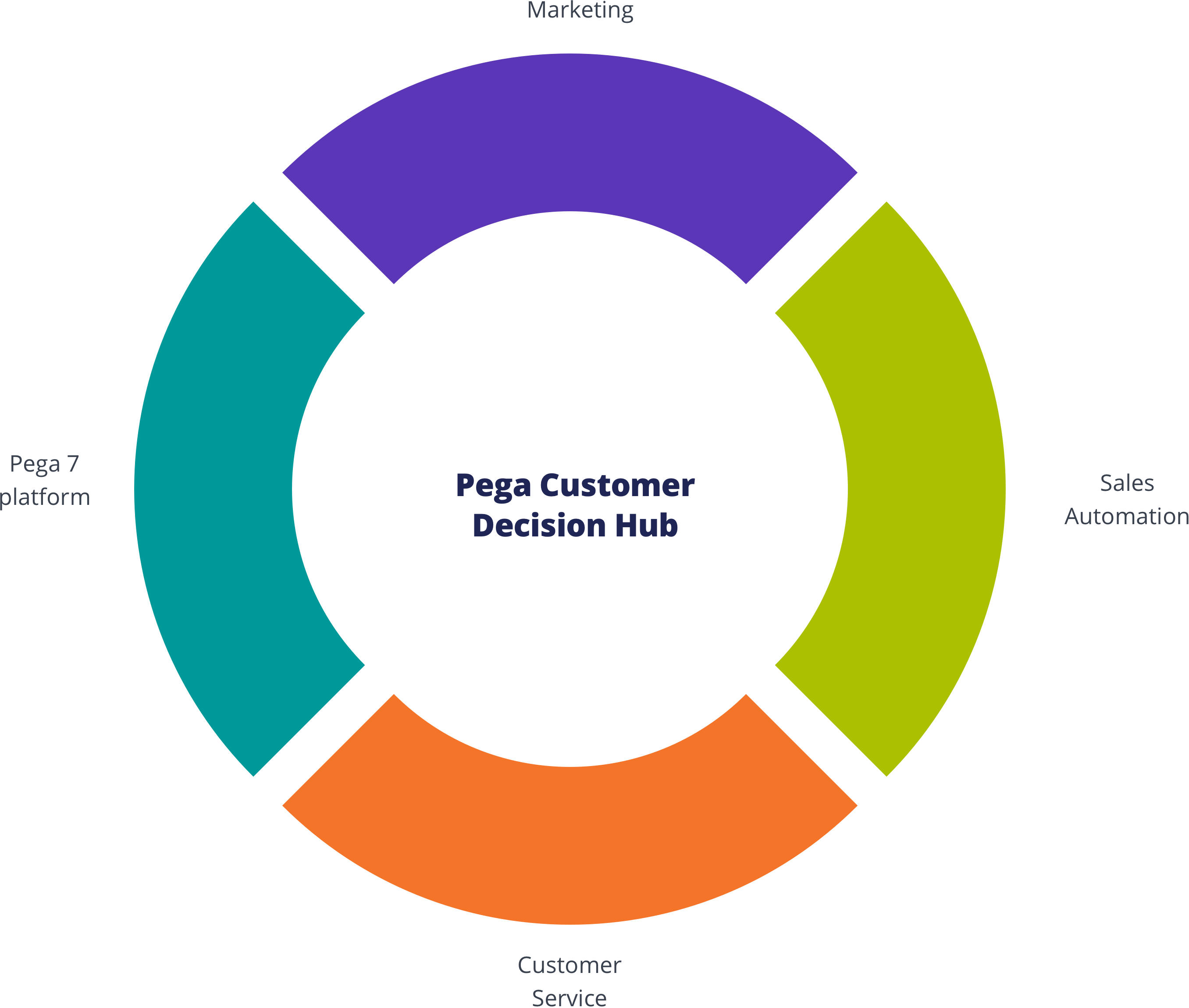
Customer Decision Hub
Infuse real-time AI into every customer engagement
There’s nothing artificial about Pega’s proven AI. This always-on brain gets results. Using pragmatic artificial intelligence and decision management, you can improve response rates by up to 6X, NPS by 30 points, and get ROI as high as 500%.
Call to ActionTab label 1
Tab label 2
Tab label 3
Placeholder "fixed" element, should not overlap tabs when page first loads.
scrollOffsetSelector to select the "fixed" element. That will offset the scroll position by the "fixed" element's height. Use scrollOffset for any additional adjstments. See a demo: ?selected-tab=tab-3.
Tab label 1
Tab label 2
Tab label 3
<bolt-tabs> element containing multiple <bolt-tabs-panel> elements to create a set of tabs. Inside each <bolt-tab-panel> mark the "label" content with the attribute slot="label". Everything else is considered tab "content".
<bolt-tabs>
<bolt-tab-panel>
<bolt-text slot="label">Tab label 1</bolt-text>
<bolt-text>Tab panel 1</bolt-text>
</bolt-tab-panel>
<bolt-tab-panel>
<bolt-text slot="label">Tab label 2</bolt-text>
<bolt-text>Tab panel 2</bolt-text>
</bolt-tab-panel>
<bolt-tab-panel>
<bolt-text slot="label">Tab label 3</bolt-text>
<bolt-text>Tab panel 3</bolt-text>
</bolt-tab-panel>
</bolt-tabs><bolt-tabs panel-spacing="small" align="center">
<bolt-tab-panel>
<bolt-text slot="label">Tab label 1</bolt-text>
<bolt-text>Tab panel 1</bolt-text>
</bolt-tab-panel>
<bolt-tab-panel>
<bolt-text slot="label">Tab label 2</bolt-text>
<bolt-text>Tab panel 2</bolt-text>
</bolt-tab-panel>
<bolt-tab-panel>
<bolt-text slot="label">Tab label 3</bolt-text>
<bolt-text>Tab panel 3</bolt-text>
</bolt-tab-panel>
</bolt-tabs><bolt-tab-panel> by setting selected-tab on <bolt-tabs> or by adding selected to a single <bolt-tab-panel>.
<!-- Use `selected-tab` to set selected tab -->
<bolt-tabs selected-tab="2">
<bolt-tab-panel>
<bolt-text slot="label">Tab label 1</bolt-text>
<bolt-text>Tab panel 1</bolt-text>
</bolt-tab-panel>
<bolt-tab-panel>
<bolt-text slot="label">Tab label 2</bolt-text>
<bolt-text>Tab panel 2</bolt-text>
</bolt-tab-panel>
<bolt-tab-panel>
<bolt-text slot="label">Tab label 3</bolt-text>
<bolt-text>Tab panel 3</bolt-text>
</bolt-tab-panel>
</bolt-tabs>
<!-- Use `selected` to set selected tab -->
<bolt-tabs>
<bolt-tab-panel>
<bolt-text slot="label">Tab label 1</bolt-text>
<bolt-text>Tab panel 1</bolt-text>
</bolt-tab-panel>
<bolt-tab-panel selected>
<bolt-text slot="label">Tab label 2</bolt-text>
<bolt-text>Tab panel 2</bolt-text>
</bolt-tab-panel>
<bolt-tab-panel>
<bolt-text slot="label">Tab label 3</bolt-text>
<bolt-text>Tab panel 3</bolt-text>
</bolt-tab-panel>
</bolt-tabs><bolt-text>
This is text.
</bolt-text>| Prop Name | Description | Type | Default Value | Option(s) |
|---|---|---|---|---|
|
attributes
|
A Drupal-style attributes object with extra attributes to append to this component. |
object
| — |
|
|
text
*
|
Text content of the headline. |
string
| — |
|
|
tag
|
HTML semantic tags. |
string
|
p
|
|
|
display
|
Inline text or a block of text. |
string
|
block
|
|
|
color
|
Text color in context of theme colors. |
string
|
theme-body
|
|
|
align
|
Text alignment. |
string
|
inherit
|
|
|
opacity
|
Opacity level. |
number
|
100
|
|
|
quoted
|
Quoted text. |
boolean
|
false
|
|
|
line-height
|
Line height in context of the typographic design. |
string
|
regular
|
|
|
letter-spacing
|
Letter spacing in context of the typographic design. |
string
|
regular
|
|
|
text-transform
|
Transform controls the type case. Please note that capitalize would capitalize the first letter of each word, it is not the same as title case. |
string
|
regular
|
|
|
font-family
|
Font family in context of the typographic design. |
string
|
body
|
|
|
font-size
|
Font size in context of the typographic design. |
string
|
medium
|
|
|
font-weight
|
Font weight in context of the typographic design. |
string
|
regular
|
|
|
font-style
|
Emphasized text. |
string
|
regular
|
|
|
headline
|
A preset for headlines in context of the typographic design. |
boolean
|
false
|
|
|
subheadline
|
A preset for subheadlines in context of the typographic design. |
boolean
|
false
|
|
|
eyebrow
|
A preset for eyebrow in context of the typographic design. |
boolean
|
false
|
|
|
util
|
Each item in the array will build a utility class. No need to include |
array
| — |
|
npm install @bolt/components-text<bolt-text> in the markup to make it render.
<bolt-text>
This is text.
</bolt-text><bolt-text> allows for separation of semantics and visual. Using a semantically correct tag will not affect the appearance of the text.
<bolt-text tag="h1">
This text has its tag prop defined as: h1
</bolt-text><bolt-text tag="h2">
This text has its tag prop defined as: h2
</bolt-text><bolt-text tag="h3">
This text has its tag prop defined as: h3
</bolt-text><bolt-text tag="h4">
This text has its tag prop defined as: h4
</bolt-text><bolt-text tag="h5">
This text has its tag prop defined as: h5
</bolt-text><bolt-text tag="h6">
This text has its tag prop defined as: h6
</bolt-text><bolt-text tag="p">
This text has its tag prop defined as: p
</bolt-text><bolt-text tag="div">
This text has its tag prop defined as: div
</bolt-text><bolt-text tag="span">
This text has its tag prop defined as: span
</bolt-text><bolt-text> can be defined as a paragraph of text (block display) or a piece of inline text (inline display).
<bolt-text display="block">
This paragraph of text has block display, which means it will take up the full width of its container.
</bolt-text>
<bolt-text display="block">
This paragraph of text also has block display, but within this paragraph, certain text can be <bolt-text display="inline" font-weight="bold" text-transform="uppercase">inline display</bolt-text>, and it can be styled differently than the rest of the paragraph.
</bolt-text><bolt-text> can be colored accordingly based on theming. It can either take on a particular theme's headline color or body text color.
<bolt-text color="theme-headline" font-weight="bold" font-size="large">
This text has its color prop defined as: theme-headline
</bolt-text><bolt-text color="theme-body" font-weight="bold" font-size="large">
This text has its color prop defined as: theme-body
</bolt-text><bolt-text> can be aligned horizontally. This only applies if display is set to block.
<bolt-text display="block" align="inherit">
This text has its align prop defined as: inherit
</bolt-text><bolt-text display="block" align="start">
This text has its align prop defined as: start
</bolt-text><bolt-text display="block" align="center">
This text has its align prop defined as: center
</bolt-text><bolt-text display="block" align="end">
This text has its align prop defined as: end
</bolt-text><bolt-text> can be adjusted in terms of opacity. The options are synced with Bolt's opacity scale.
<bolt-text opacity="100">
This text has its opacity prop defined as: 100
</bolt-text><bolt-text opacity="80">
This text has its opacity prop defined as: 80
</bolt-text><bolt-text opacity="60">
This text has its opacity prop defined as: 60
</bolt-text><bolt-text opacity="40">
This text has its opacity prop defined as: 40
</bolt-text><bolt-text opacity="20">
This text has its opacity prop defined as: 20
</bolt-text><bolt-text> can be turned into a quote by using the quoted boolean prop.
<bolt-text quoted>
This text is quoted.
</bolt-text>
<bolt-text headline quoted>
This headline text is also quoted.
</bolt-text><bolt-text> has a few options for leading (line-height). Leading can be adjusted for legibility. The default is regular.
its line-height
prop defined as:
tight
<bolt-text line-height="tight">
This text has<br>
its line-height<br>
prop defined as:<br>
tight
</bolt-text>its line-height
prop defined as:
regular
<bolt-text line-height="regular">
This text has<br>
its line-height<br>
prop defined as:<br>
regular
</bolt-text>its line-height
prop defined as:
loose
<bolt-text line-height="loose">
This text has<br>
its line-height<br>
prop defined as:<br>
loose
</bolt-text><bolt-text> has a few options for the spacing in between letters. It can be adjusted for legibility. The default is regular.
<bolt-text letter-spacing="narrow">
This text has its letter-spacing prop defined as: narrow
</bolt-text><bolt-text letter-spacing="regular">
This text has its letter-spacing prop defined as: regular
</bolt-text><bolt-text letter-spacing="wide">
This text has its letter-spacing prop defined as: wide
</bolt-text><bolt-text> has a few options for transforming letter case. It can be adjusted for legibility. The default is regular.
<bolt-text text-transform="regular">
This text has its text-transform prop defined as: regular
</bolt-text><bolt-text text-transform="uppercase">
This text has its text-transform prop defined as: uppercase
</bolt-text><bolt-text text-transform="lowercase">
This text has its text-transform prop defined as: lowercase
</bolt-text><bolt-text text-transform="capitalize">
This text has its text-transform prop defined as: capitalize
</bolt-text><bolt-text> has a few options to change typefaces. These options are relative to the types of text such as heading, body, and code. Each type is linked to a specific typeface. This method accounts for our evolving brand.
<bolt-text font-family="headline">
This text has its font-family prop defined as: headline
</bolt-text><bolt-text font-family="body">
This text has its font-family prop defined as: body
</bolt-text><bolt-text font-family="code">
This text has its font-family prop defined as: code
</bolt-text><bolt-text>
has font-size options to indicate information hierarchy.
<bolt-text font-size="xsmall">
This text has its font-size prop defined as: xsmall
</bolt-text><bolt-text font-size="small">
This text has its font-size prop defined as: small
</bolt-text><bolt-text font-size="medium">
This text has its font-size prop defined as: medium
</bolt-text><bolt-text font-size="large">
This text has its font-size prop defined as: large
</bolt-text><bolt-text font-size="xlarge">
This text has its font-size prop defined as: xlarge
</bolt-text><bolt-text font-size="xxlarge">
This text has its font-size prop defined as: xxlarge
</bolt-text><bolt-text font-size="xxxlarge">
This text has its font-size prop defined as: xxxlarge
</bolt-text><bolt-text> has font-style options to indicate simple emphasis.
<bolt-text font-style="regular">
This text has its font-style prop defined as: regular
</bolt-text><bolt-text font-style="italic">
This text has its font-style prop defined as: italic
</bolt-text><bolt-text> has font-weight options to indicate emphasis hierarchy.
<bolt-text font-weight="regular">
This text has its font-weight prop defined as: regular
</bolt-text><bolt-text font-weight="semibold">
This text has its font-weight prop defined as: semibold
</bolt-text><bolt-text font-weight="bold">
This text has its font-weight prop defined as: bold
</bolt-text>Toc
A navigation list, usually found on an article page, of its section titles.
{% include '@bolt-components-toc/toc.twig' with {
header: 'This is the header',
items: [
{
text: 'Section One',
url: '#section-one',
},
{
text: 'Section Two',
url: '#section-two',
},
{
text: 'Section Three',
url: '#section-three',
},
]
} only %}| Prop Name | Description | Type | Default Value | Option(s) |
|---|---|---|---|---|
|
attributes
|
A Drupal attributes object. Applies extra HTML attributes to the outer <bolt-toc> tag. |
object
| — |
|
|
sticky
|
When enabled, TOC will automatically use sticky positioning + add a |
boolean
| — |
|
|
scrollOffsetSelector
|
Selects a fixed element on the page, offsets smooth scrolling by the height of that element. Must be a valid CSS selector. |
string
| — |
|
|
scrollOffset
|
Additional offset for smooth scrolling, integer converted to pixel value. |
integer
| — |
|
|
variant
|
Set the visual variant. |
string
|
card
|
|
|
items
|
Generates an array of items. The items represent the headlines of top level sections in an article. |
array
| — |
|
|
header
|
Renders a header for the table of contents. |
string
| — |
|
|
uuid
|
Unique ID for the table of contents, randomly generated if not provided. |
string
| — |
|
items
| Prop Name | Description | Type | Default Value | Option(s) |
|---|---|---|---|---|
|
text
|
Renders the text for the linked item. |
string
| — |
|
|
url
|
Renders the |
string
| — |
|
|
active
|
Indicates that the item represents the current section being viewed. |
boolean
| — |
|
npm install @bolt/components-tocid of the particular section container or section heading.
Twig
{% include '@bolt-components-toc/toc.twig' with {
items: [
{
text: 'Section One',
url: '#section-one',
},
{
text: 'Section Two',
url: '#section-two',
},
{
text: 'Section Three',
url: '#section-three',
},
{
text: 'Section Four',
url: '#section-four',
},
{
text: 'Section Five',
url: '#section-five',
},
]
} only %}HTML
<bolt-toc>
<bolt-toc-item url="#section-one">
Section One
</bolt-toc-item>
<bolt-toc-item url="#section-two">
Section Two
</bolt-toc-item>
<bolt-toc-item url="#section-three">
Section Three
</bolt-toc-item>
<bolt-toc-item url="#section-four">
Section Four
</bolt-toc-item>
<bolt-toc-item url="#section-five">
Section Five
</bolt-toc-item>
</bolt-toc>active to indicate that the page is anchored to the respective section.
Twig
{% include '@bolt-components-toc/toc.twig' with {
items: [
{
text: 'Section One',
url: '#section-one',
},
{
text: 'Section Two',
url: '#section-two',
active: true,
},
{
text: 'Section Three',
url: '#section-three',
},
]
} only %}HTML
<bolt-toc>
<bolt-toc-item url="#section-one">
Section One
</bolt-toc-item>
<bolt-toc-item url="#section-two" active>
Section Two
</bolt-toc-item>
<bolt-toc-item url="#section-three">
Section Three
</bolt-toc-item>
</bolt-toc>header prop.
Twig
{% include '@bolt-components-toc/toc.twig' with {
header: 'This is the header',
items: [
{
text: 'Section One',
url: '#section-one',
},
{
text: 'Section Two',
url: '#section-two',
},
{
text: 'Section Three',
url: '#section-three',
},
]
} only %}HTML
<bolt-toc header="This is the header">
<bolt-toc-item url="#section-one">
Section One
</bolt-toc-item>
<bolt-toc-item url="#section-two">
Section Two
</bolt-toc-item>
<bolt-toc-item url="#section-three">
Section Three
</bolt-toc-item>
</bolt-toc>variant prop.
Twig
{% include '@bolt-components-toc/toc.twig' with {
header: 'This is the transparent variant',
items: [
{
text: 'Section One',
url: '#section-one',
active: true,
},
{
text: 'Section Two',
url: '#section-two',
},
{
text: 'Section Three',
url: '#section-three',
},
],
variant: 'transparent',
} only %}HTML
<bolt-toc header="This is the transparent variant" variant="transparent">
<bolt-toc-item url="#section-one" active>
Section One
</bolt-toc-item>
<bolt-toc-item url="#section-two">
Section Two
</bolt-toc-item>
<bolt-toc-item url="#section-three">
Section Three
</bolt-toc-item>
</bolt-toc>sticky prop.
scrollOffsetSelector and scrollOffset.
Section One
Iron Man. Phasellus molestie magna non est bibendum non venenatis nisl tempor. Suspendisse dictum feugiat nisl ut dapibus. Mauris iaculis porttitor posuere. Praesent id metus massa, ut blandit odio. Proin quis tortor orci. Etiam at risus et justo dignissim congue. Donec congue lacinia dui, a porttitor lectus condimentum laoreet. Nunc eu ullamcorper orci. Quisque eget odio ac lectus vestibulum faucibus eget in metus.
Vivamus hendrerit arcu sed erat molestie vehicula. Sed auctor neque eu tellus rhoncus ut eleifend nibh porttitor. Ut in nulla enim. Phasellus molestie magna non est bibendum non venenatis nisl tempor. Suspendisse dictum feugiat nisl ut dapibus. Mauris iaculis porttitor posuere. Praesent id metus massa, ut blandit odio. Proin quis tortor orci. Etiam at risus et justo dignissim congue. Donec congue lacinia dui, a porttitor lectus condimentum laoreet. Nunc eu ullamcorper orci. Quisque eget odio ac lectus vestibulum faucibus eget in metus. In pellentesque faucibus vestibulum. Nulla at nulla justo, eget luctus tortor. Nulla facilisi. Duis aliquet egestas purus in blandit. Curabitur vulputate, ligula lacinia scelerisque tempor, lacus lacus ornare ante, ac egestas est urna sit amet arcu. Class aptent taciti sociosqu ad litora torquent per conubia nostra, per inceptos himenaeos. Sed molestie augue sit amet leo consequat posuere. Vestibulum ante.
Vestibulum ante ipsum primis in faucibus orci luctus et ultrices posuere cubilia Curae; Proin vel ante a orci tempus eleifend ut et magna. Lorem ipsum dolor sit amet, consectetur adipiscing elit. Vivamus luctus urna sed urna ultricies ac tempor dui sagittis. In condimentum facilisis porta. Sed nec diam eu diam mattis viverra. Nulla fringilla, orci ac euismod semper, magna diam porttitor mauris, quis sollicitudin sapien justo in libero. Vestibulum mollis mauris enim. Morbi euismod magna ac lorem rutrum elementum. Donec viverra auctor lobortis. Pellentesque eu est a nulla placerat dignissim. Morbi a enim in magna semper bibendum. Etiam scelerisque, nunc ac egestas consequat, odio nibh euismod nulla, eget auctor orci nibh vel nisi. Aliquam erat volutpat. Mauris vel neque sit amet nunc gravida congue sed sit amet purus. Quisque lacus quam, egestas ac tincidunt a, lacinia vel velit. Aenean facilisis nulla vitae urna tincidunt congue sed ut dui. Morbi malesuada nulla nec purus convallis consequat. Vivamus id mollis quam. Morbi ac commodo nulla. In condimentum orci id nisl volutpat.
Section Two
Iron Man 3. In condimentum facilisis porta. Sed nec diam eu diam mattis viverra. Nulla fringilla, orci ac euismod semper, magna diam porttitor mauris, quis sollicitudin sapien justo in libero. Vestibulum mollis mauris enim. Morbi euismod magna ac lorem rutrum elementum. Donec viverra auctor lobortis. Pellentesque eu est a nulla placerat dignissim. Morbi a enim in magna semper bibendum. Etiam scelerisque, nunc ac egestas consequat, odio nibh euismod nulla, eget auctor orci nibh vel nisi. Aliquam erat volutpat. Mauris vel neque.
Sed molestie augue sit amet leo consequat posuere. Vestibulum ante ipsum primis in faucibus orci luctus et ultrices posuere cubilia Curae; Proin vel ante a orci tempus eleifend ut et magna. Lorem ipsum dolor sit amet, consectetur adipiscing elit. Vivamus luctus urna sed urna ultricies ac tempor dui.
Duis aliquet egestas purus in blandit. Curabitur vulputate, ligula lacinia scelerisque tempor, lacus lacus ornare ante, ac egestas est urna sit amet arcu. Class aptent taciti sociosqu ad litora torquent per conubia nostra, per inceptos himenaeos. Sed molestie augue sit amet leo consequat posuere. Vestibulum ante ipsum primis in faucibus orci luctus et ultrices posuere cubilia Curae; Proin vel ante a orci tempus eleifend ut et.
Section Three
Captain America: Civil War. Ut in nulla enim. Phasellus molestie magna non est bibendum non venenatis nisl tempor. Suspendisse dictum feugiat nisl ut dapibus. Mauris iaculis porttitor posuere. Praesent id metus massa, ut blandit odio. Proin quis tortor orci. Etiam at risus et justo dignissim congue. Donec congue lacinia dui, a porttitor lectus condimentum laoreet. Nunc eu ullamcorper orci. Quisque eget odio ac lectus vestibulum faucibus eget in metus. In pellentesque faucibus vestibulum. Nulla at nulla justo, eget luctus tortor. Nulla facilisi. Duis aliquet egestas purus in blandit. Curabitur vulputate, ligula lacinia scelerisque tempor, lacus lacus ornare ante, ac egestas est urna sit amet arcu. Class aptent taciti sociosqu ad litora torquent per conubia.
Lorem ipsum dolor sit amet, consectetur adipiscing elit. Vivamus luctus urna sed urna ultricies ac tempor dui sagittis. In condimentum facilisis porta. Sed nec diam eu diam mattis viverra. Nulla fringilla, orci ac euismod semper, magna diam porttitor mauris, quis sollicitudin sapien justo in libero. Vestibulum.
Sed molestie augue sit amet leo consequat posuere. Vestibulum ante ipsum primis in faucibus orci luctus et ultrices posuere cubilia Curae; Proin vel ante a orci tempus eleifend ut et magna. Lorem ipsum dolor sit amet, consectetur adipiscing elit. Vivamus luctus urna sed urna ultricies ac tempor dui sagittis. In condimentum facilisis porta. Sed nec diam eu diam mattis viverra. Nulla fringilla, orci ac euismod semper, magna diam porttitor mauris, quis sollicitudin sapien justo in libero. Vestibulum mollis mauris enim. Morbi euismod magna ac lorem rutrum elementum. Donec viverra auctor lobortis. Pellentesque eu est a nulla placerat dignissim. Morbi a enim in magna semper bibendum. Etiam scelerisque, nunc ac egestas consequat, odio nibh euismod nulla, eget auctor orci nibh vel nisi. Aliquam erat volutpat. Mauris vel neque sit amet nunc gravida congue sed sit amet.
Twig
{% include '@bolt-components-toc/toc.twig' with {
header: 'Table of Contents',
items: [
{
text: 'Section One',
url: '#section-one',
},
{
text: 'Section Two',
url: '#section-two',
},
{
text: 'Section Three',
url: '#section-three',
},
],
sticky: true,
scrollOffsetSelector: '.js-sticky-target',
scrollOffset: 20,
} only %}HTML
<bolt-toc header="Table of Contents" sticky scroll-offset-selector=".js-sticky-target" scroll-offset=20>
<bolt-toc-item url="#section-one">
Section One
</bolt-toc-item>
<bolt-toc-item url="#section-two">
Section Two
</bolt-toc-item>
<bolt-toc-item url="#section-three">
Section Three
</bolt-toc-item>
</bolt-toc>Tooltip
Floating label that briefly describes an element.
{% include '@bolt-components-tooltip/tooltip.twig' with {
trigger: 'This is the tooltip trigger',
content: 'This is the tooltip content.'
} only %}| Prop Name | Description | Type | Default Value | Option(s) |
|---|---|---|---|---|
|
attributes
|
A Drupal attributes object. Applies extra HTML attributes to the outer <bolt-tooltip> tag. |
object
| — |
|
|
trigger
*
|
Renders the trigger of the tooltip. |
any
| — |
|
|
content
*
|
Renders the content of the tooltip. Plain text is preferred because this is supposed to be a simple label. For passing more complex content and actions, please use Popover instead. |
any
| — |
|
|
placement
|
Sets the preferred placement of the tooltip. The actual placement of the tooltip will be automatically adjusted based on the space available on screen. |
string
|
top
|
|
|
inverted
|
Invert the colors of the tooltip content. If true, content will be dark text on light background |
boolean
| — |
|
|
uuid
|
Unique ID for the tooltip, randomly generated if not provided. |
string
| — |
|
|
boundary
|
Optionally allows you to specify a parent element selector to use as an outer boundary when calculating placement. |
string
| — |
|
|
fallbackPlacements
|
An array of different placement options that Popper.js should try if there isn't enough space for the ideal placement. Normally this defaults to all placement options however this lets you limit the options to pick from in certain situations. |
array
| — |
|
|
aria_type
|
This sets the specific aria attribute for rendering the tooltip, the 2 available options do different things. 'labelledby' sets the tooltip text as the accessible name for the trigger, while 'describedby' keeps the trigger's accessible name (it must have one in such case) and provides additional description. |
string
|
labelledby
|
|
|
direction
(deprecated) |
This prop is deprecated. Please use placement instead. |
any
| — |
|
|
noWrap
(deprecated) |
This prop is deprecated. Please stop using it. |
any
| — |
|
|
spacing
(deprecated) |
This prop is deprecated. Please stop using it. |
any
| — |
|
npm install @bolt/components-tooltipinverted prop to invert the colors so it stands out better against the dark background. Such as
<bolt-tooltip> in the markup to make it render.
<bolt-tooltip>
CRM
<span slot="content">Customer relationship management</span>
</bolt-tooltip><bolt-tooltip placement="top" uuid="target-this-unique-id">
CRM
<span slot="content">Customer relationship management</span>
</bolt-tooltip><bolt-tooltip placement="top" uuid="target-this-unique-id">
CRM
<span slot="content">Customer relationship management</span>
</bolt-tooltip>{% include '@bolt-components-trigger/trigger.twig' with {
content: 'This is a trigger'
} only %}| Prop Name | Description | Type | Default Value | Option(s) |
|---|---|---|---|---|
|
attributes
|
A Drupal-style attributes object with extra attributes to append to this component. |
object
| — |
|
|
content
|
Main content of the trigger (Twig only). |
string
, array
, object
|
— |
|
|
url
|
Optional. Contains a URL that the chip points to. When URL is present, tag changes to |
string
| — |
|
|
target
|
A valid HTML target attribute to modify the behavior when clicking this element. Only valid when "url" is also present. |
string
|
_self
|
|
|
type
|
Determines the button tag type for semantic buttons |
string
|
button
|
|
|
rel
|
Set to |
string
| — |
|
|
cursor
|
Type of cursor shown on hover. |
string
|
pointer
|
|
|
on_click
|
When used with on_click_target, an event to fire on the targeted elements when this element is clicked. When used without on_click_target, arbitrary javascript to execute when this element is clicked. |
string
| — |
|
|
on_click_target
|
Requires on_click. A CSS selector for elements that the on_click event will fire on when this element is clicked. |
string
| — |
|
|
onClick
(deprecated) |
Use on_click instead. |
— | — |
|
|
onClickTarget
(deprecated) |
Use on_click_target instead. |
— | — |
|
|
display
|
Set the display property |
string
|
inline
|
|
|
no_outline
|
Turn off the default outline on focus |
boolean
|
false
|
|
|
disabled
|
Make trigger unusable and un-clickable. Only applies to |
boolean
|
false
|
|
npm install @bolt/components-trigger<bolt-trigger> element in the markup.
<bolt-trigger onclick="alert('Trigger clicked')">
This is a trigger
</bolt-trigger>button tag. Set the url prop to render a semantic a tag.
<bolt-trigger url="https://google.com">
This is a trigger
</bolt-trigger>cursor prop.
<bolt-trigger cursor="zoom-in">
This is a trigger
</bolt-trigger>on-click and on-click-target props to call a method on another component. See schema for more info.
<bolt-trigger on-click="show" on-click-target="js-image-modal-456" cursor="zoom-in" display="block">
<bolt-image src="/images/placeholders/16x9.jpg" alt="A Rock Climber" ratio="640/480"></bolt-image>
</bolt-trigger>
<bolt-modal class="js-image-modal-456" spacing="none" theme="none" scroll="overall">
<bolt-trigger on-click="hide" on-click-target="js-image-modal-456" cursor="zoom-out" display="block">
<bolt-image src="/images/placeholders/16x9.jpg" alt="A Rock Climber" sizes="auto" ratio="640/480"></bolt-image>
</bolt-trigger>
</bolt-modal>Typeahead
Typeahead is an input field with dropdown-like listbox that displays suggested results that most closely match a user's given search term.
{% include '@bolt-components-typeahead/typeahead.twig' %}| Prop Name | Description | Type | Default Value | Option(s) |
|---|---|---|---|---|
|
attributes
|
A Drupal-style attributes object with extra attributes to append to this component. |
object
| — |
|
|
max_results
|
The maximum number of typeahead results to display |
number
|
10
|
|
|
items
|
An array of objects that's used to populate the suggestion list that appears below the input as the users type. This array of objects can be asynchronously fetched and should contain a |
array
| — |
|
|
clear_input_text
|
Screenreader-specific text for the clear search button, intended to provide a longer, more descriptive explanation of the clear button's behavior. |
string
|
Clear search results
|
|
|
submit_button_text
|
Screenreader-specific text for the submit button, intended to provide a longer, more descriptive explanation of the submit button's behavior. |
string
|
Submit
|
|
|
input_label
|
Screenreader-specific label text associated with the search input. |
string
| — |
|
|
input_placeholder
|
The placeholder text to display inside the Typeahead search input. |
string
|
Search
|
|
|
input_value
|
Initial value to pre-populate the input field |
string
| — |
|
|
input_name
|
Input element's name attribute used when pre-rendering the component |
string
| — |
|
|
no_highlight
|
Disable text highlighting in matching search results (highlighting is enabled by default) |
boolean
|
false
|
|
|
disabled
|
Disables input as well as the search and cancel buttons. |
boolean
|
false
|
|
npm install @bolt/components-typeaheadDemo: Dyamically Fetch Data
In this example, we populate the Typeahead component with JSON data that's dynamically fetched from an external source via the getSuggestions hook.
Also, this demo caps the max # of search results to display at 5.
{% include "@bolt-components-form/form.twig" with {
children: include("@bolt-components-typeahead/typeahead.twig", {
attributes: {
class: [
"js-typeahead-hook--dynamically-fetch-data"
]
},
max_results: 5,
input_name: "q"
}),
attributes: {
action: "https://www.pega.com/search",
target: "_blank",
rel: "noopener",
method: "GET"
}
} %}
// NOTE: make sure you're running this code through a tool like Babel before shipping for cross browser compatibility!
const dynamicTypeaheadDemo = document.querySelector(
'.js-typeahead-hook--dynamically-fetch-data',
);
const setupEventHandlers = () => {
// note: make sure to let Typeahead know when the data fetched is ready
dynamicTypeaheadDemo.on('getSuggestions', async value => {
return await new Promise(async resolve => {
await fetch('/build/data/typeahead.data.json')
.then(function(response) {
return response.json();
})
.then(function(data) {
return resolve(data);
});
});
});
dynamicTypeaheadDemo.on('onSelected', (element, event, suggestion) => {
const exactMatch = element.items.filter(
item => item.label === suggestion.suggestionValue,
)[0];
function navigateTo(url) {
if (window.location !== window.parent.location) {
const win = window.open(url, '_blank', 'noopener');
win.focus();
} else {
window.location = url;
}
}
if (exactMatch && exactMatch.url) {
if (exactMatch.url) {
navigateTo(exactMatch.url);
} else {
navigateTo(`https://www.pega.com/search?q=${itemSelected.label}`);
}
} else if (suggestion.suggestionValue !== '') {
navigateTo(`https://www.pega.com/search?q=${suggestion.suggestionValue}`);
}
});
};
if (dynamicTypeaheadDemo) {
if (dynamicTypeaheadDemo._wasInitiallyRendered) {
setupEventHandlers();
}
dynamicTypeaheadDemo.addEventListener('ready', e => {
if (e.detail.name === 'bolt-typeahead') {
setupEventHandlers();
}
});
}
{% include '@bolt-components-ul/ul.twig' with {
items: [
'Do not include any data or information in your posts that are confidential!',
'Apply basic practices for collaborative work.',
'Be honest, respectful, trustworthy and helpful.',
'Answer questions authoritatively and concisely. Avoid cluttering discussions with noise.'
]
} only %}| Prop Name | Description | Type | Default Value | Option(s) |
|---|---|---|---|---|
|
attributes
|
A Drupal-style attributes object with extra attributes to append to this component. |
object
| — |
|
|
contentItems
(deprecated) |
Use the items prop instead. |
array
| — |
|
|
items
|
All items can be simple text or |
array
| — |
|
items
| Prop Name | Description | Type | Default Value | Option(s) |
|---|---|---|---|---|
|
text
|
Item text |
string
| — |
|
|
contentItems
|
Items pass to |
array
| — |
|
npm install @bolt/components-ulTheme: xlight
Theme: light
Theme: dark
Theme: xdark
Web Component Usage
Bolt Unordered List is a web component, you can simply use <bolt-ul> in the markup to make it render. Its inner content is comprised of <bolt-li>.
Example
<bolt-ul>
<bolt-li>Item 1</bolt-li>
<bolt-li>Item 2</bolt-li>
<bolt-li>Item 3</bolt-li>
<bolt-li>Item 4</bolt-li>
<bolt-li>Item 5</bolt-li>
</bolt-ul>Simple usage
Nesting of lists (ol and ul)
Theme variations
Theme: xlight
Theme: light
Theme: dark
Theme: xdark
Video Thumbnail
A graphical element that represents a video.
{% include '@bolt-components-video-thumbnail/video-thumbnail.twig' with {
content: image,
video: {
title: 'Video Title',
duration: '4:55'
}
} only %}| Prop Name | Description | Type | Default Value | Option(s) |
|---|---|---|---|---|
|
attributes
|
A Drupal attributes object. Applies extra HTML attributes to the parent element. |
object
| — |
|
|
content
|
Content of the video thumbnail. An image pointing to the video poster is recommended. |
any
| — |
|
|
border_radius
|
Set the border radius of the video thumbnail. |
string
|
none
|
|
|
aspect_ratio
|
Set the aspect ratio of the video thumbnail. |
string
|
16:9
|
|
|
chip
|
Display a chip (or chip-list) that overlays the video thumbnail. Positioned before the video title. Chip or Chip-list component is expected here. |
any
| — |
|
|
button_attributes
|
A Drupal attributes object. Applies extra HTML attributes to the inner button element. |
object
| — |
|
|
video
|
Props that pertain to the Brightcove video |
object
| — |
|
npm install @bolt/components-video-thumbnailvideo.title prop. This will provide contextual information for screen readers.content prop accepts both plain <img> element and Bolt Image element.video.duration prop is optional while recommended.
Twig
{% set image %}
{% include '@bolt-elements-image/image.twig' with {
attributes: {
src: '/images/placeholders/16x9.jpg',
alt: 'A Rock Climber',
background: true,
loading: 'lazy',
width: 400,
height: 300,
}
} only %}
{% endset %}
{% include '@bolt-components-video-thumbnail/video-thumbnail.twig' with {
content: image,
video: {
title: 'Title of the Video',
duration: '4:55'
}
} only %}HTML
Twig
{% include '@bolt-components-video-thumbnail/video-thumbnail.twig' with {
content: image,
aspect_ratio: '1:1',
video: {
title: 'Title of the Video',
duration: '4:55'
}
} only %}HTML
Twig
{% include '@bolt-components-video-thumbnail/video-thumbnail.twig' with {
content: image,
border_radius: 'large',
video: {
title: 'Title of the Video',
duration: '4:55'
}
} only %}HTML
size as small, and its border_radius to match the Video Thumbnail’s border_radius.
Twig
{% set chip %}
{% include '@bolt-components-chip/chip.twig' with {
text: 'Preview',
size: 'small',
border_radius: 'small',
...
} only %}
{% endset %}
{% include '@bolt-components-video-thumbnail/video-thumbnail.twig' with {
chip: chip,
video: {
title: 'This is a Video Title',
duration: '4:26',
has_subtitles: true,
show_title: true
}
...
} only %}HTML
video.title prop. This will provide contextual information for screen readers.button_attributes prop to pass in the required data-bolt-modal-target attribute to hook up a modal.Twig
// Set up the thumbnail
{% set video_thumbnail %}
{% set image %}
{% include '@bolt-elements-image/image.twig' with {
attributes: {
src: '/images/placeholders/16x9.jpg',
alt: 'A Rock Climber',
loading: 'lazy',
width: 400,
height: 300,
}
} only %}
{% endset %}
{% include '@bolt-components-video-thumbnail/video-thumbnail.twig' with {
content: image,
button_attributes: {
'data-bolt-modal-target': '#js-modal-target'
},
video: {
duration: '4:55',
title: 'Video Title',
has_subtitles: true
}
} only %}
{% endset %}
{{ video_thumbnail }}
// Set up the modal
{% set video %}
{% set video_embed %}
<video-js
data-account='1900410236'
data-player='O3FkeBiaDz'
data-embed='default'
data-video-id='4892122320001'
controls
class="c-base-video"></video-js>
{% endset %}
{% include '@bolt-elements-ratio/ratio.twig' with {
content: video_embed,
ratio: 'wide'
} only %}
{% endset %}
{% include '@bolt-components-modal/modal.twig' with {
content: video,
width: 'optimal',
spacing: 'none',
scroll: 'overall',
attributes: {
id: 'js-modal-target',
},
} only %}HTML
video.content prop is used.
video.video_title prop. This will provide contextual information for screen readers.video.content prop to pass in the video object.Twig
// Set up the video thumbnail
{% set video_thumbnail %}
{% set _image %}
{% include '@bolt-elements-image/image.twig' with {
attributes: {
src: '/images/placeholders/16x9.jpg',
alt: 'A Rock Climber',
ratio: false,
background: true,
loading: 'lazy',
}
} only %}
{% endset %}
{% set _video %}
<video-js
data-account='1900410236'
data-player='O3FkeBiaDz'
data-embed='default'
data-video-id='4892122320001'
controls
class="c-base-video"></video-js>
{% endset %}
// Utilizing the 'video' prop will open the video inline
{% include '@bolt-components-video-thumbnail/video-thumbnail.twig' with {
content: _image,
video: {
content: _video,
duration: '4:55',
title: 'Video Title',
has_subtitles: true
}
} only %}
{% endset %}
{{ video_thumbnail }}HTML
video.content or button_attributes props.Twig
{% set video_thumbnail %}
{% set image %}
{% include '@bolt-elements-image/image.twig' with {
attributes: {
src: '/images/placeholders/16x9.jpg',
alt: 'A Rock Climber',
loading: 'lazy',
width: 400,
height: 300,
}
} only %}
{% endset %}
{% include '@bolt-components-video-thumbnail/video-thumbnail.twig' with {
content: image
} only %}
{% endset %}
<a href="https://google.com" target="_blank" rel="noopener" aria-label="Link to Video Resource">
{{ video_thumbnail }}
</a>HTML